Integrated Campaign Design
Crunch Fitness
Role Design Manager
Scope Co-developed campaign concepts and evolved existing brand systems. Led visual system development across typography, layout, and photography direction. Designed key hero assets, and built scalable campaign toolkits for global rollout. Managed production timelines and mentored junior designers throughout execution.
Timeframe 3 campaign cycles (2021–2026)
Scale Global rollout across 500+ franchise and corporate locations, reaching a community of 3M+ members.
Impact 31% lift in brand awareness and 72% of purchase intent influenced by campaign creative.
Campaign Platform Evolution
Timeline
Over multiple campaign cycles, I partnered in evolving Crunch’s campaign platform toward a more refined and scalable visual system. Each campaign iteration introduced improvements in hierarchy, photography direction, and modular layout structures to support a consistent global rollout. The progression below highlights how campaign language and visual identity developed over time.
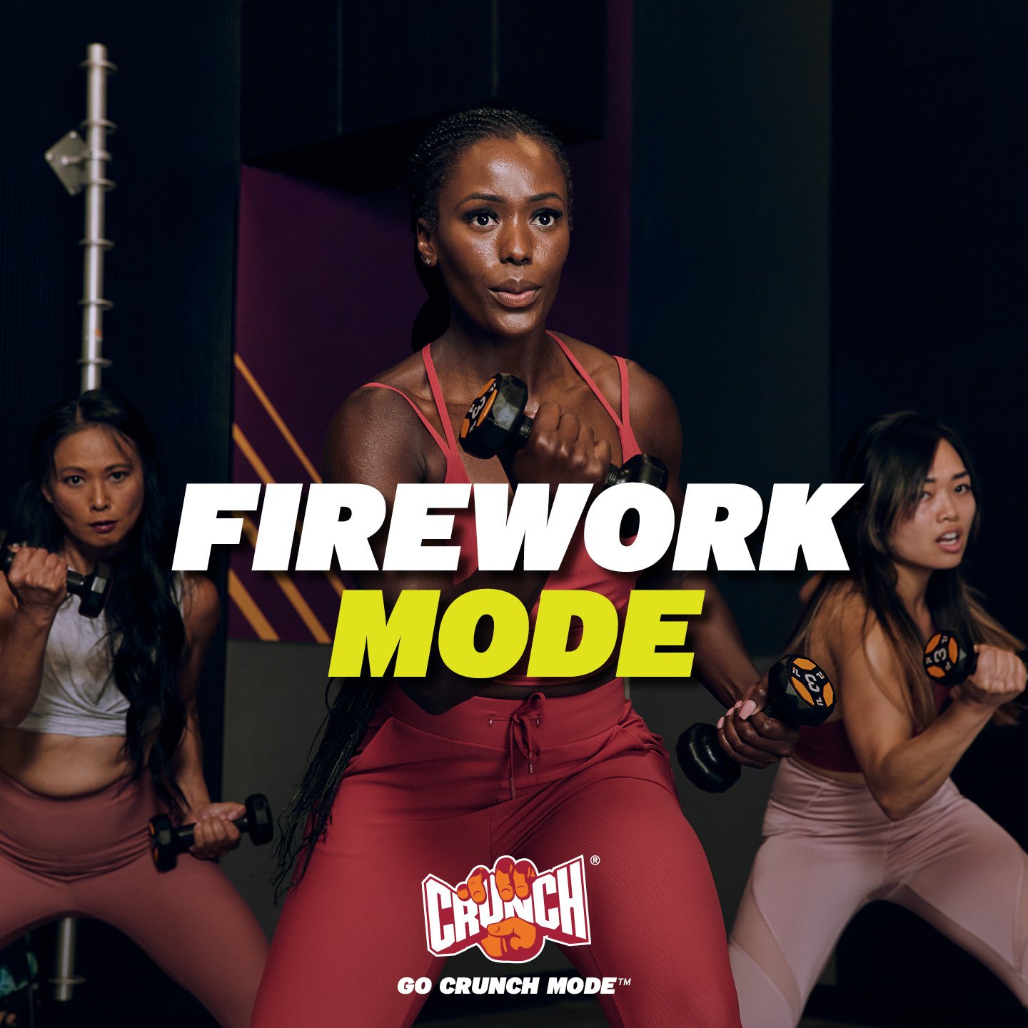
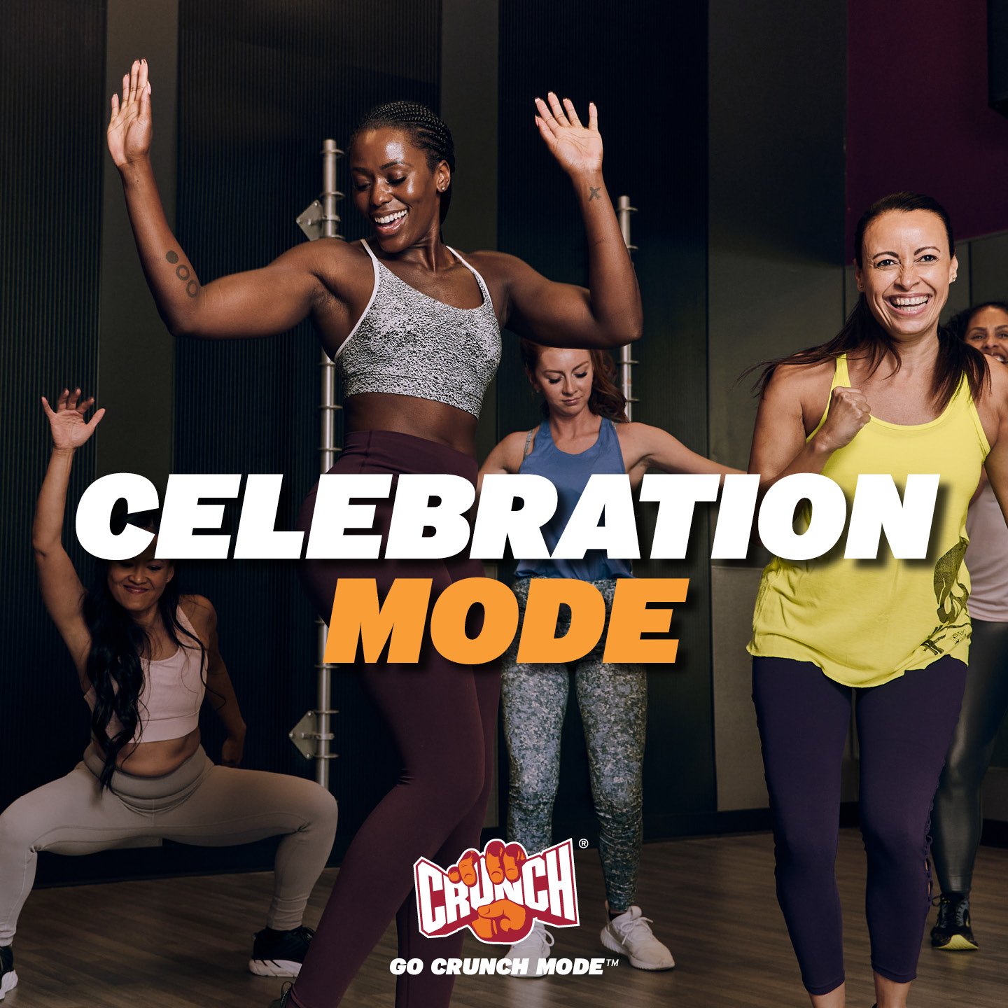
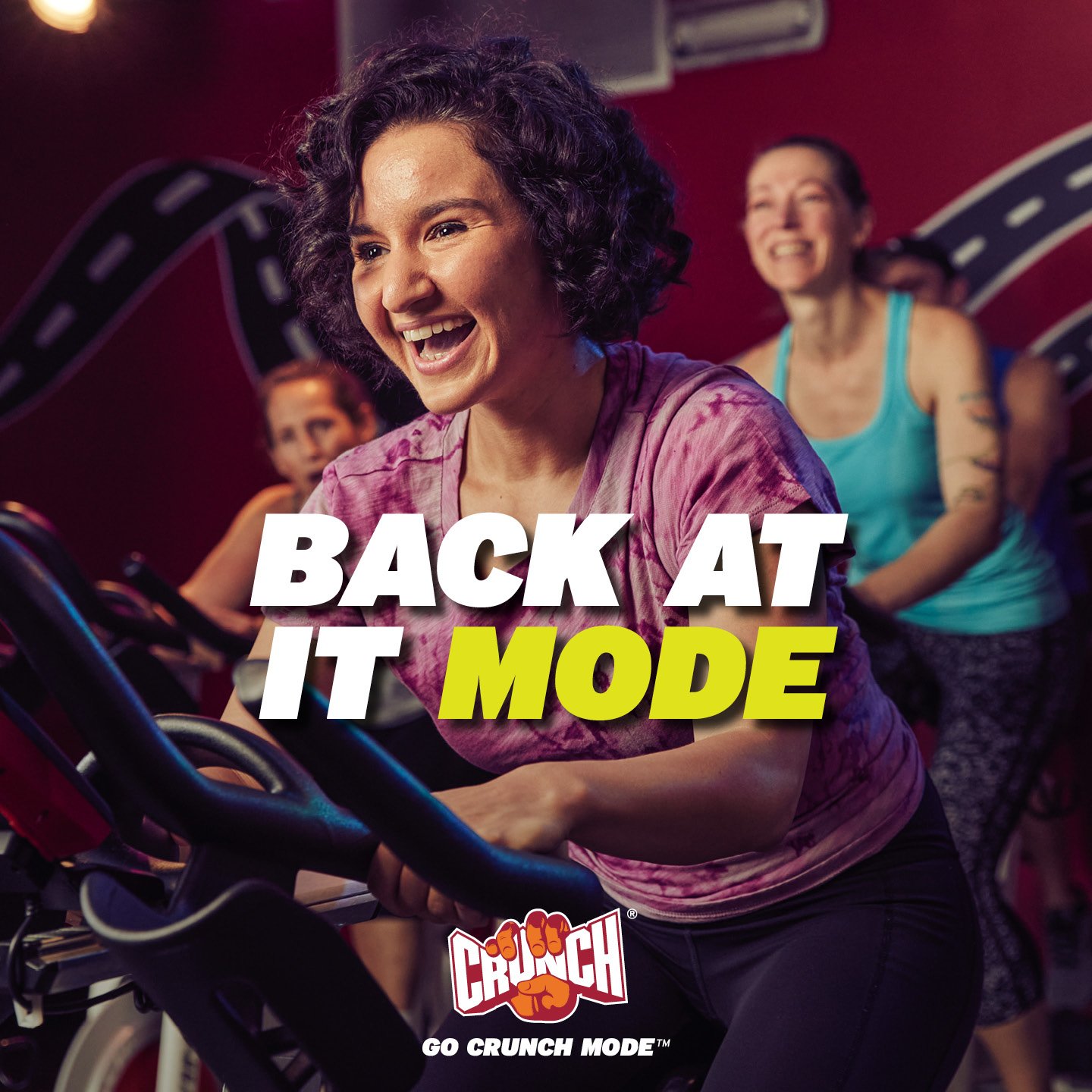
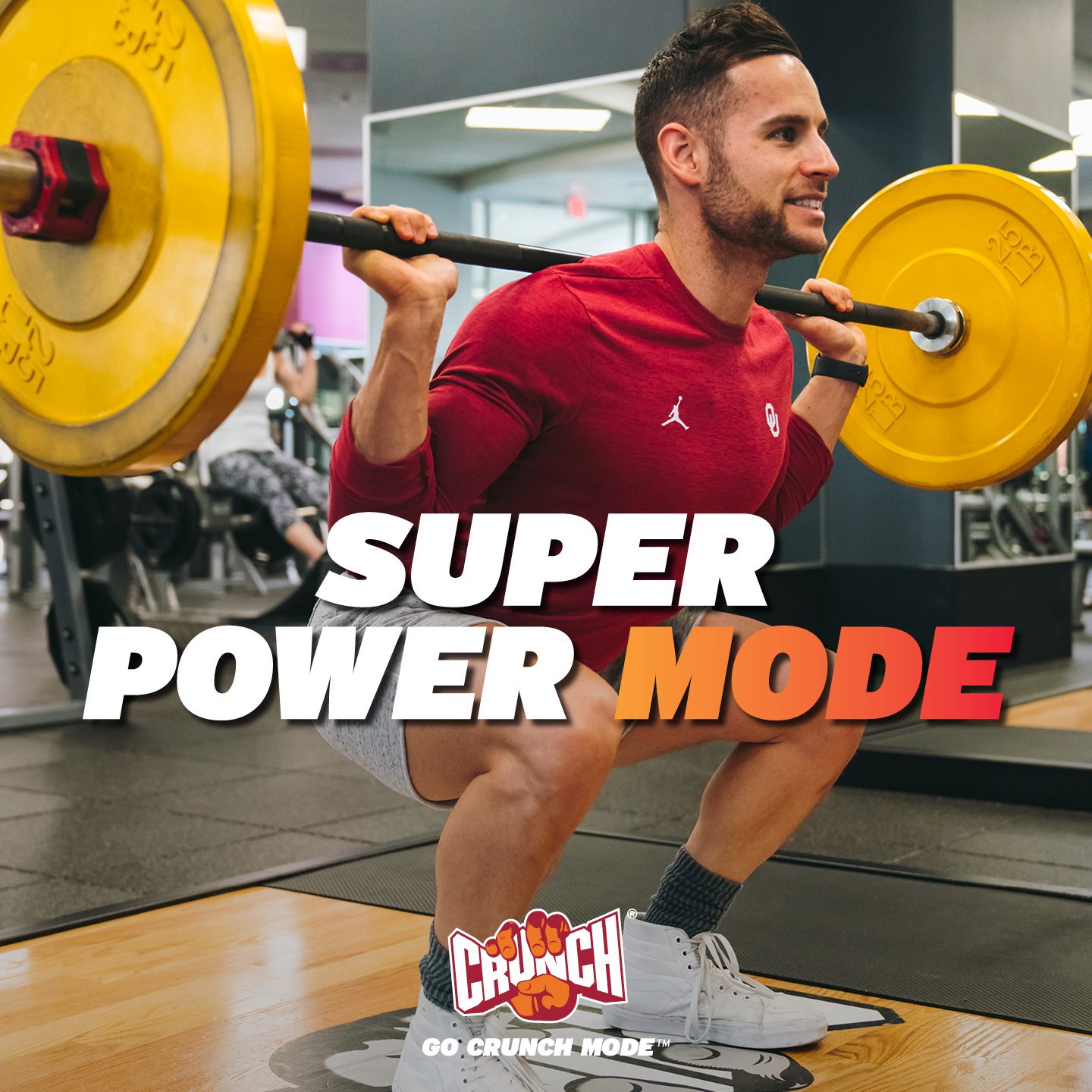
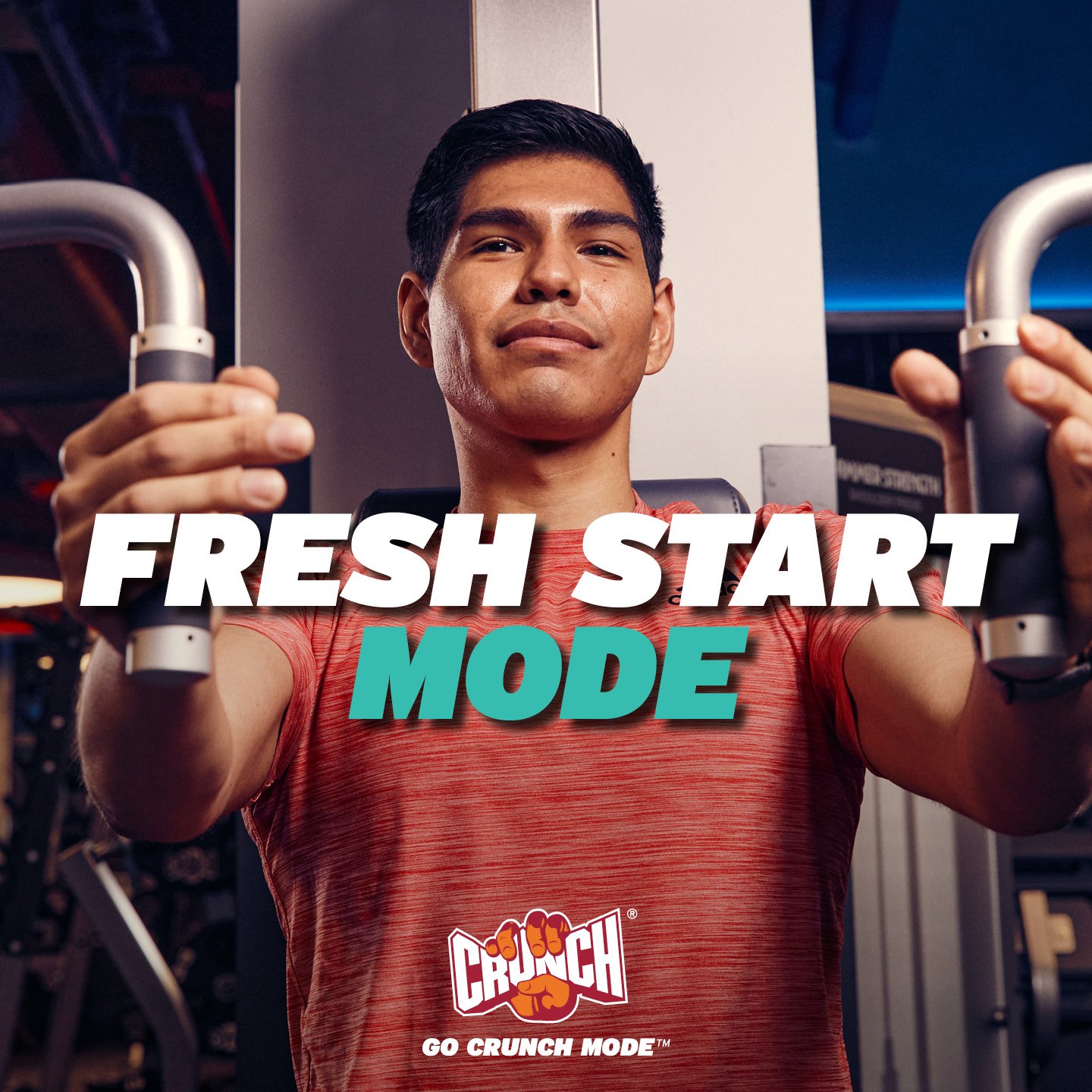
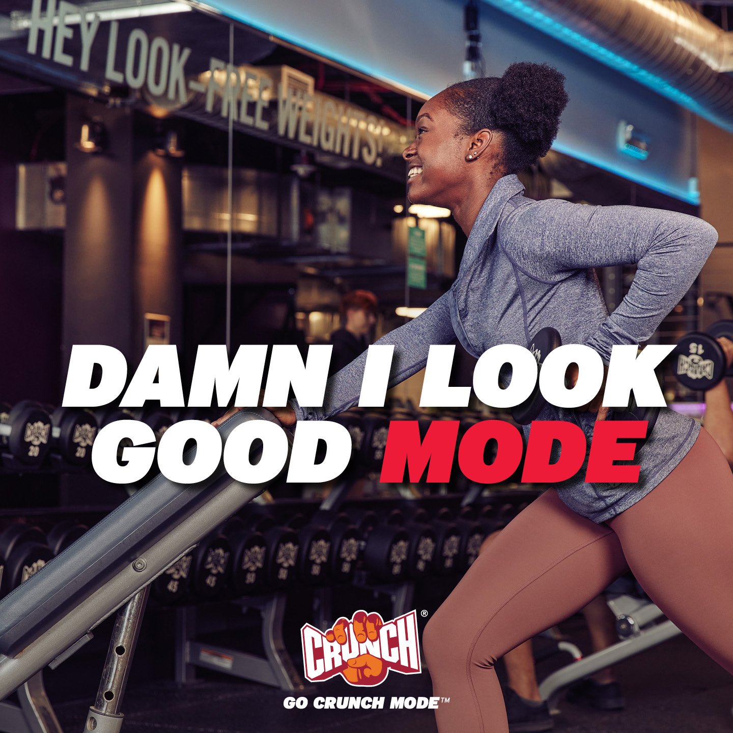
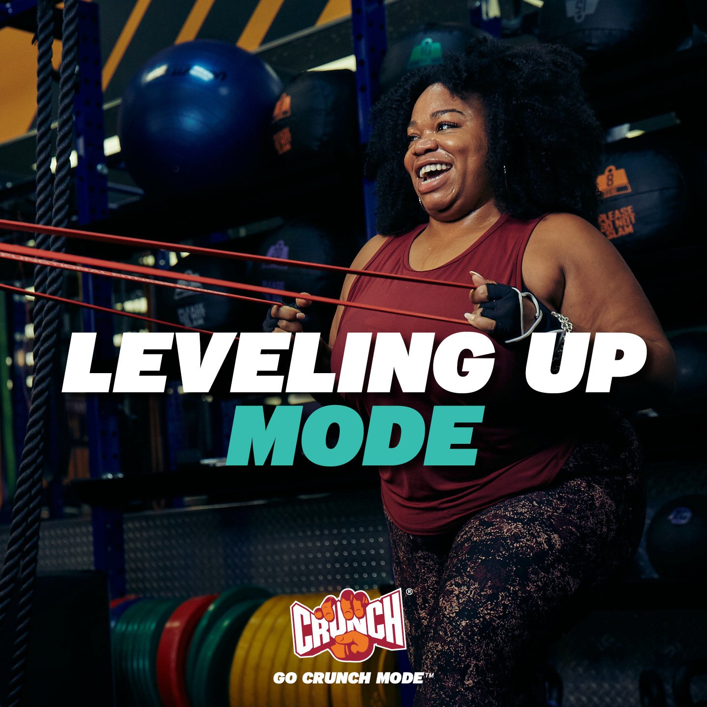
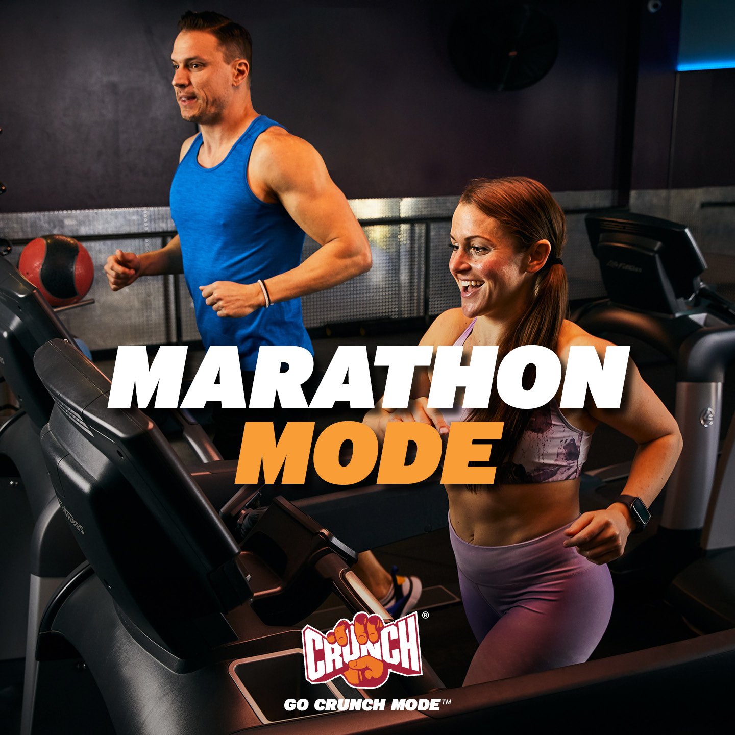
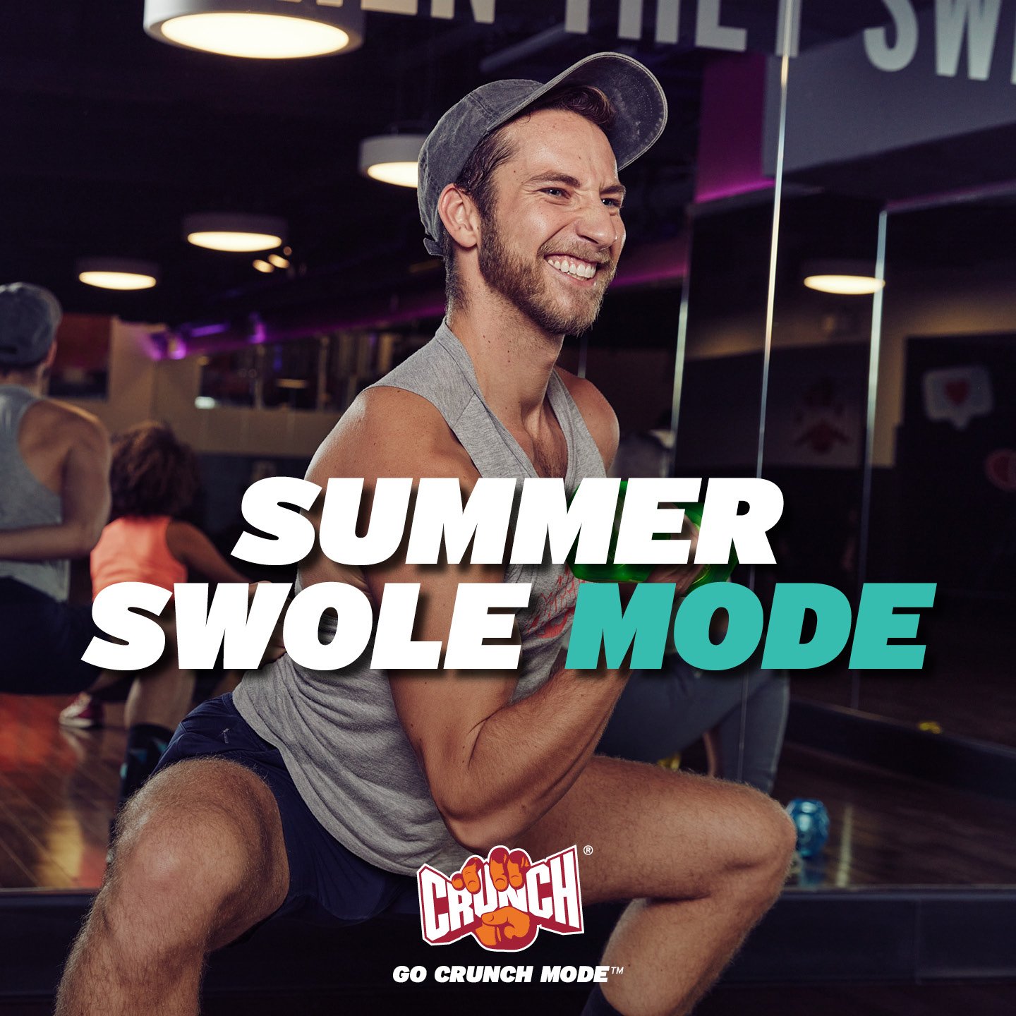
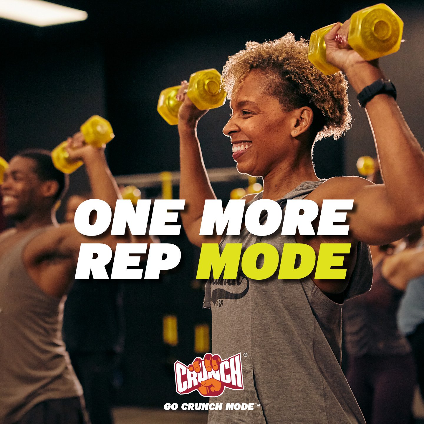
Go Crunch Mode (2022)
Campaign Evolution & Timeline
Established a bold, high-energy campaign voice centered on oversized typography, vibrant color accents, and optimistic lifestyle photography. While the campaign successfully re-engaged members post-pandemic, the expressive color palette and varied messaging formats limited scalability and consistency across franchise environments.
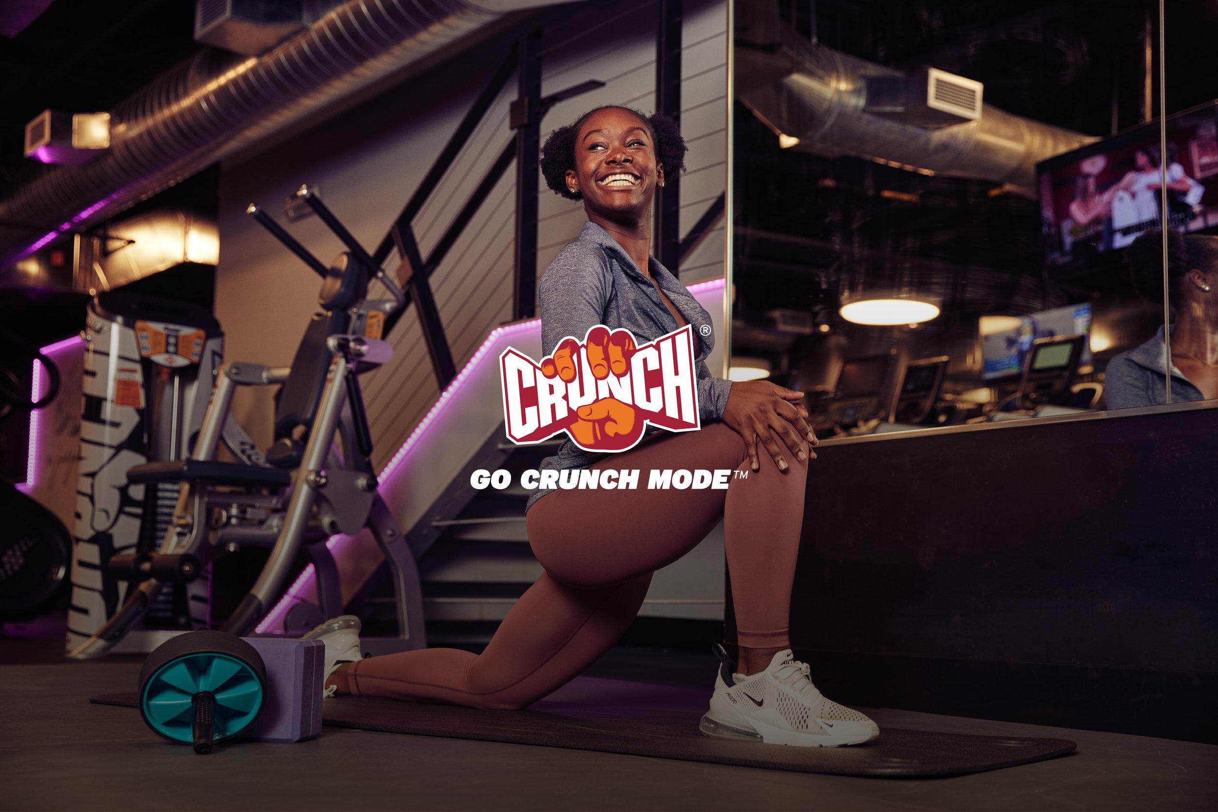
Credits Art Director: Suze Myers; Photographer: Coty Tarr; Ad Agency: Familiar Creatures
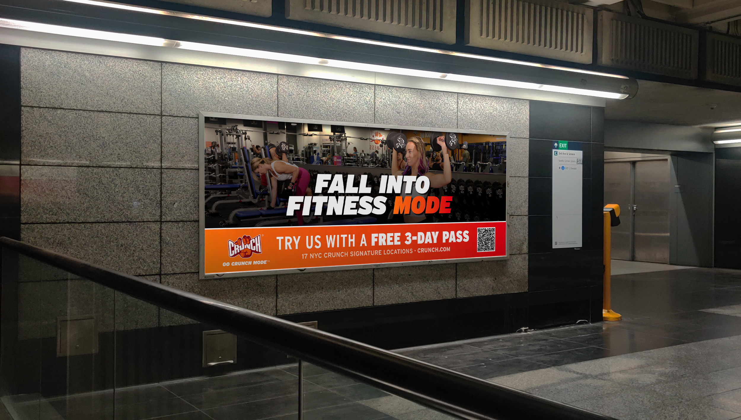
Billboard

Direct Mail

Sandwich Board
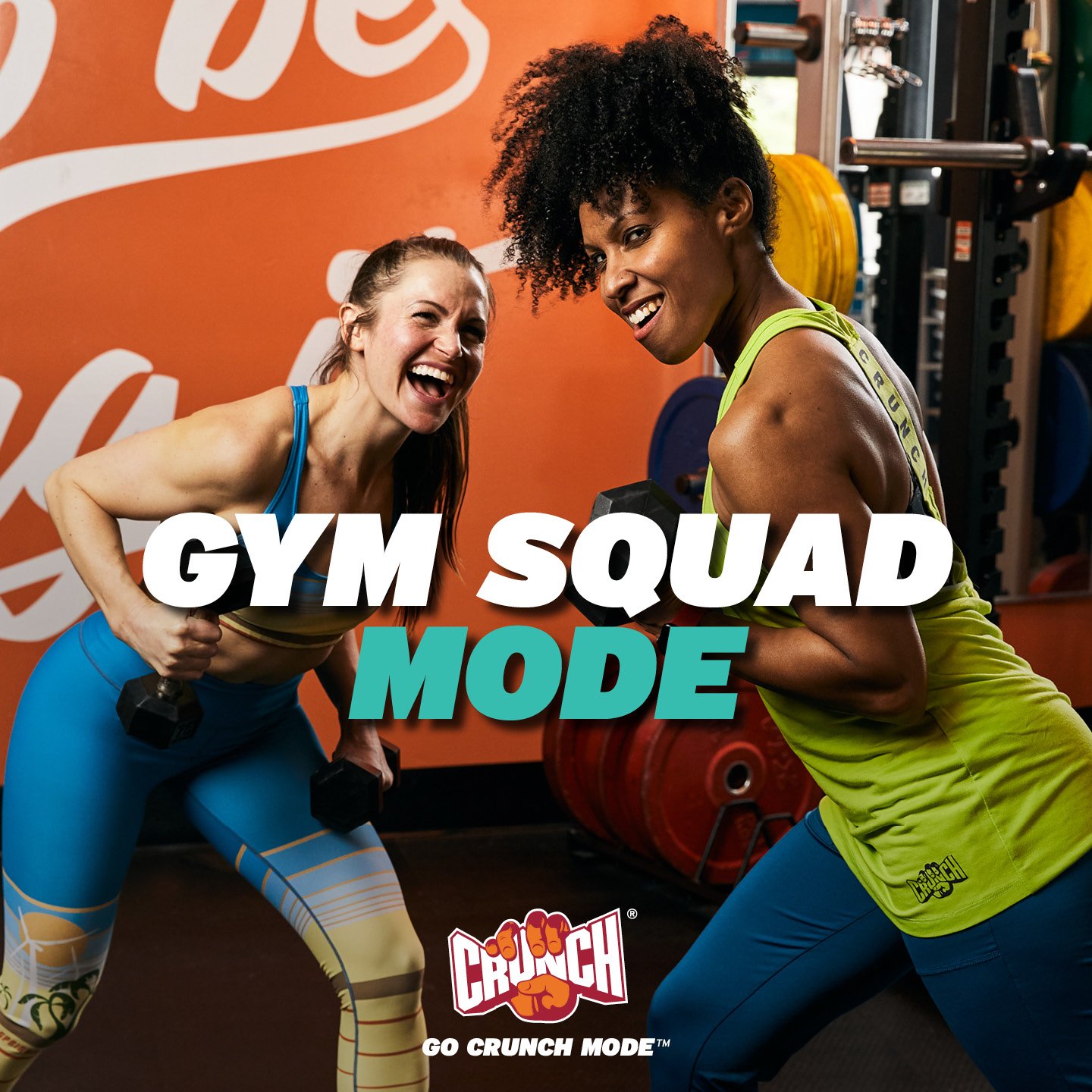

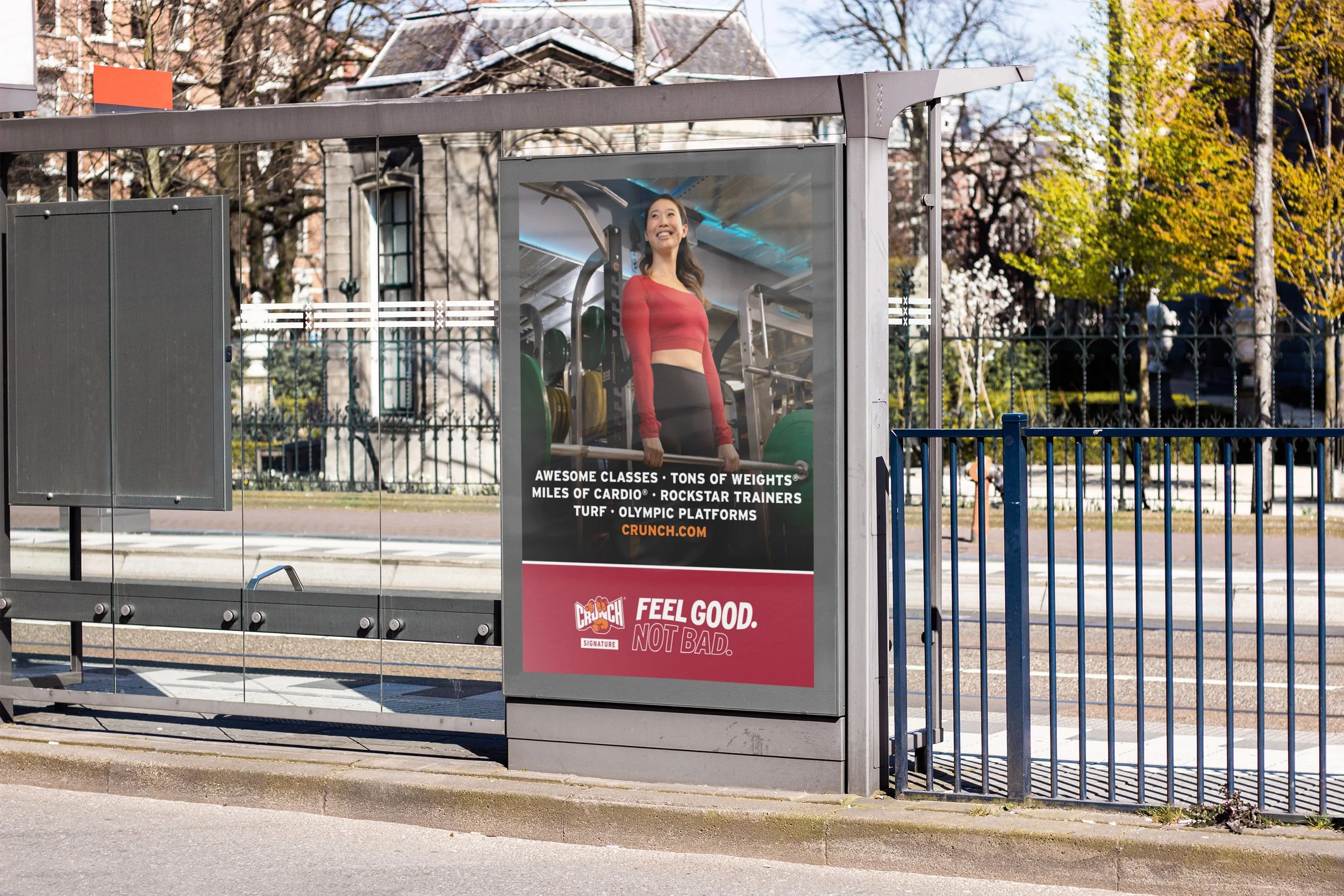
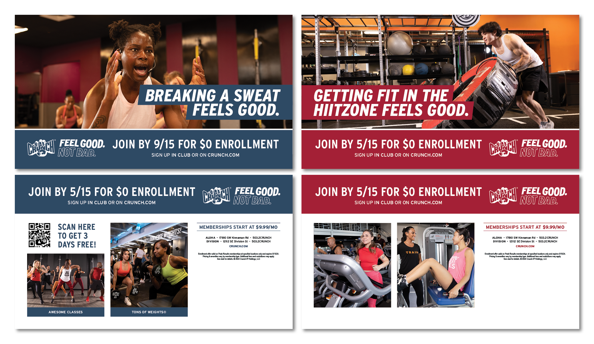
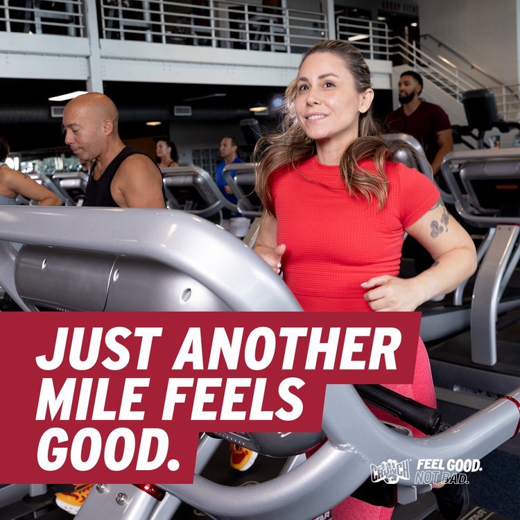
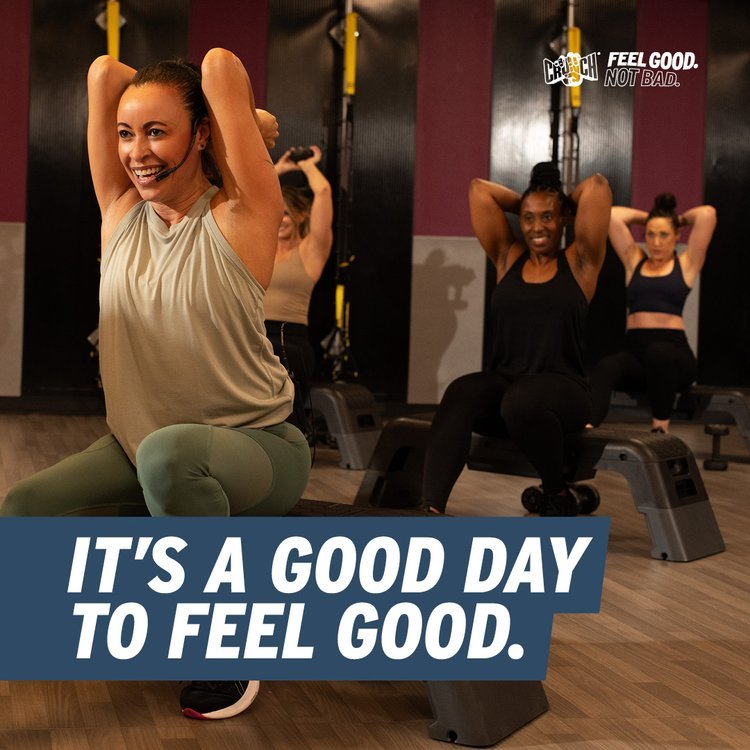
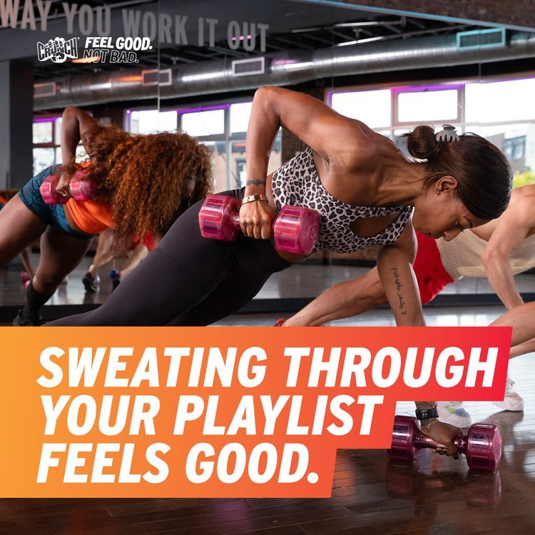
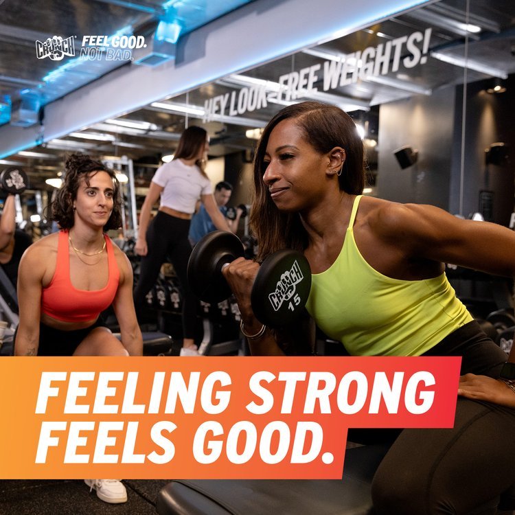
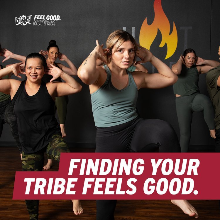
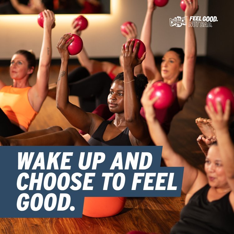
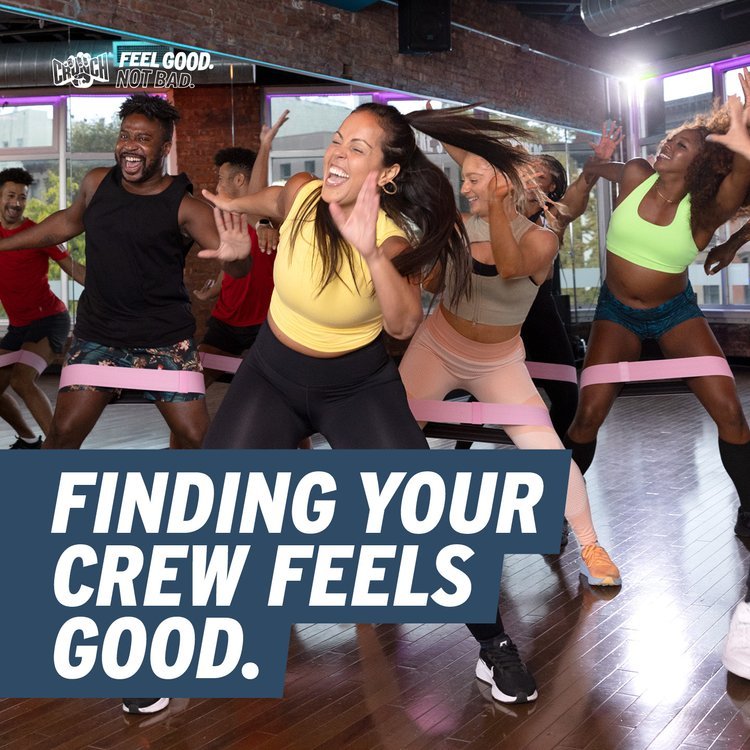
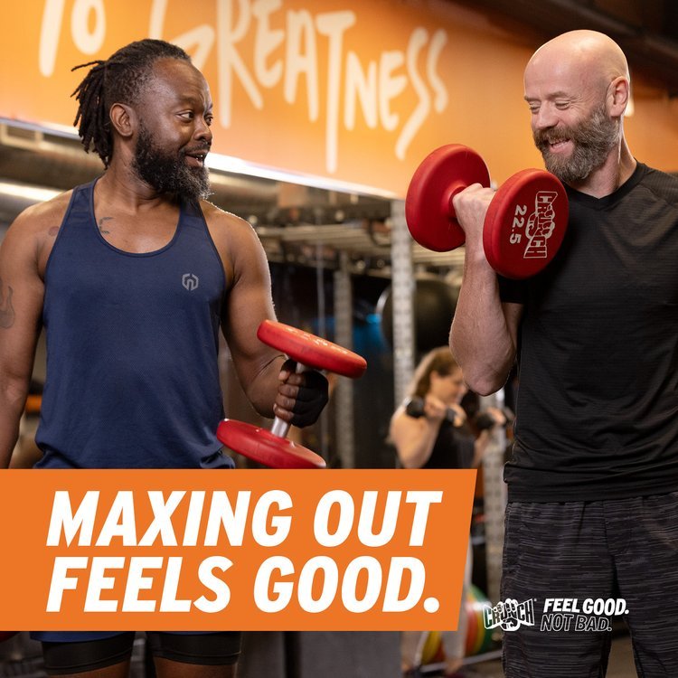
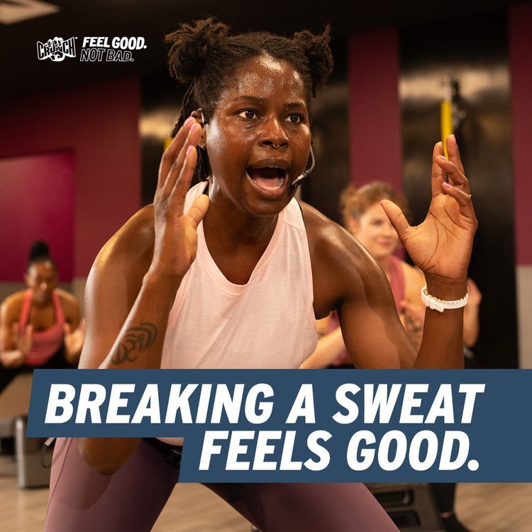
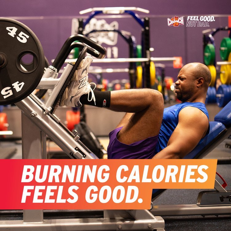
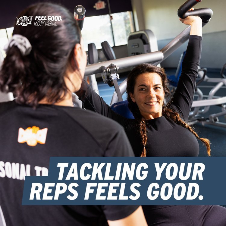
Feel Good (2024)
Campaign Evolution & Timeline
Introduced a more assertive typographic system and simplified color palette rooted in Crunch’s core brand colors, alongside photography that emphasized in-gym energy and movement. Bold color-blocked headers improved message visibility but created layout rigidity, making the campaign more difficult to scale consistently across diverse franchise formats.
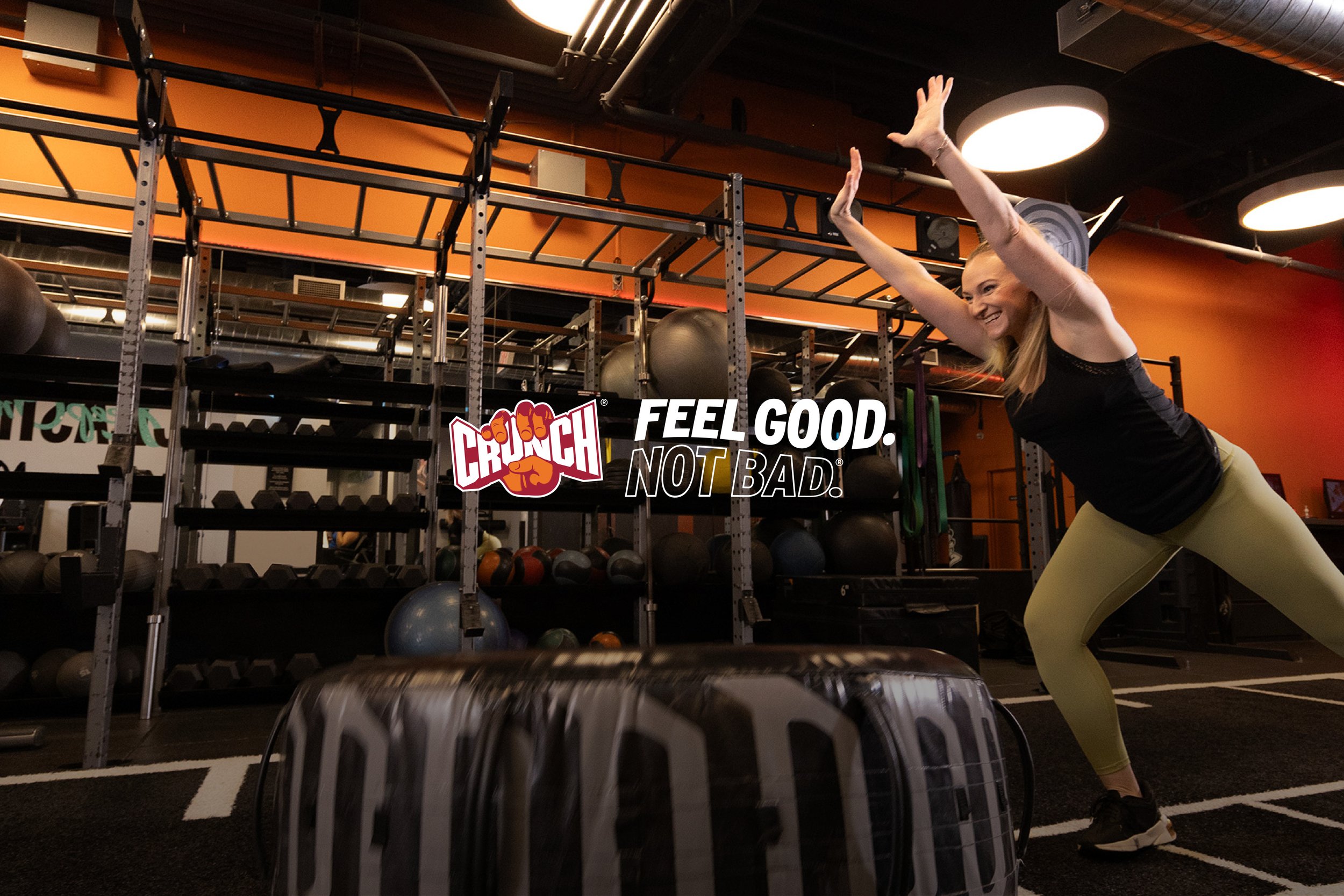
Credits Creative Direction: Luis Vega; Photography: Murphy Made; Ad Agency: Familiar Creatures
OOH
Direct Mail

Billboard

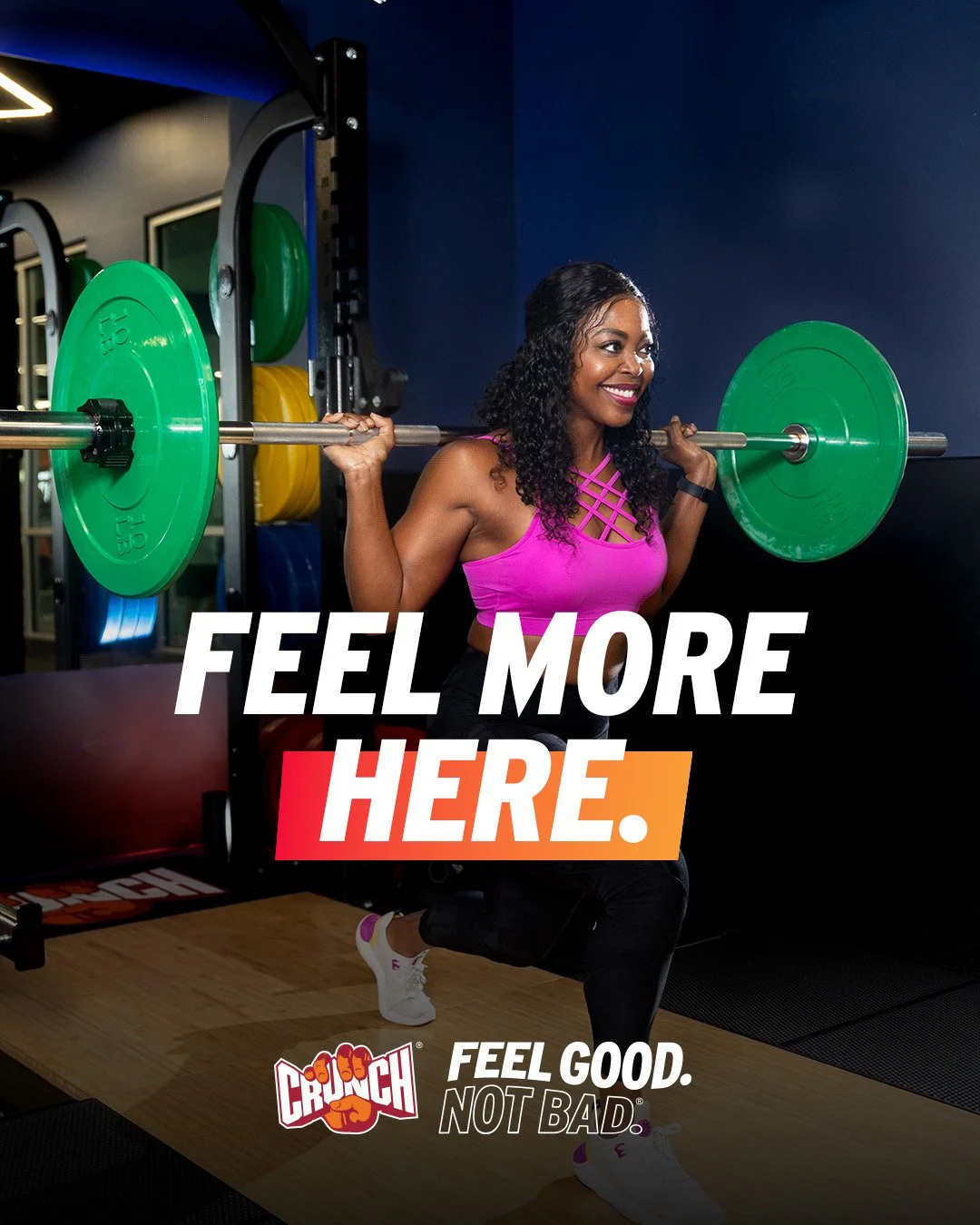
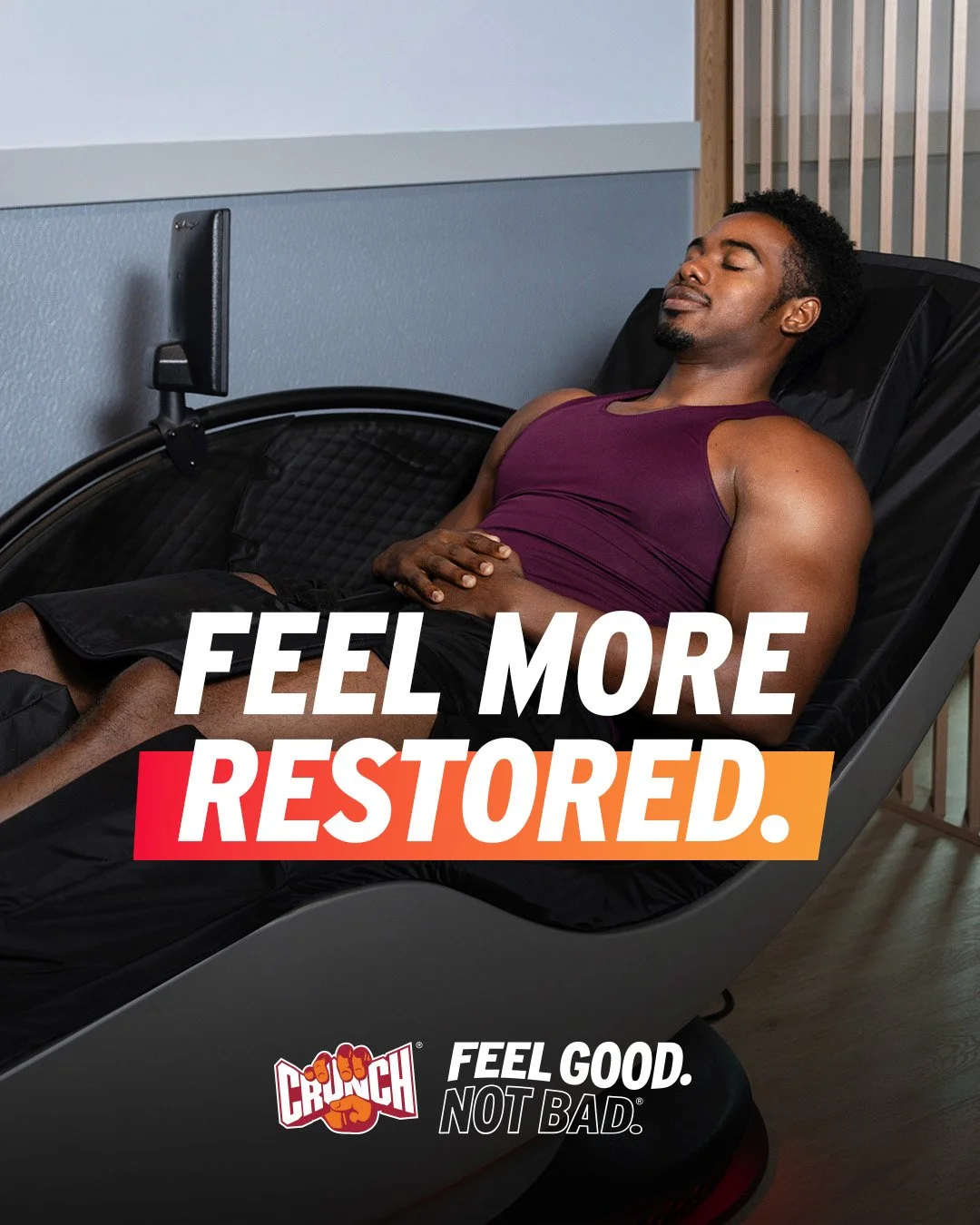
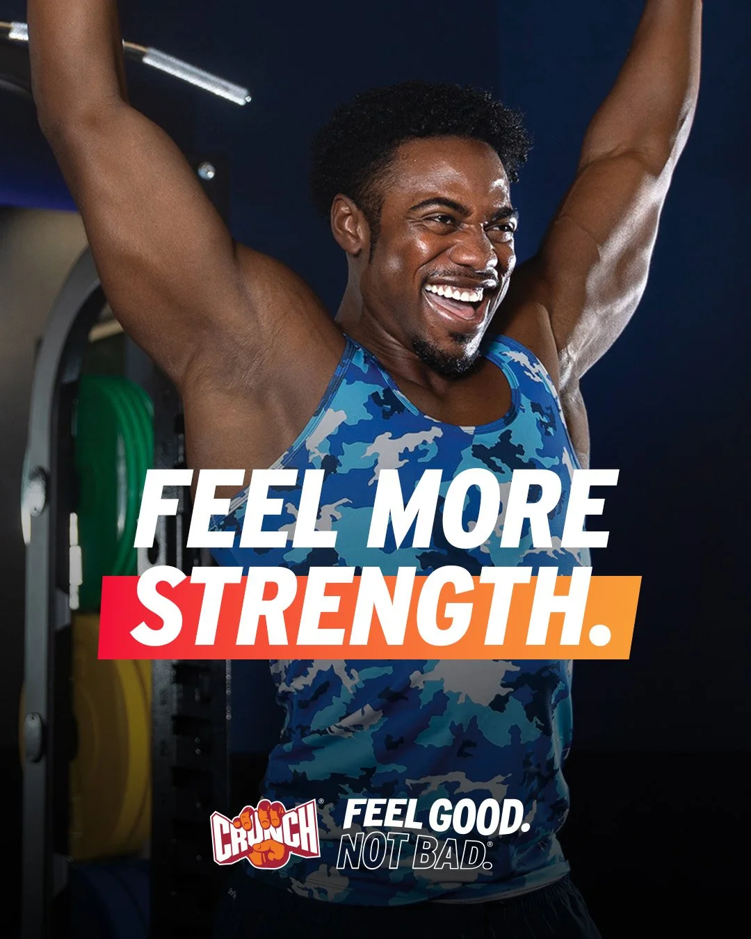
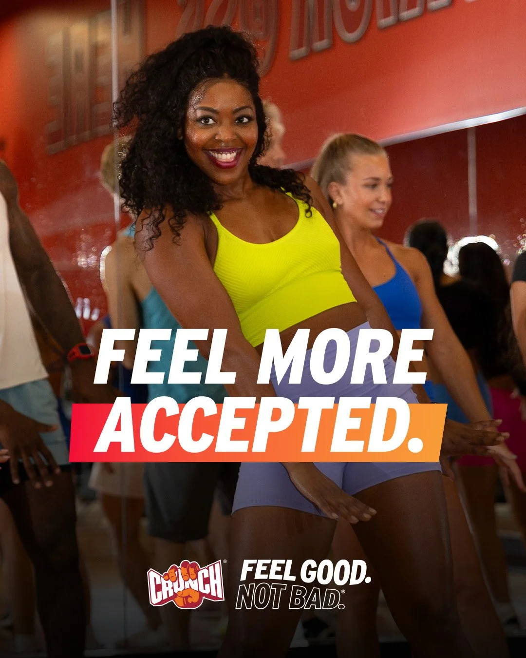
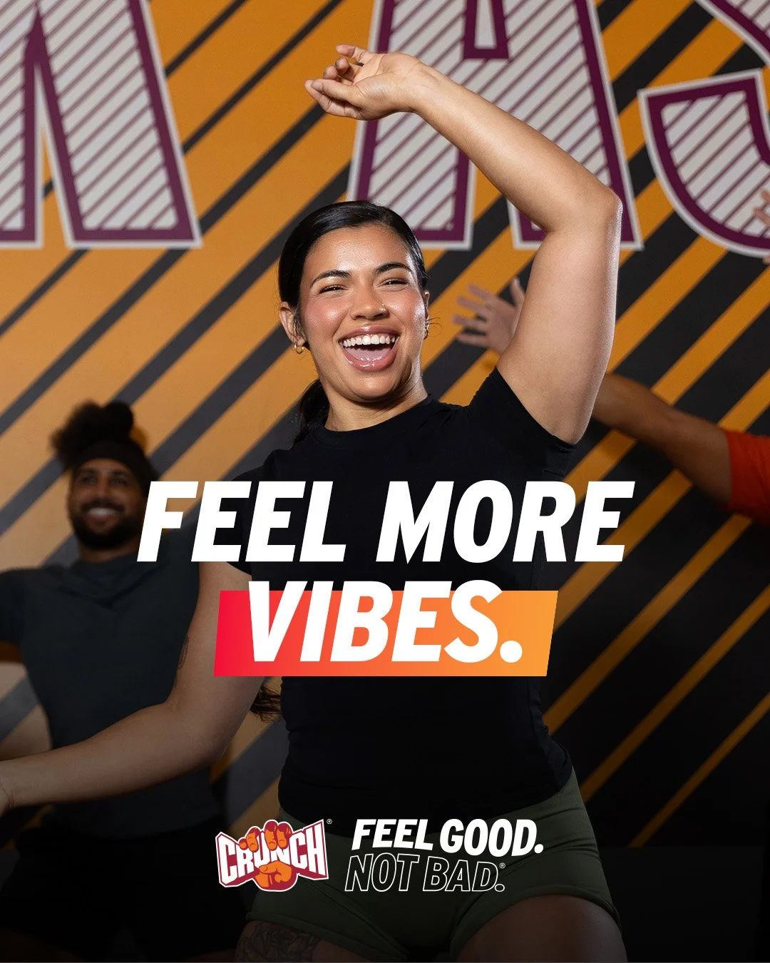
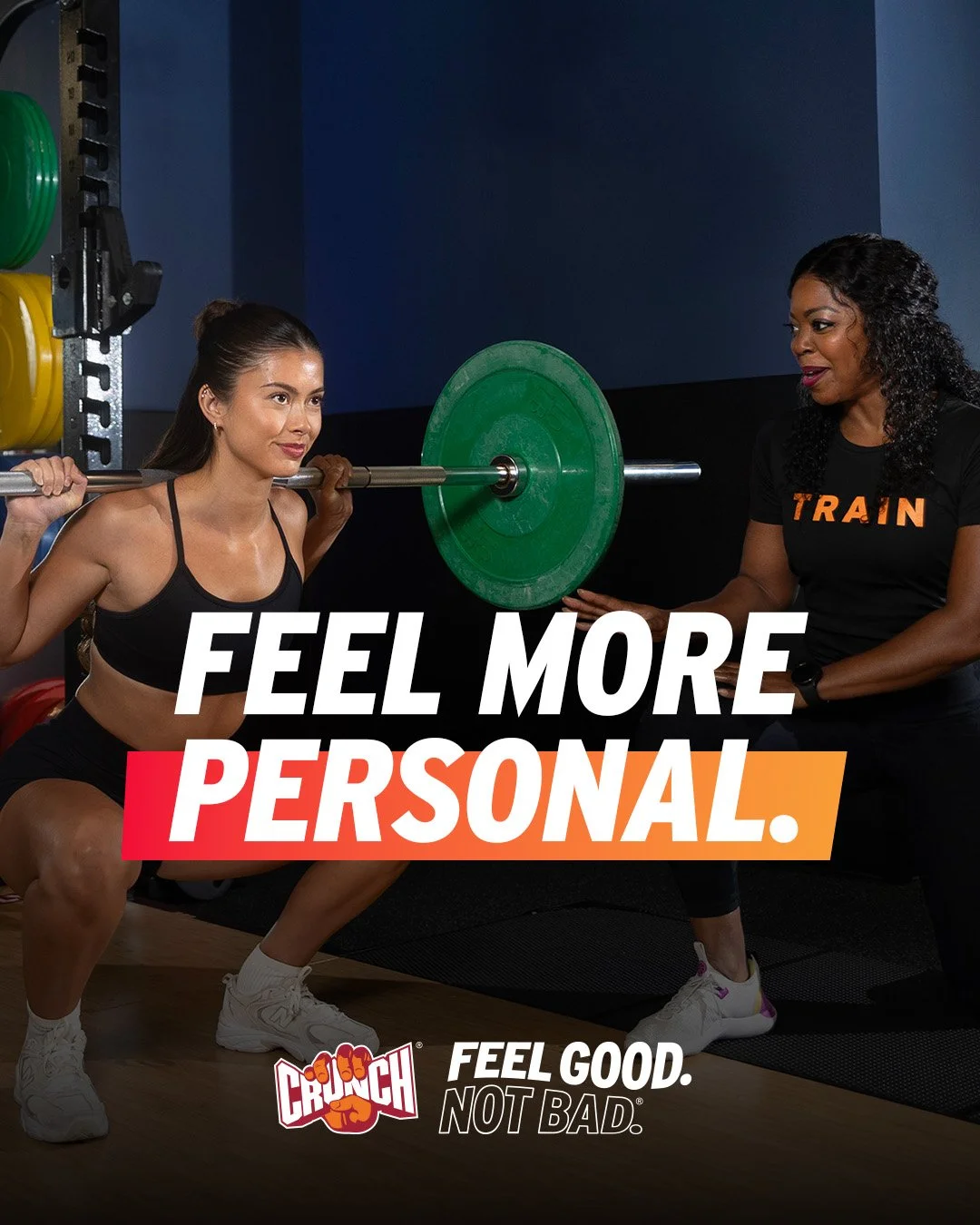
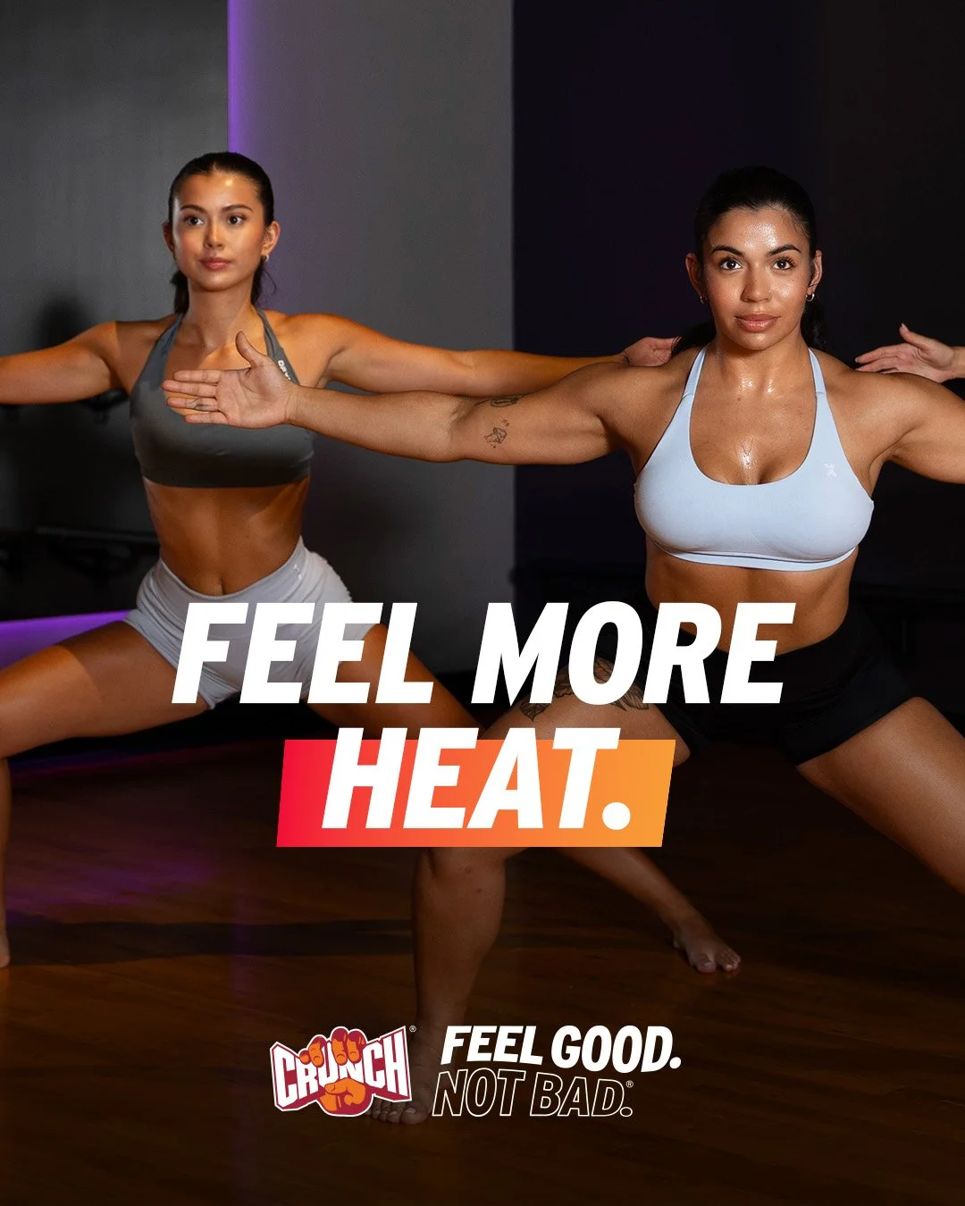
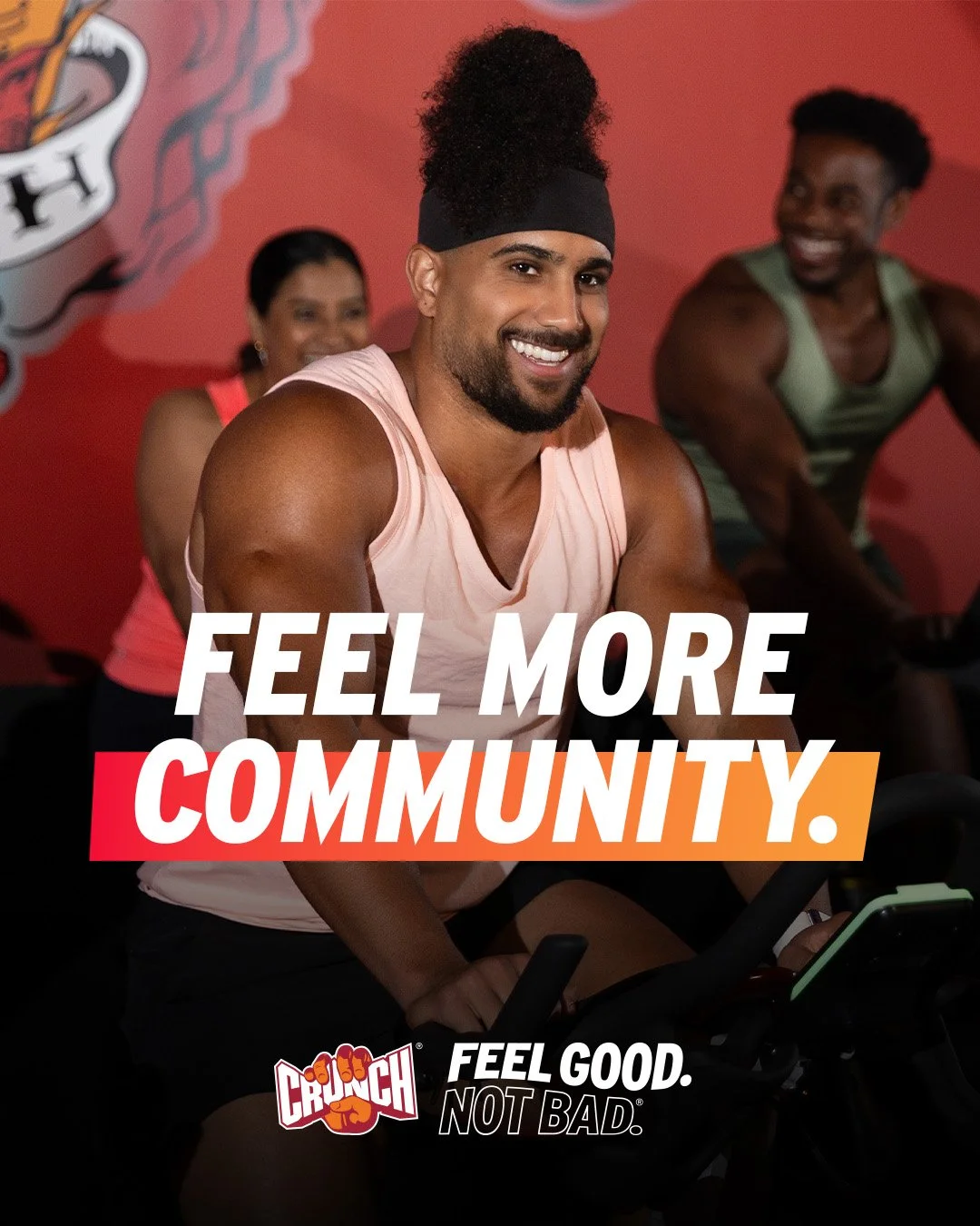
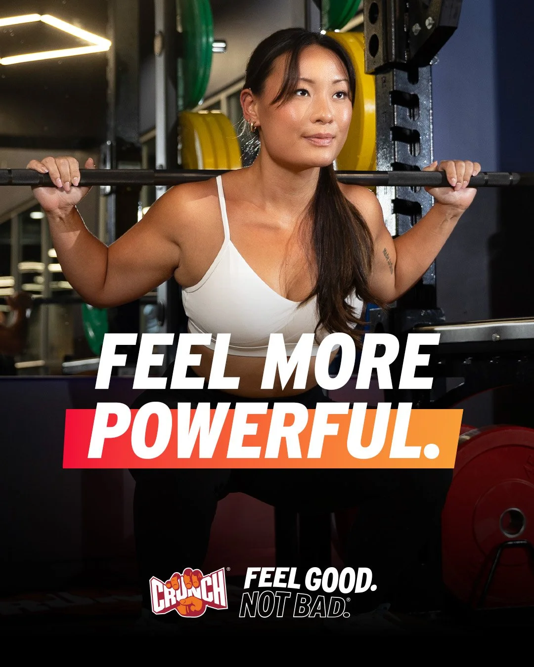
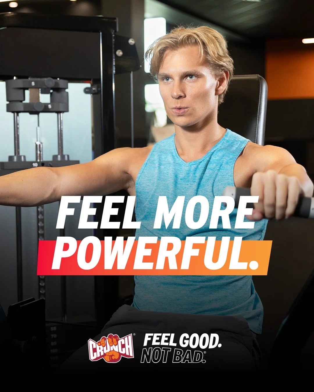
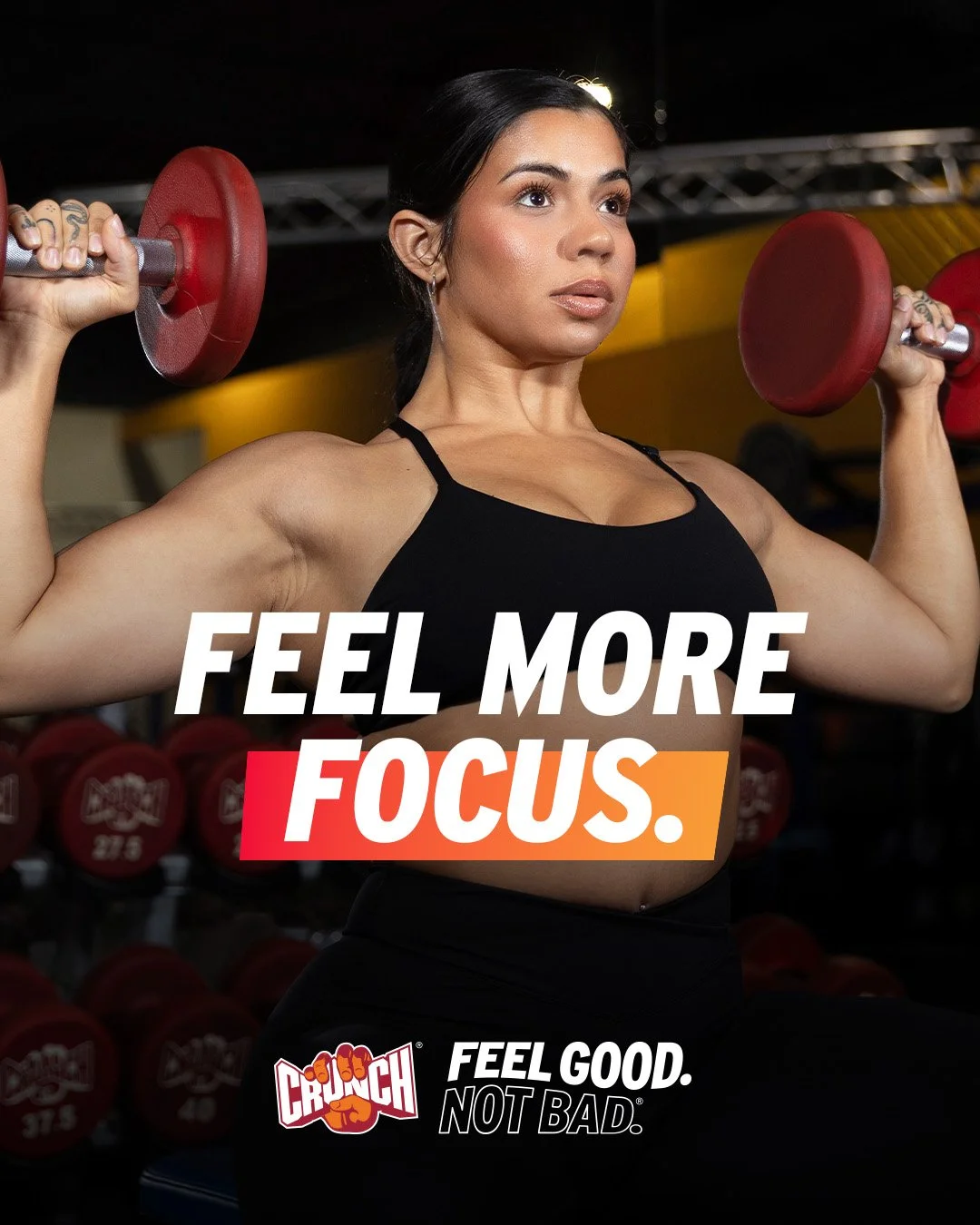
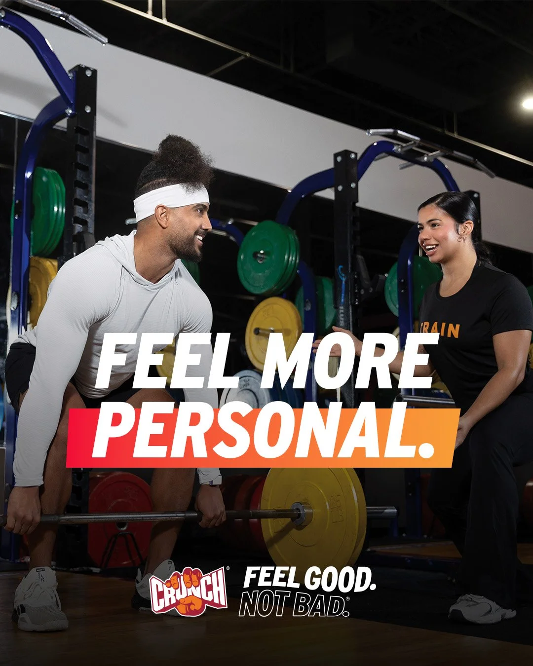
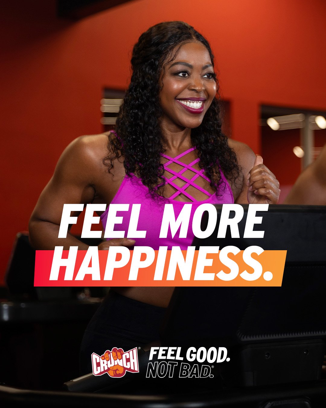
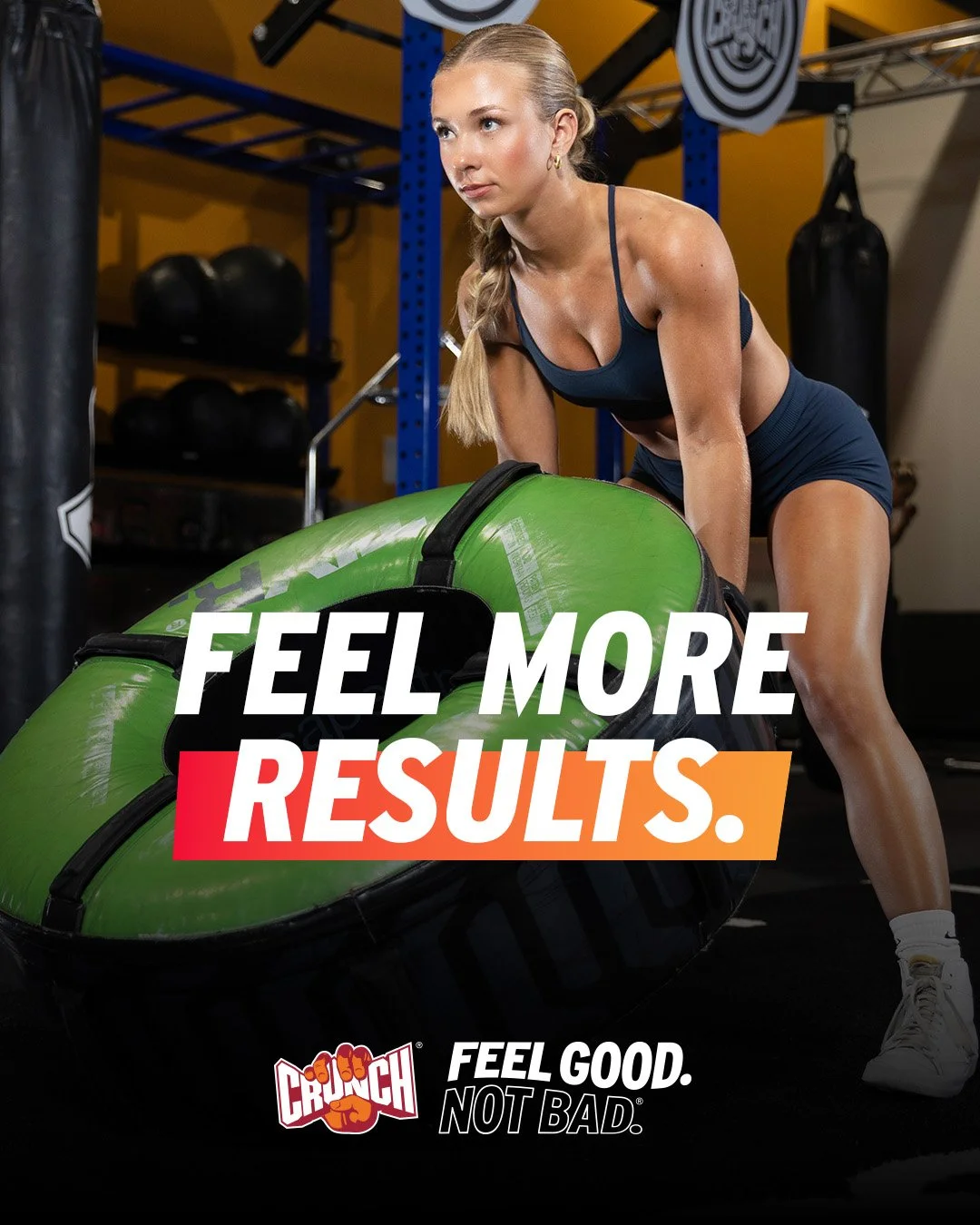
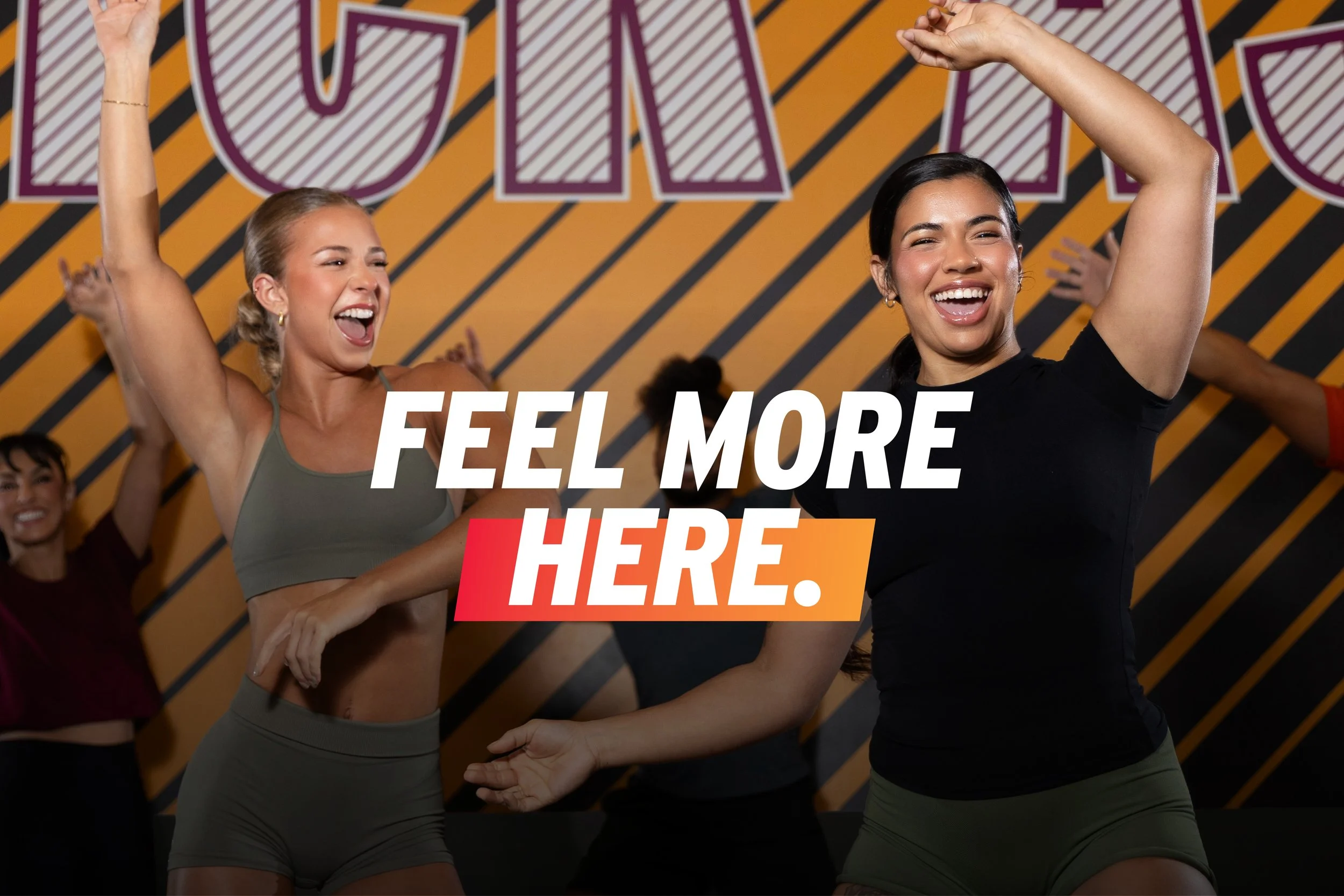
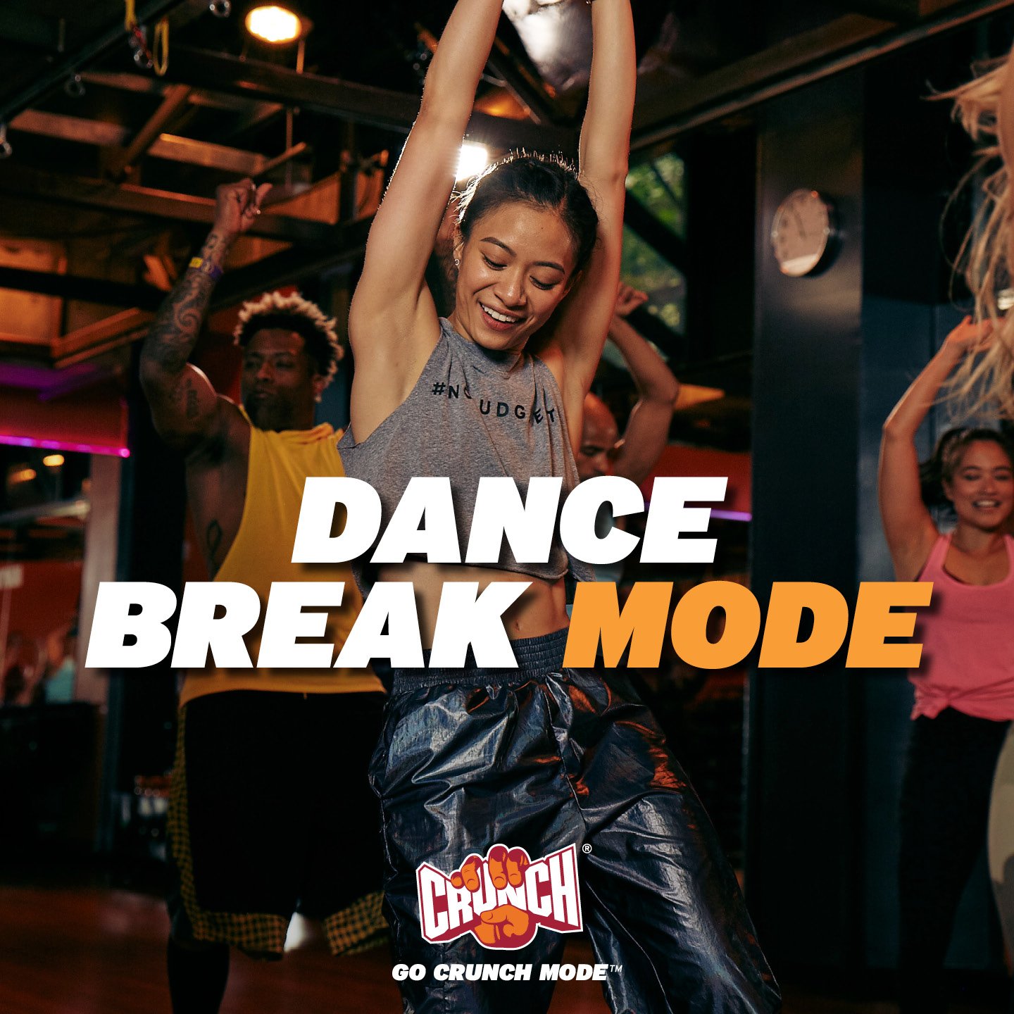
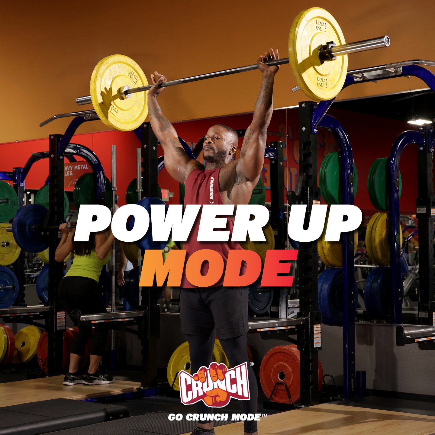
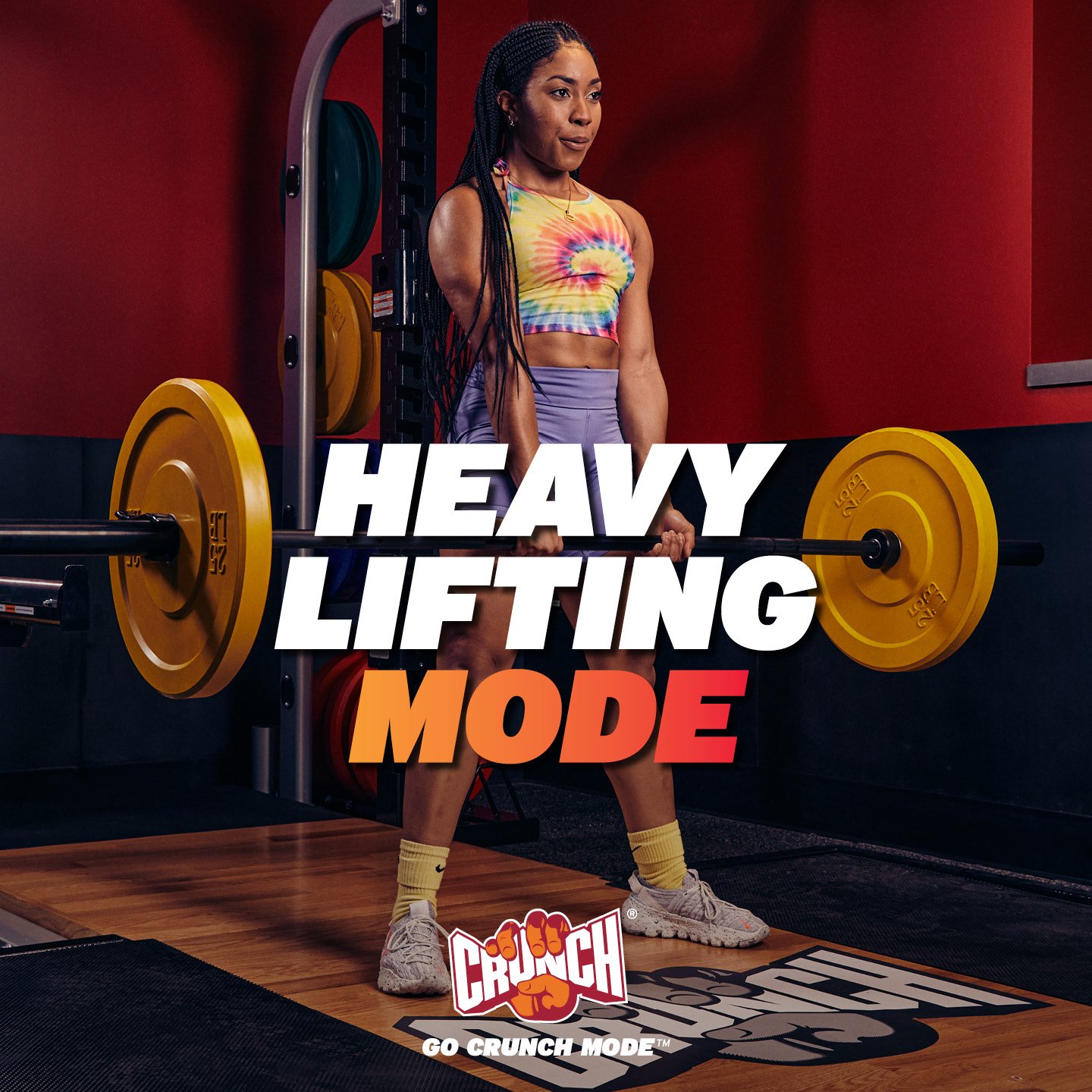
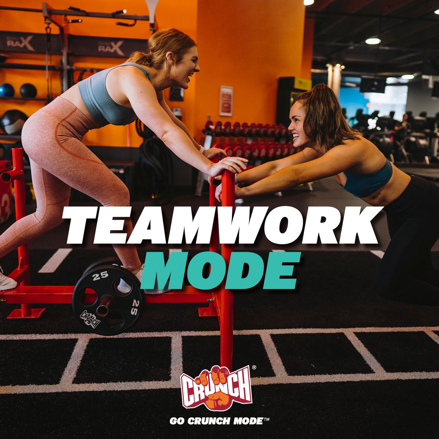
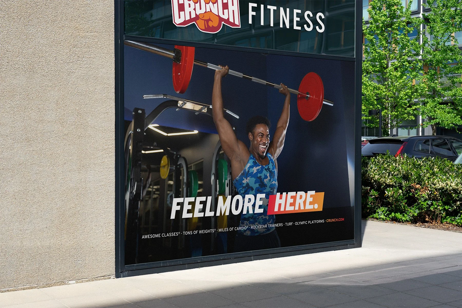
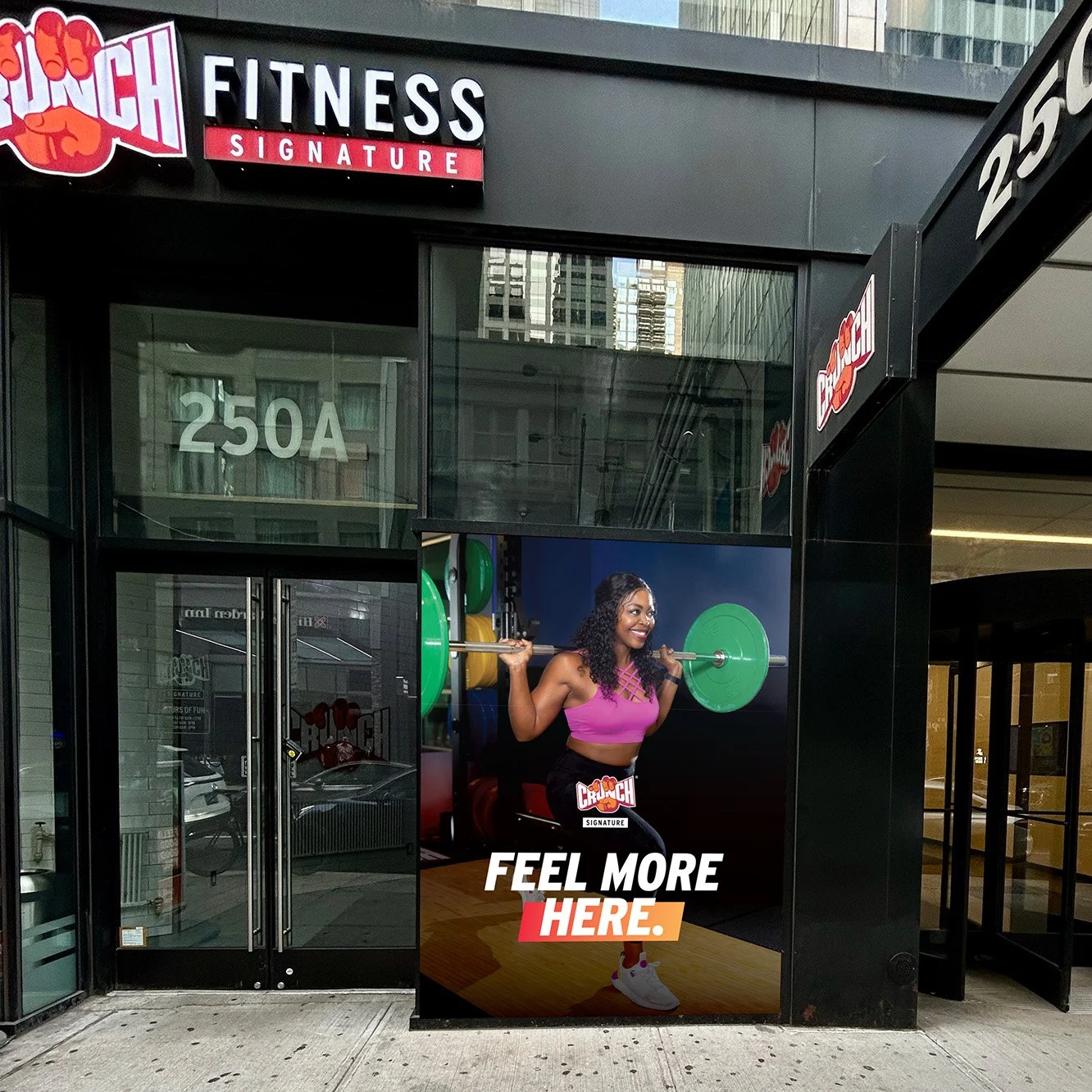
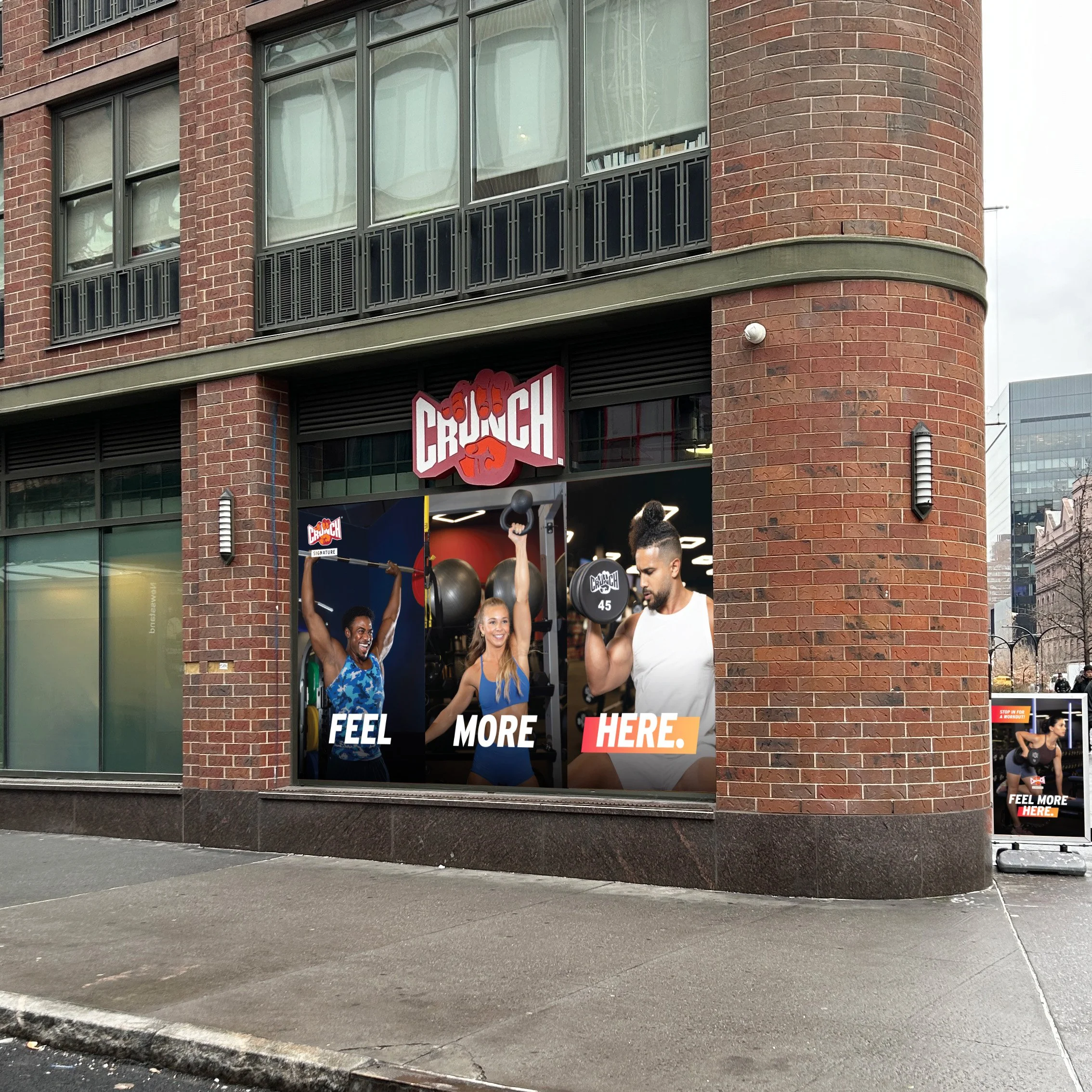
Feel More Here (2026)
Campaign Evolution & Timeline
Refined the campaign system with a cleaner, more scalable typographic treatment that maintained the color-block motif while simplifying its application across formats. Further reduced the color palette to emphasize Crunch’s most recognizable color, orange gradient, strengthening brand consistency and consumer recognition. Layouts were tightened to prioritize imagery and clarity, supported by a more expressive photography direction focused on close-up moments of effort, joy, and intensity.
Credits Creative Direction: Luis Vega; Photography: Catherine Hurt; Ad Agency: Familiar Creatures
OOH

Direct Mail
Window Graphics - Crunch 34th St., NY
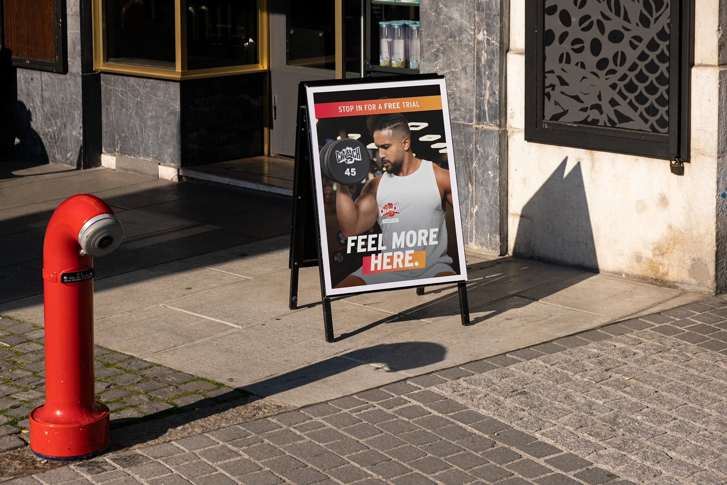
Sandwich Board
Window Graphics - Crunch Bowery, NY
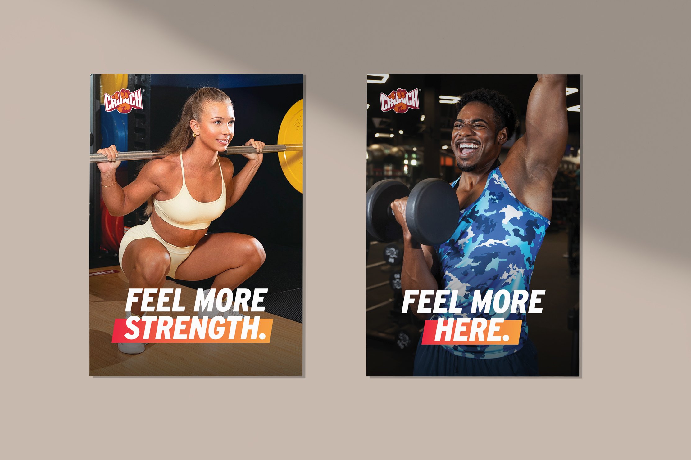
Posters