Title
The Good Grocer
Developed as part of House of Gai’s AI Branding Masterclass, this project explores how AI tools such as Weavy, Nano Banana, MidJourney, and ChatGPT can enhance creative iteration and strategic refinement within a designer-led process.
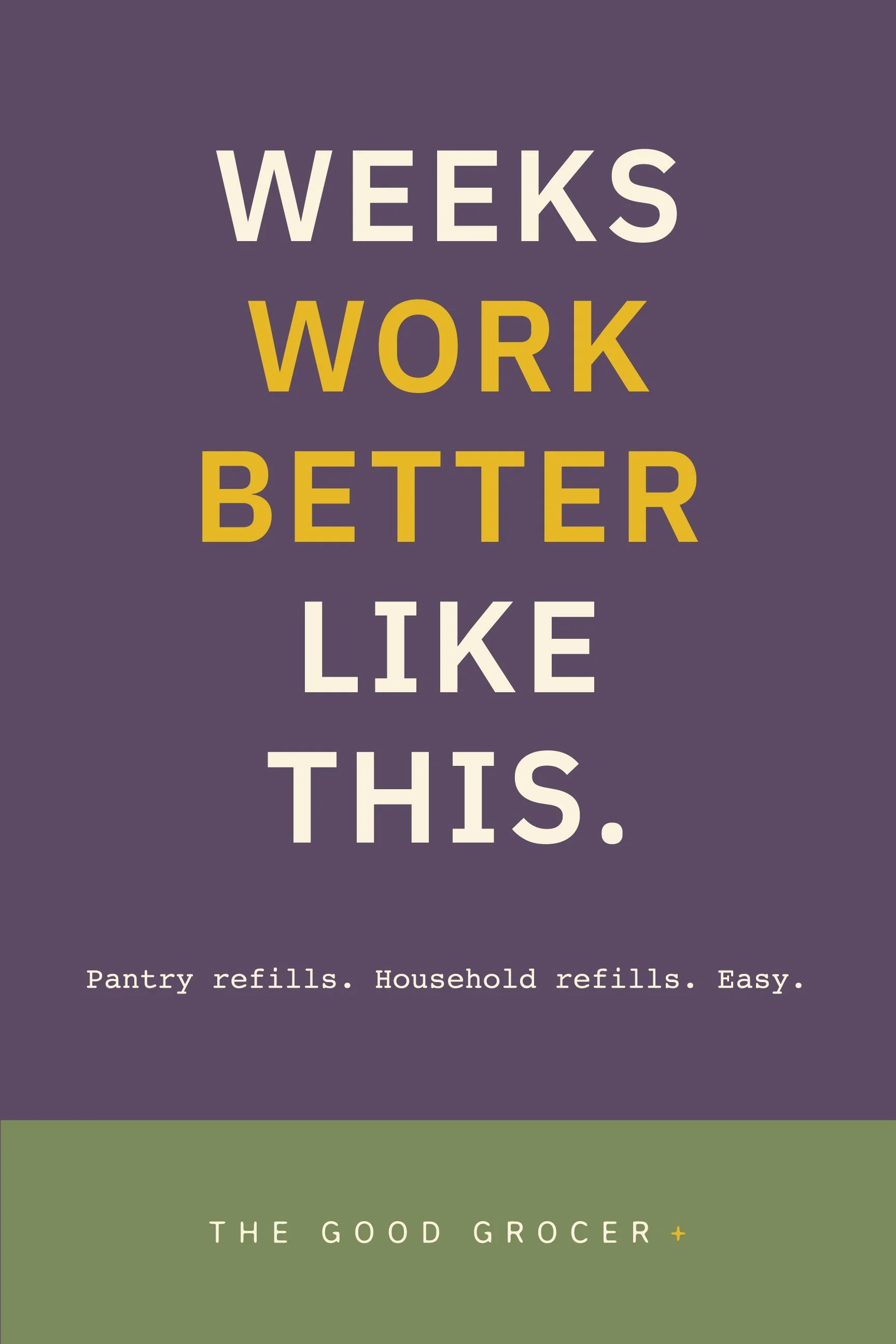
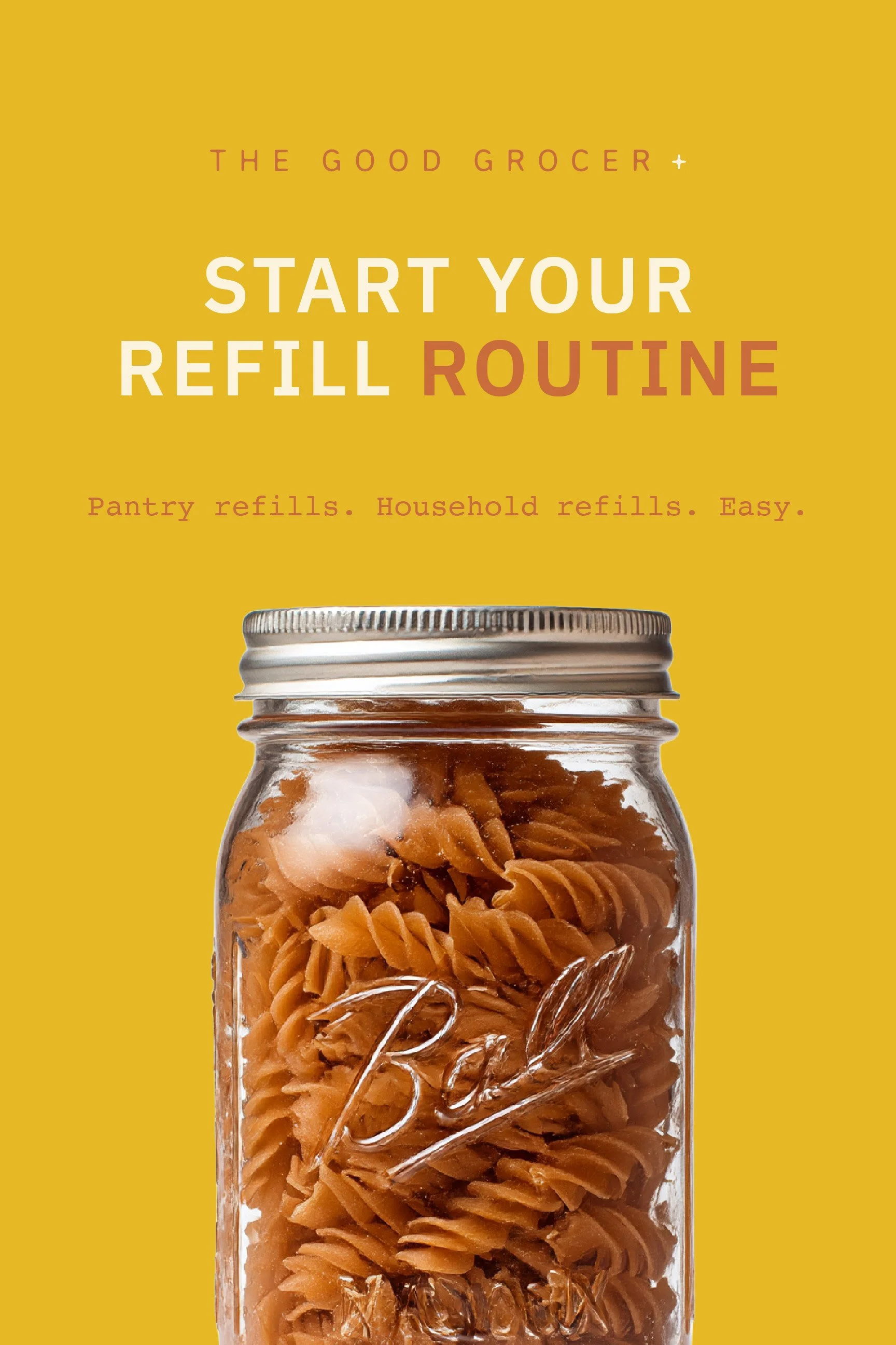
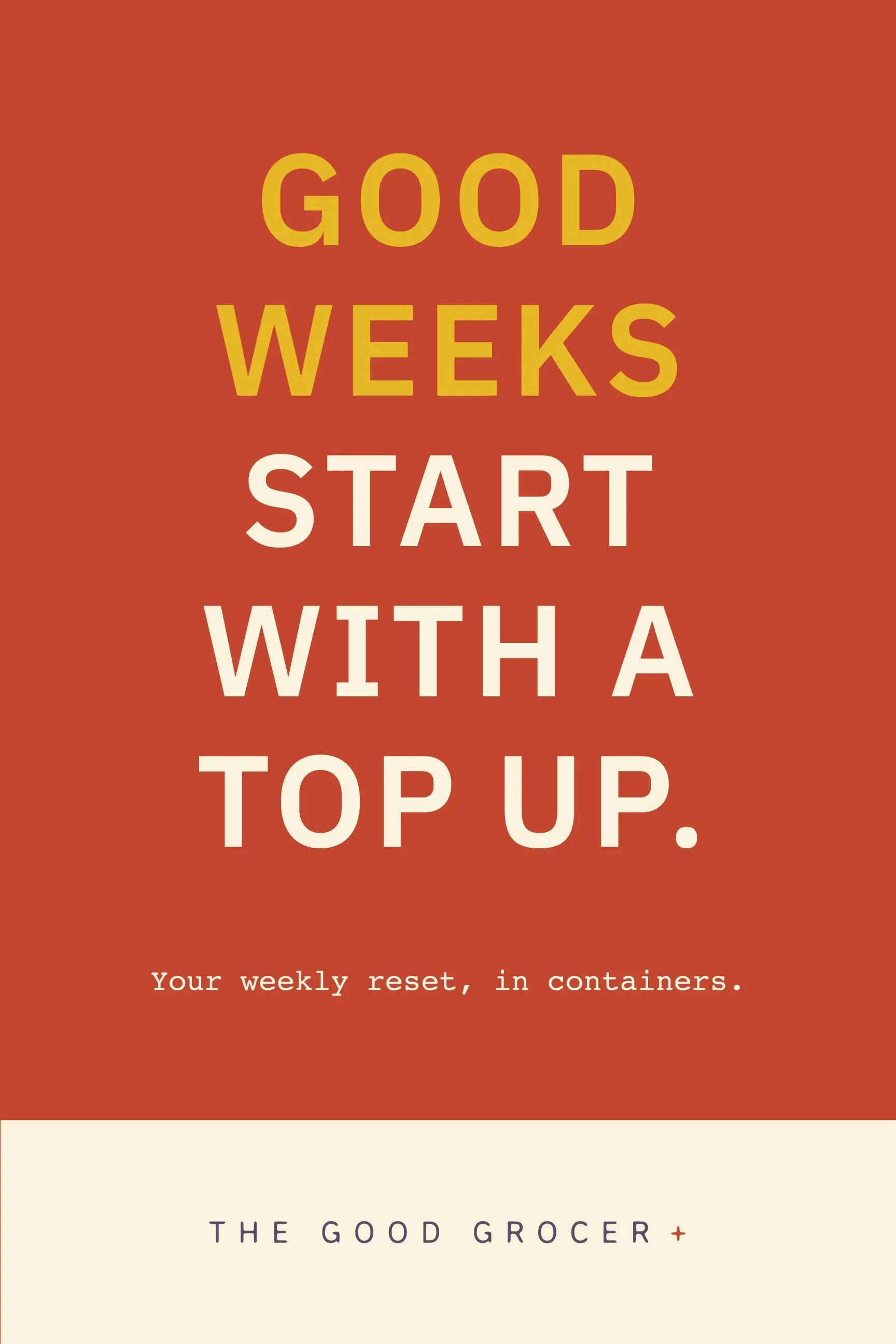
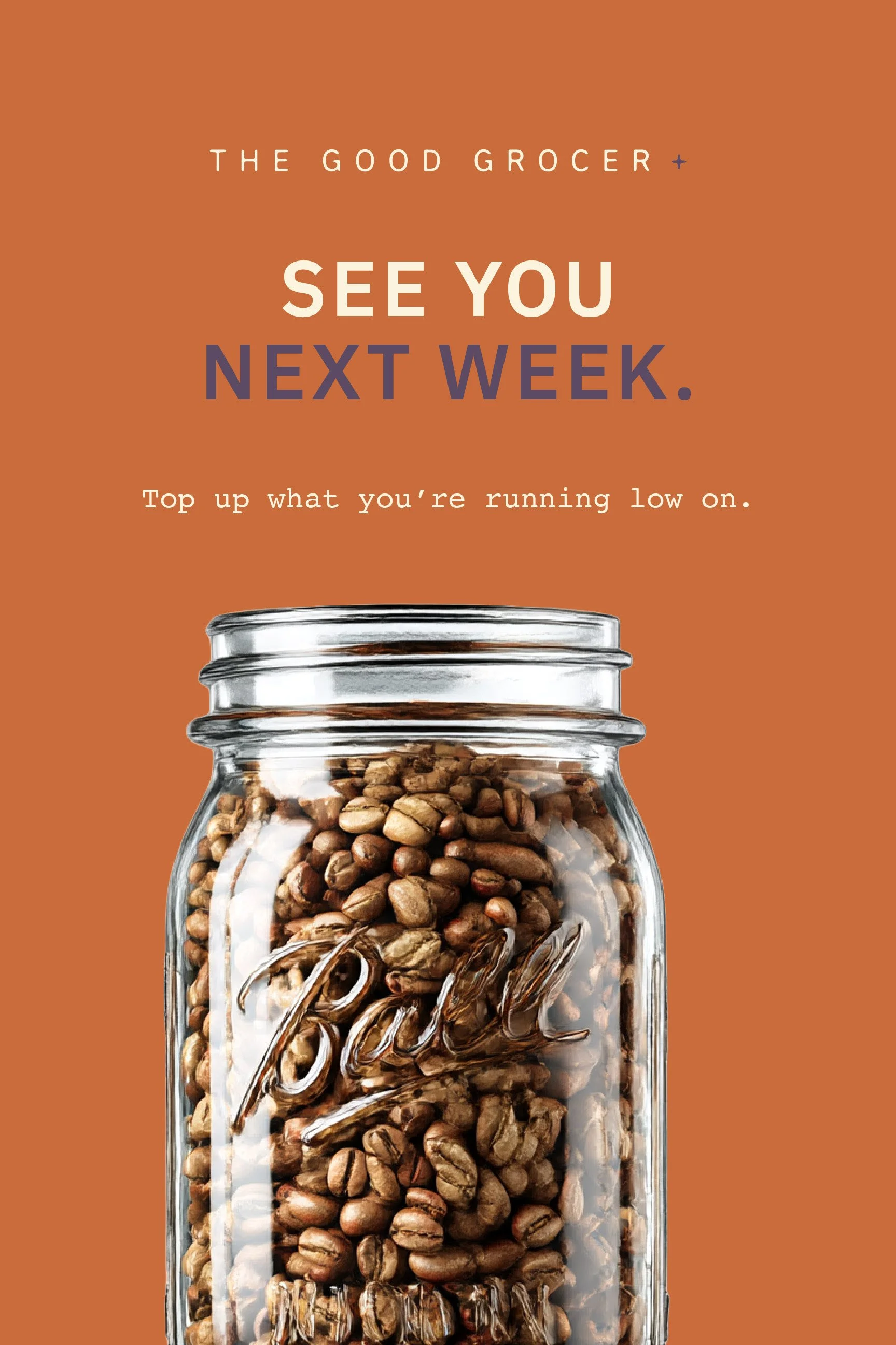
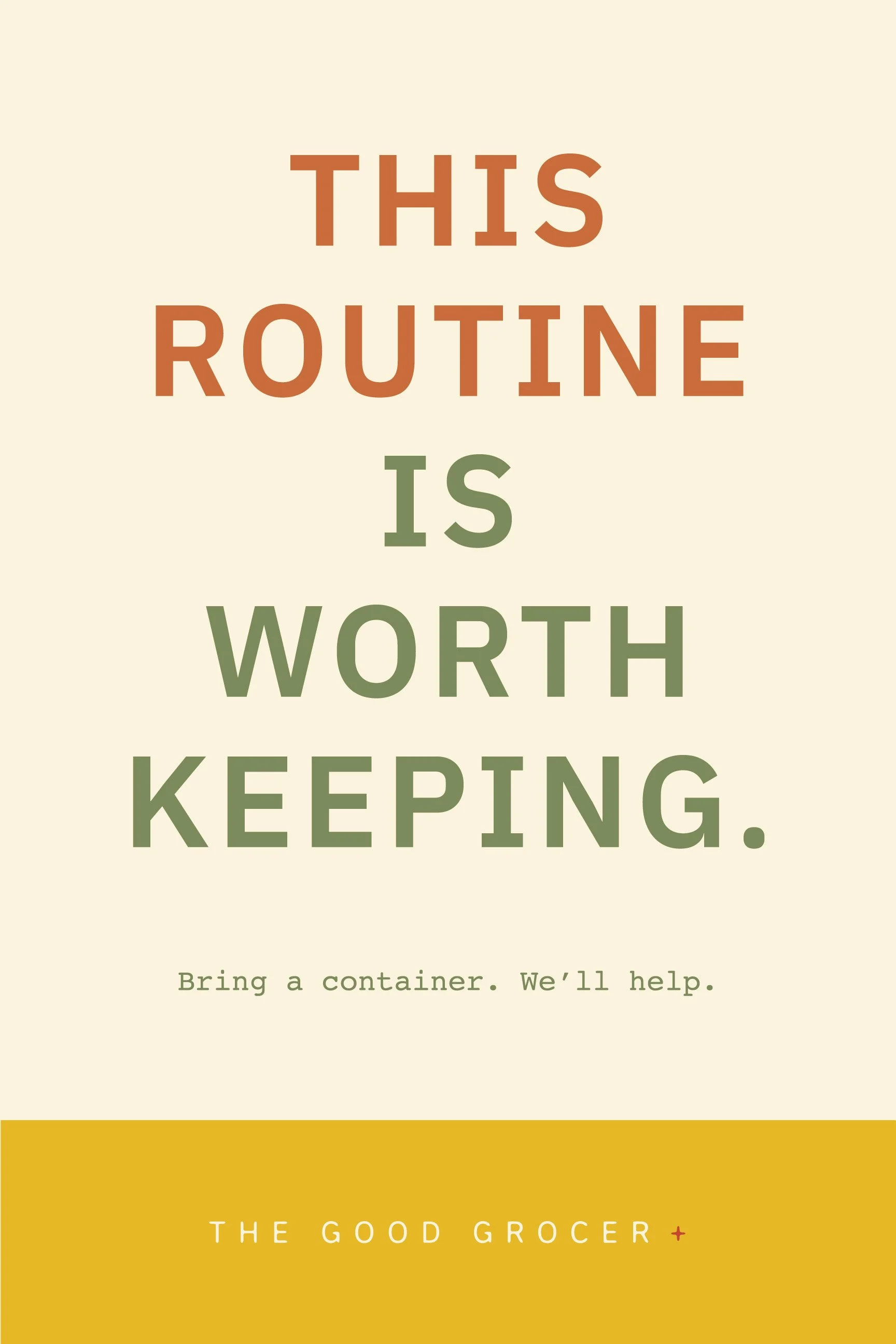
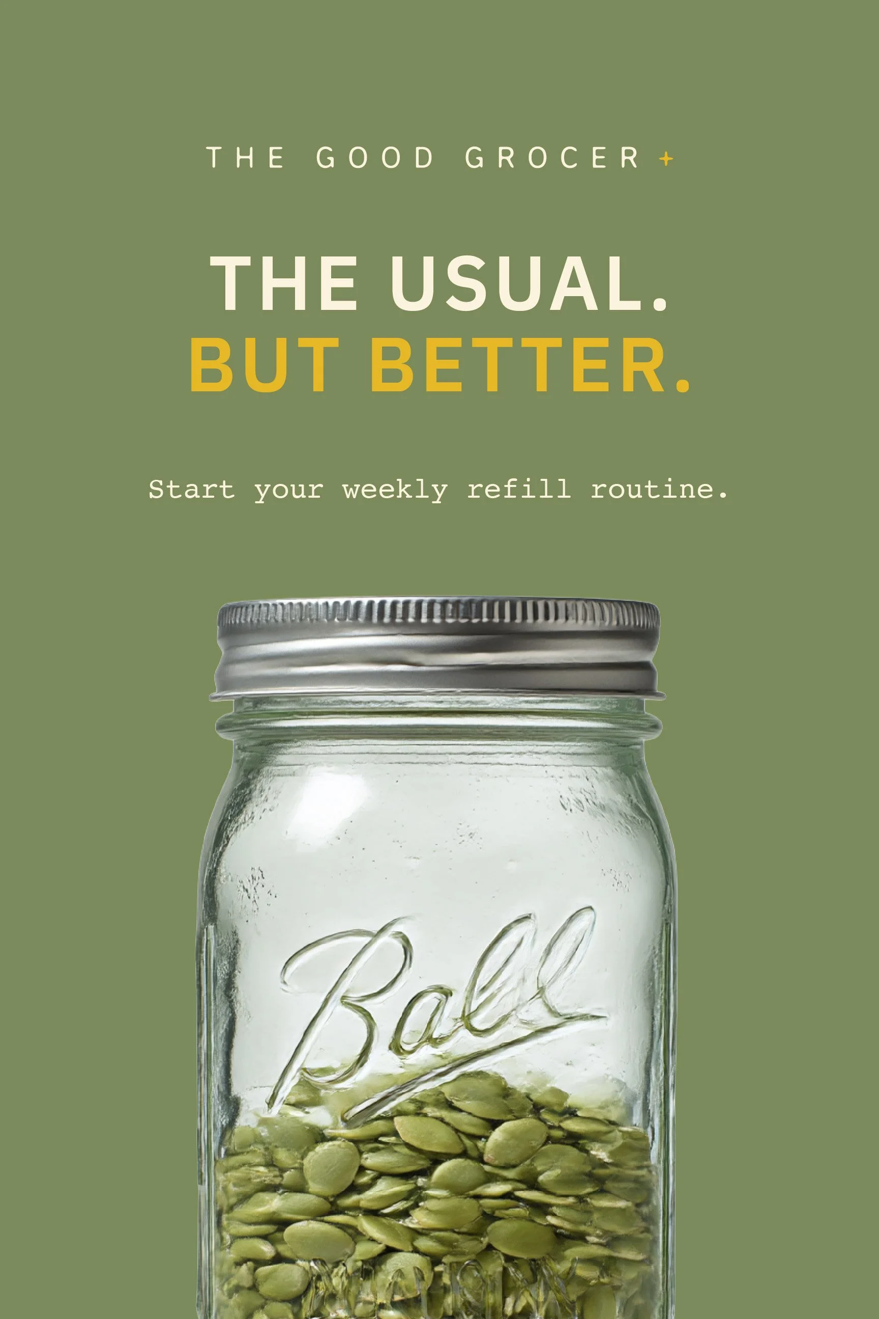
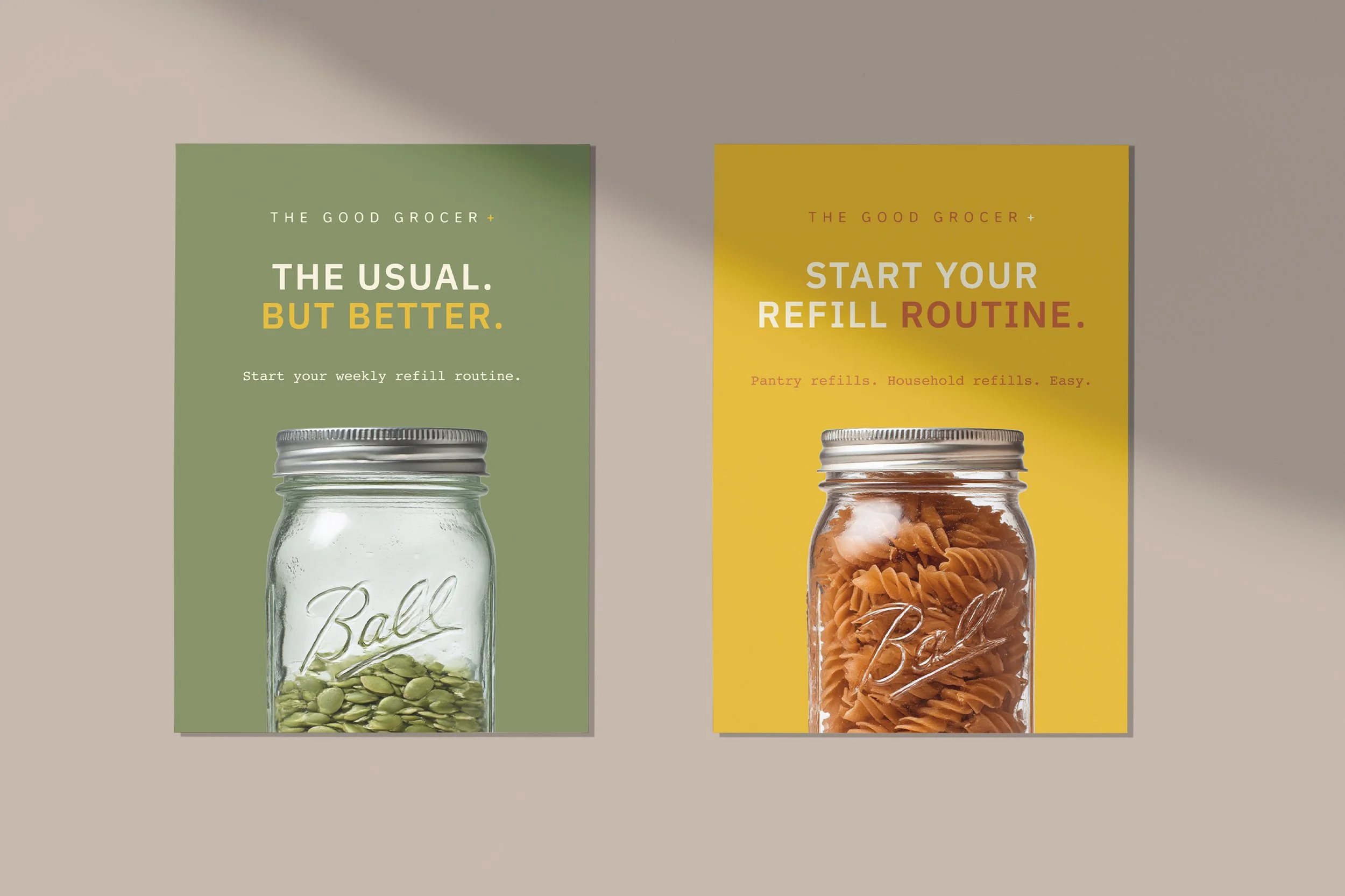
The Good Grocer is a neighborhood refill store designed to make sustainable shopping feel like a part of everyday life. Rather than positioning zero-waste as a performance or lifestyle statement, the identity focuses on the idea of routine.
The visual system draws inspiration from the rituals of weekly grocery habits, using produce-led color references and tactile typography to create a feeling of mindful repetition and familiarity. The result is a brand that builds connection through small interactions, helping people feel confident that responsible choices can be simple, local, and genuinely rewarding.
Color Palette
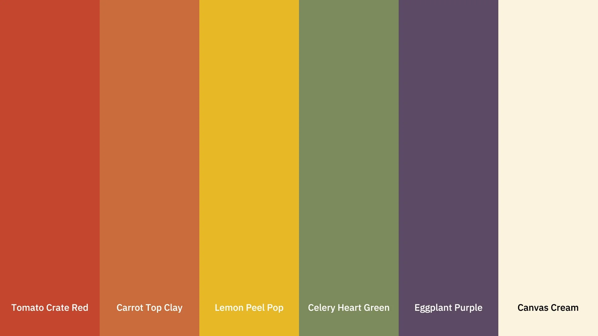
Inspired by the colors of fresh produce, the palette reflects refilling as a simple, satisfying part of the weekly shop.
Typography
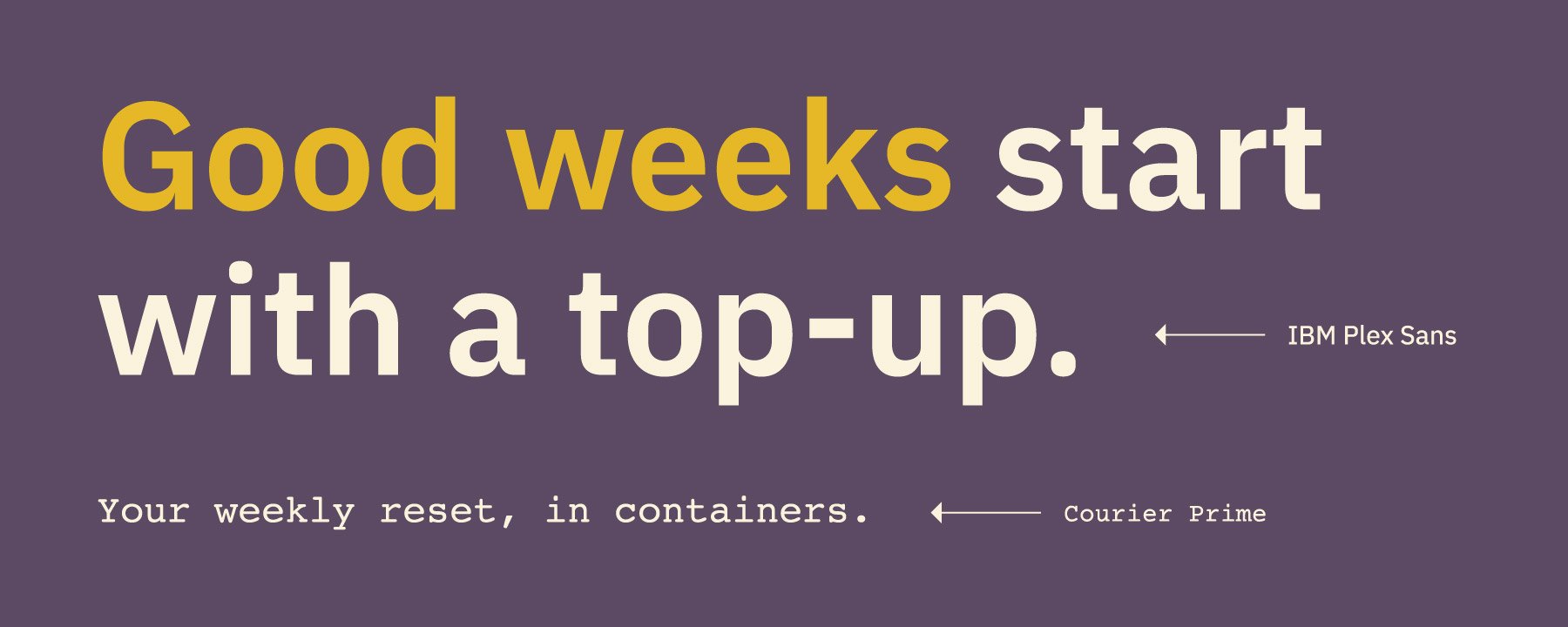
Typography pairs IBM Plex Sans with Courier Prime to balance clarity and rhythm.
Logo Development - Initial Exploration
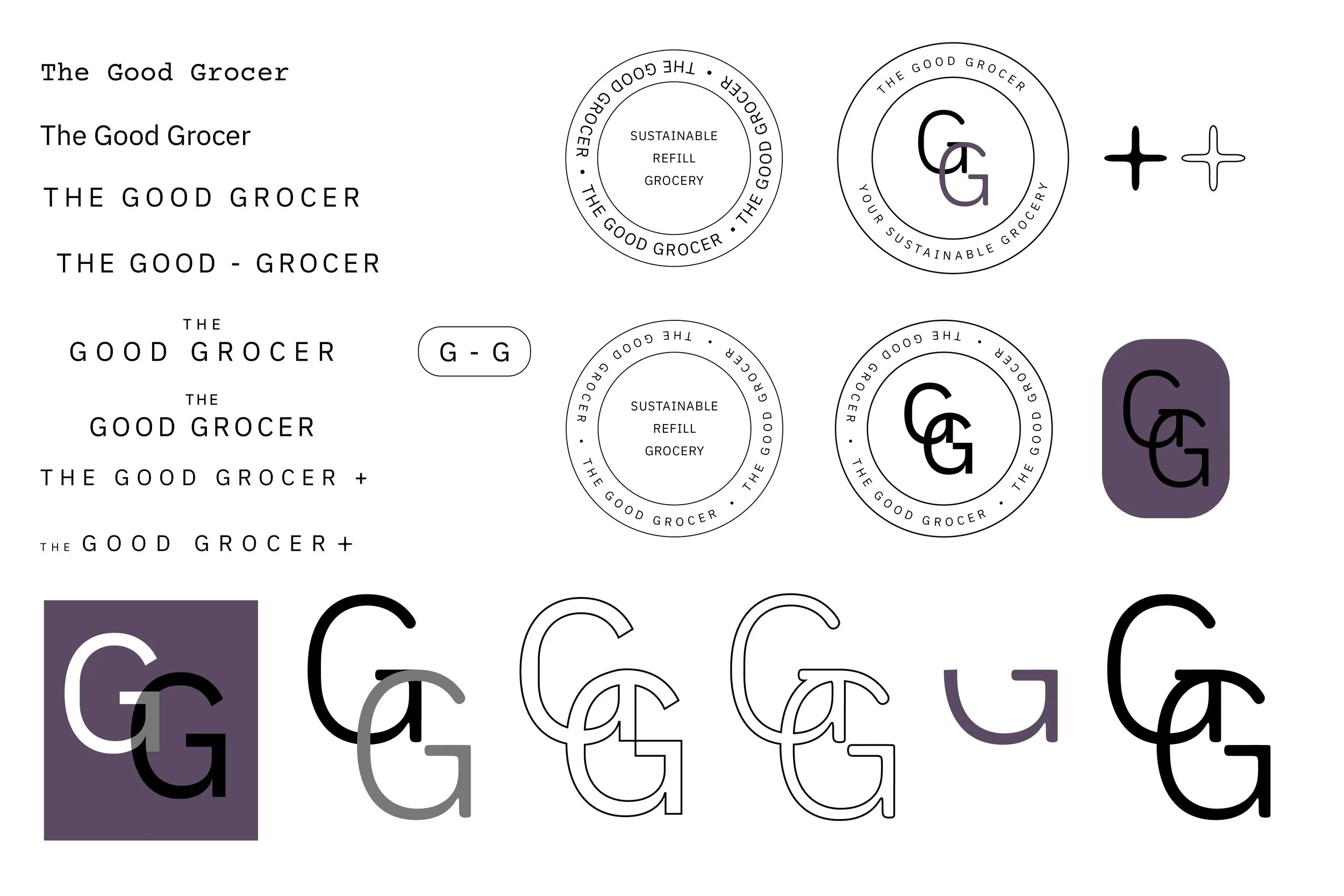
The Good Grocer logo system explores how simplicity can communicate care. Built from IBM Plex Sans as a base and manually refined, the interlocking “G” word mark was developed as a symbol of connection and repetition.
All visual design work was completed independently by me, with iterative art-direction feedback and strategic critique provided through collaboration with ChatGPT.
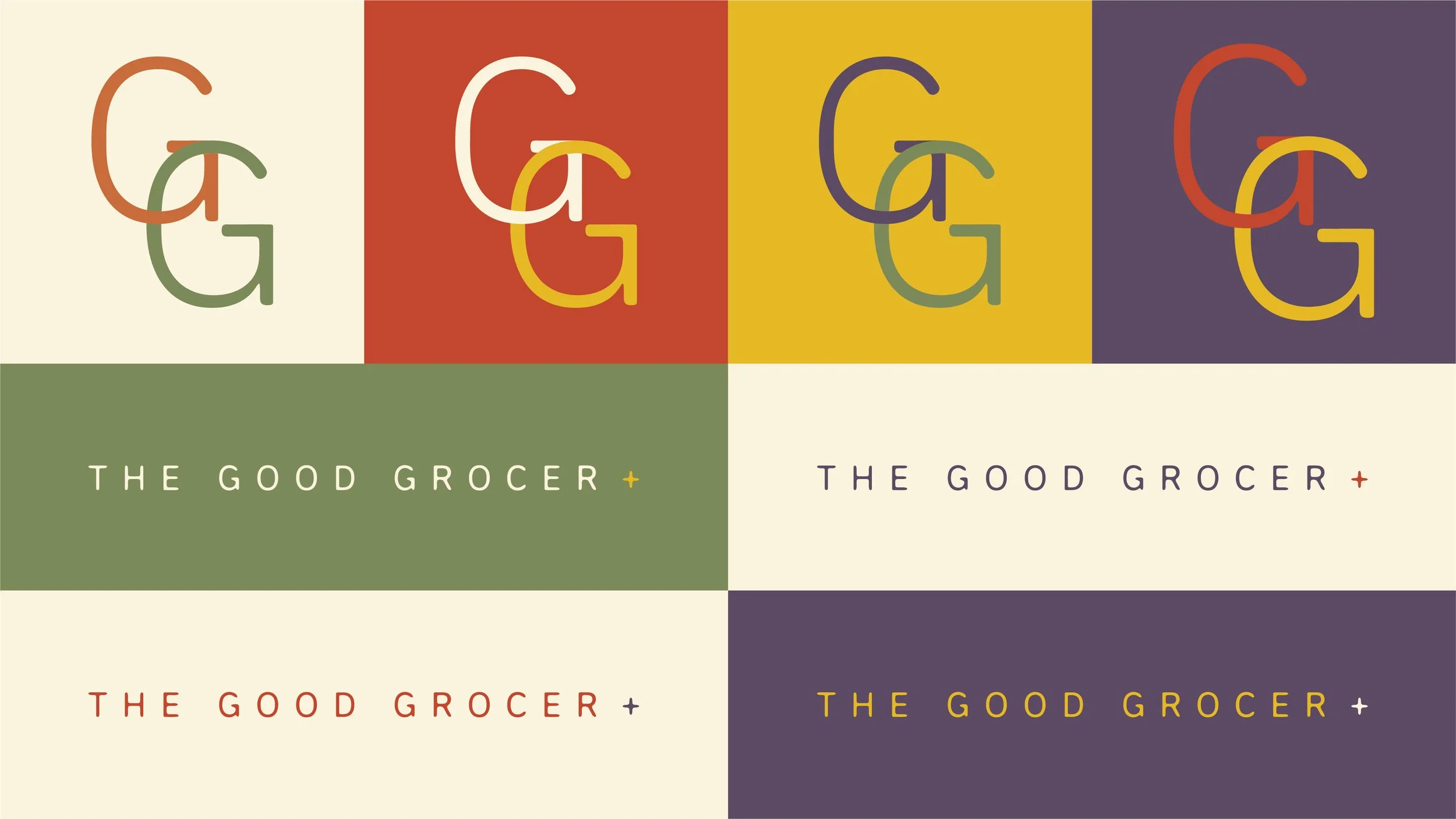
Finalized Logo Variations
Animated Wordmark
I animated my original wordmark using MidJourney, translating the tactile motion of twisting open a jar into a brand motion. The exploration was AI-assisted, while the core identity design and concept development were created independently.