Title
Crunch Fitness Retail Collections
Credits
Art Director: Suze Myers
Photographer: Coty Tarr
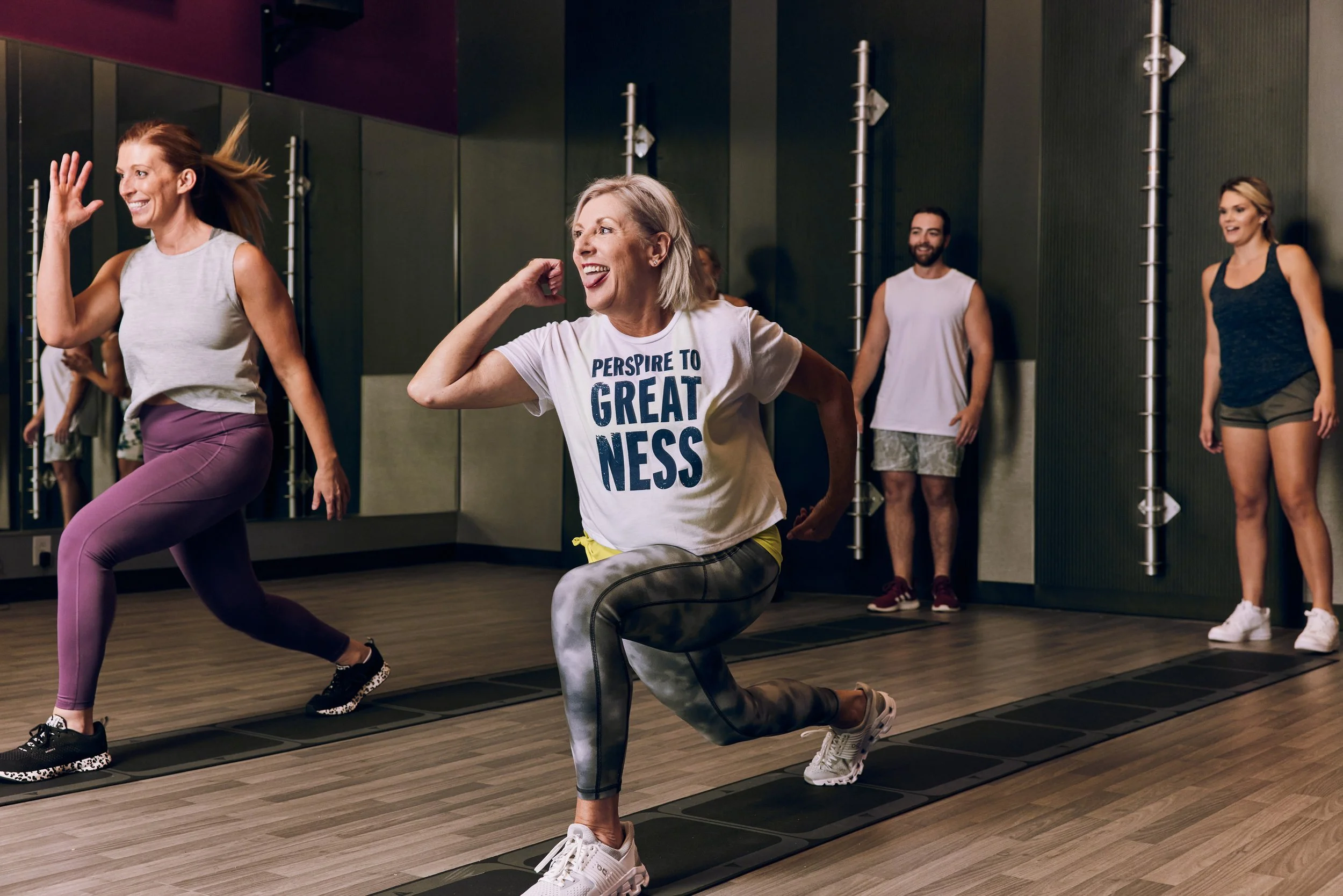
Since joining Crunch’s creative team in 2020, I have led the design of retail graphics across nationally distributed collections and localized drops. I helped evolve Crunch’s retail expression by integrating trend-relevant typography, color, and messaging while maintaining a cohesive brand voice.
Impact
Since taking the lead on retail design, quarterly sales performance has consistently exceeded expectations — a first in company history.
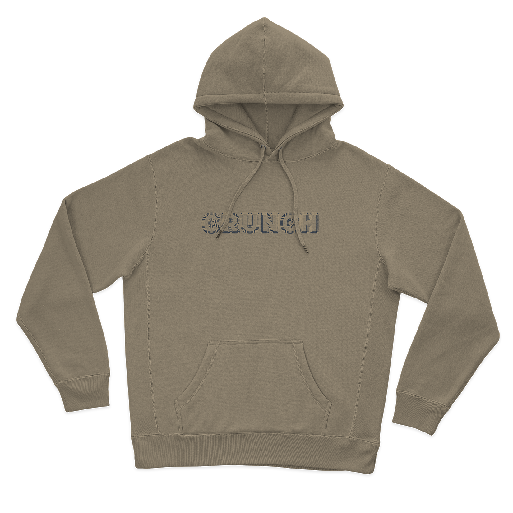
Introduced a minimal, tonal retail direction built around a repeatable triple-line typographic treatment of the Crunch wordmark. Using a soft, Spring palette of tans and blues, the collection focused on understated brand expression across everyday athleisure staples.
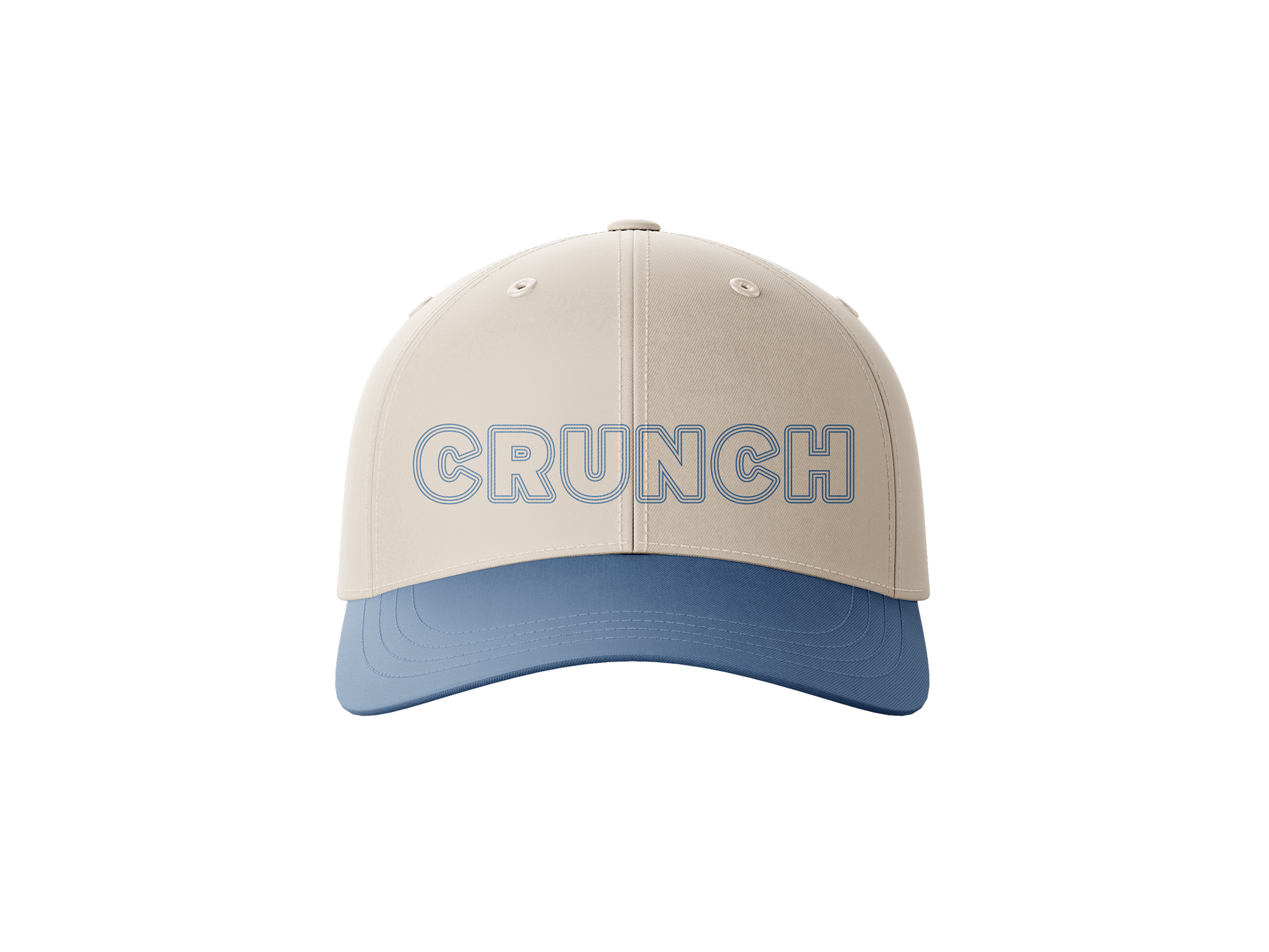
Baseball Cap
Unisex Hoodie
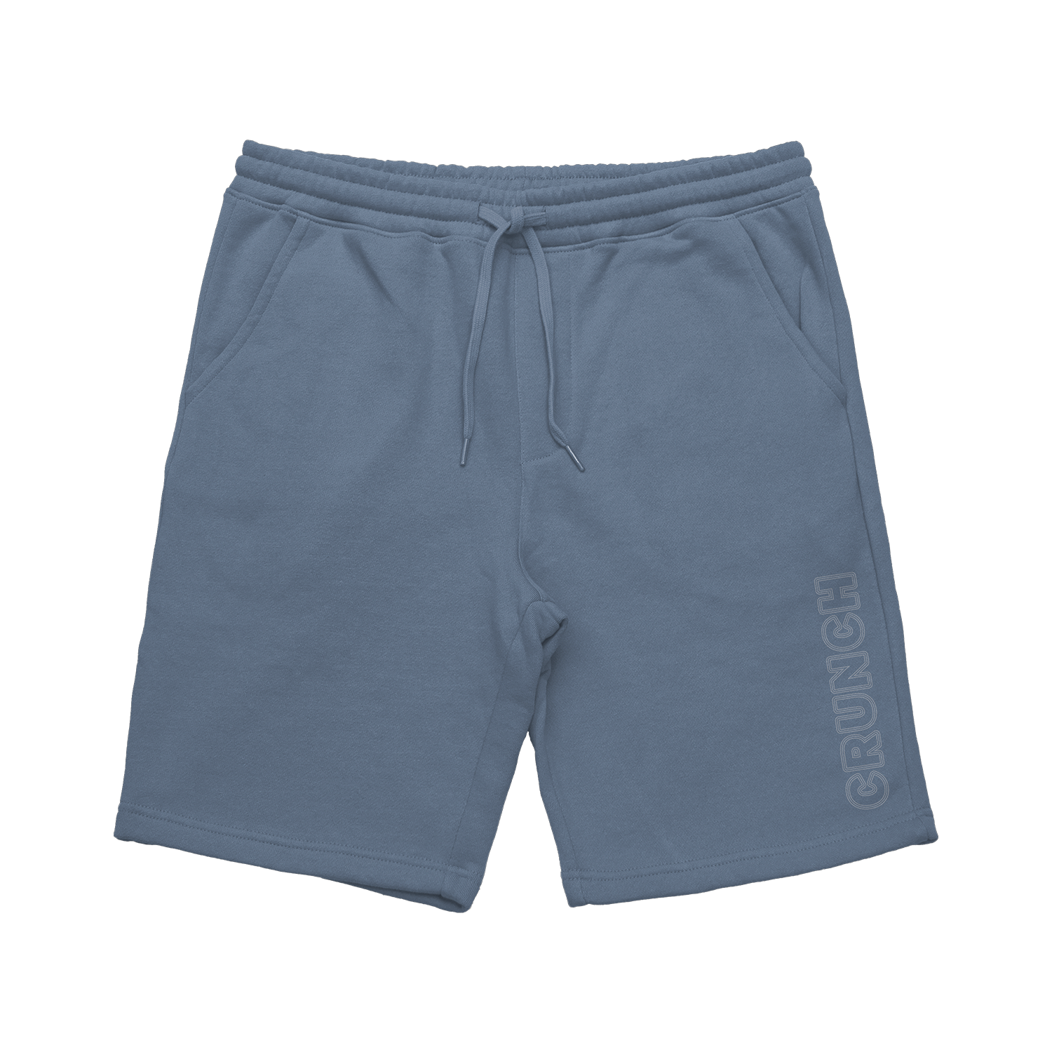
Men’s Shorts
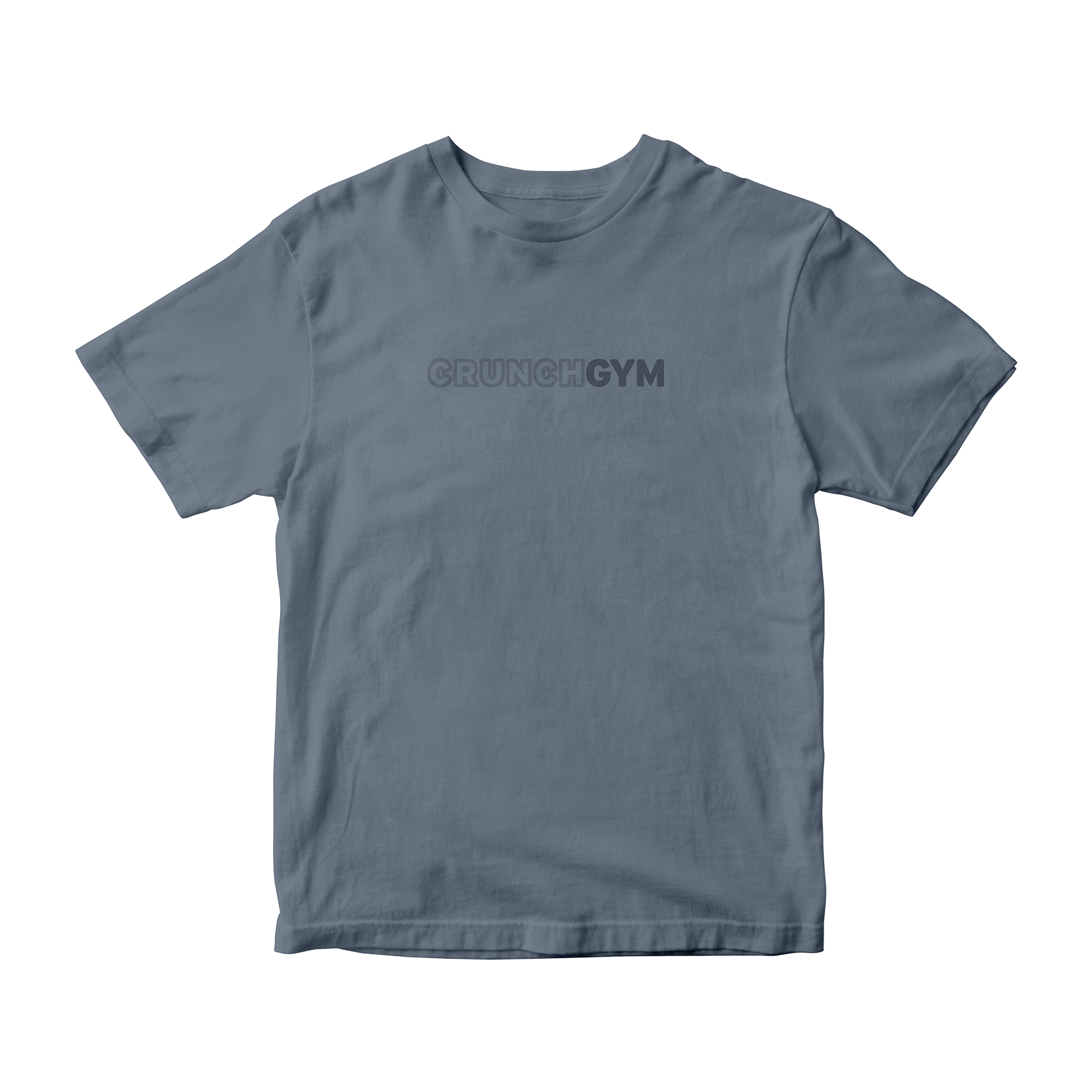
Unisex Tee
Inspired by New York City subway typography and an autumnal color palette, this collection focused on bold, type-driven branding centered on “Crunch.” The simplified graphic approach introduced a more minimal, urban direction while maintaining the brand’s energetic tone. Rolled out across clubs in New York, Los Angeles, San Francisco, and Miami, the collection exceeded sales expectations by over 110%.
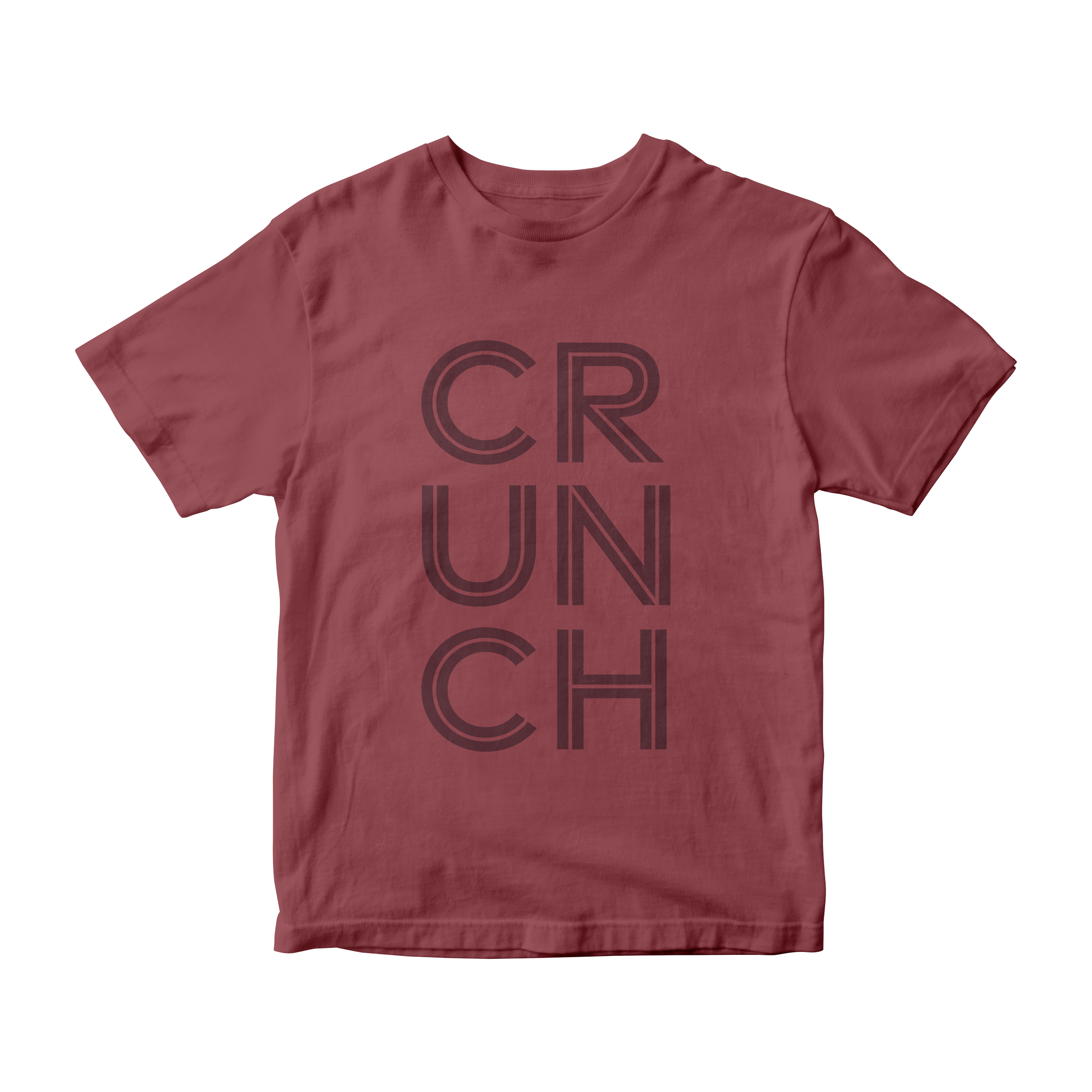
Men’s Tee
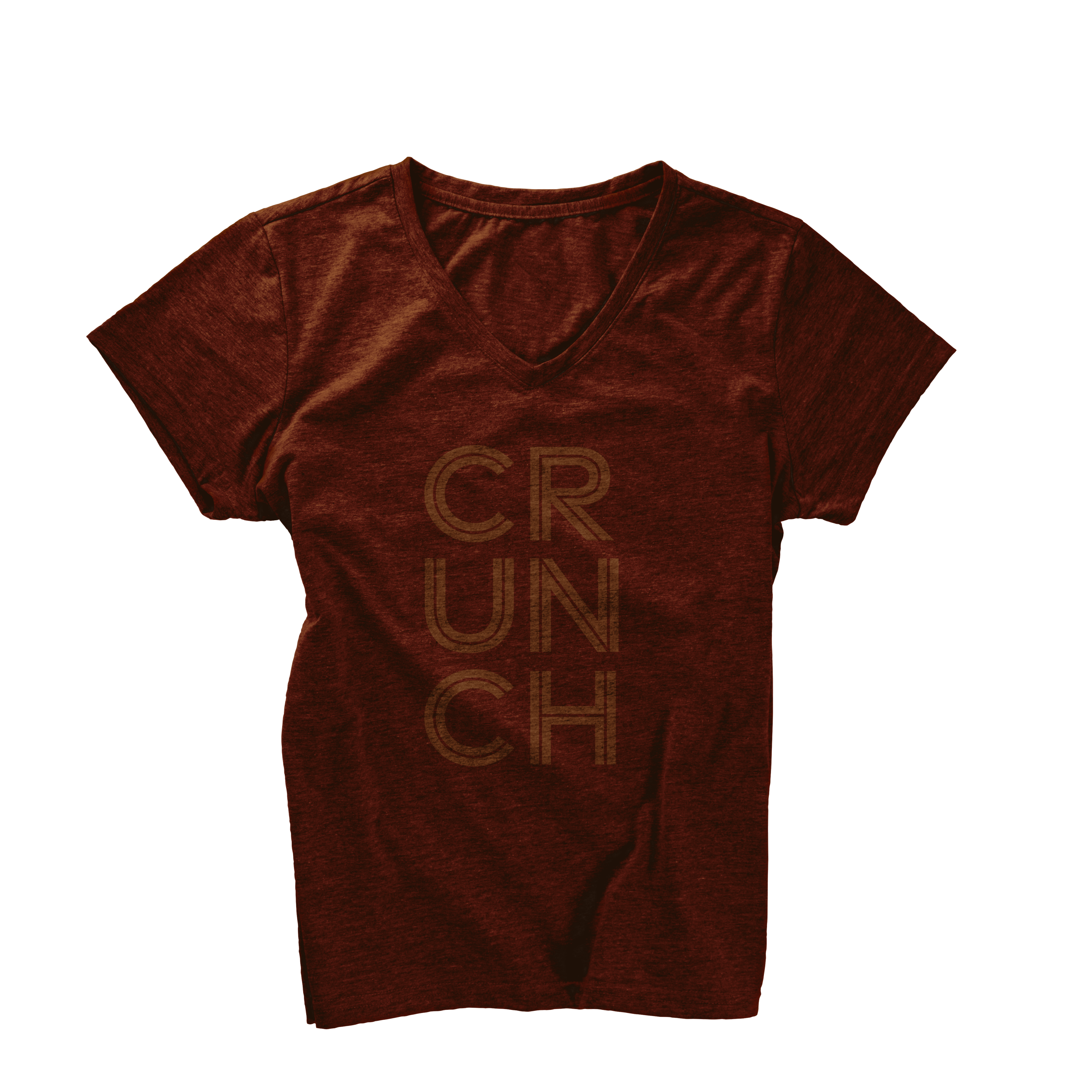
Women’s Tee
Unisex Hoodie
Men’s Shorts
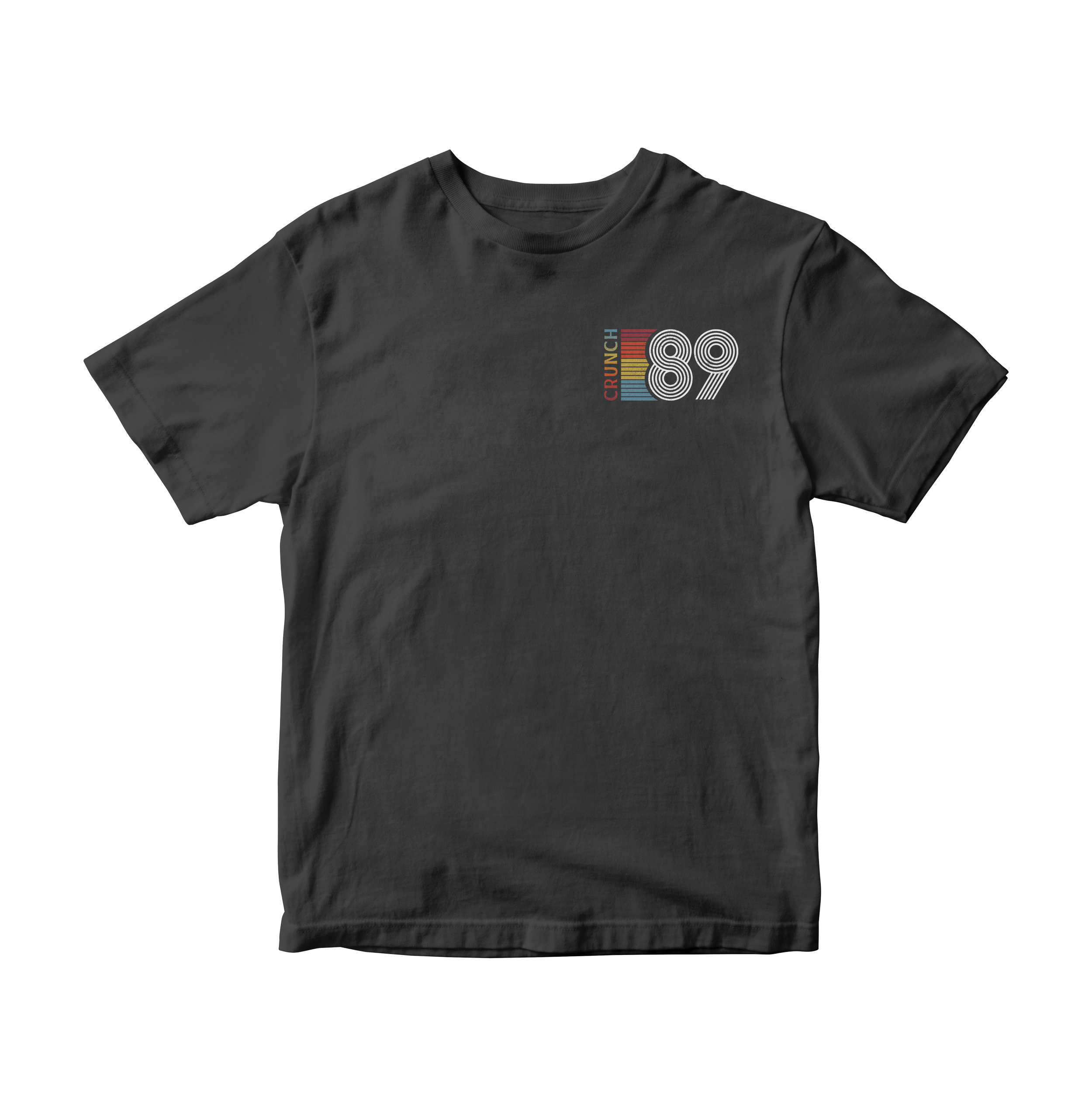
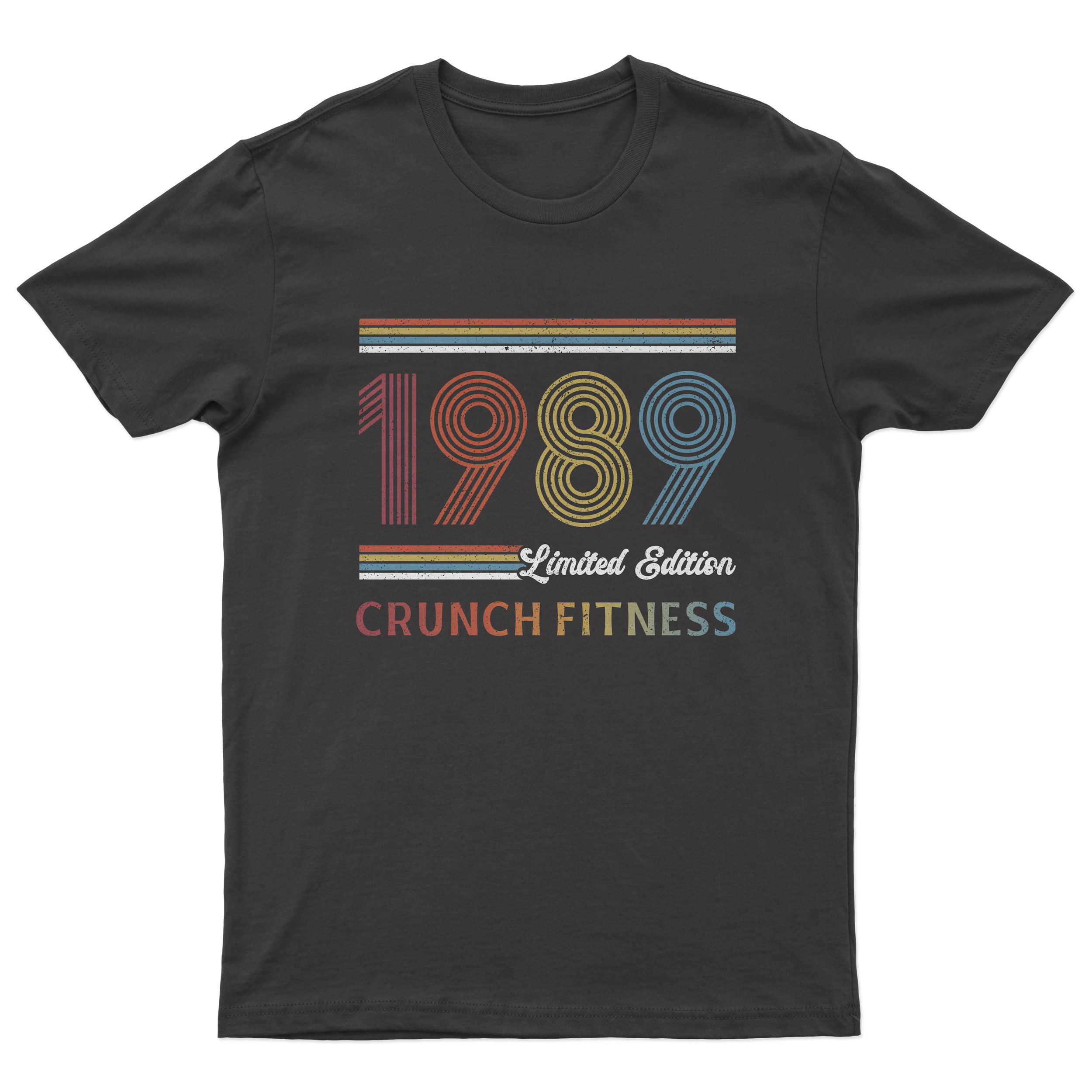
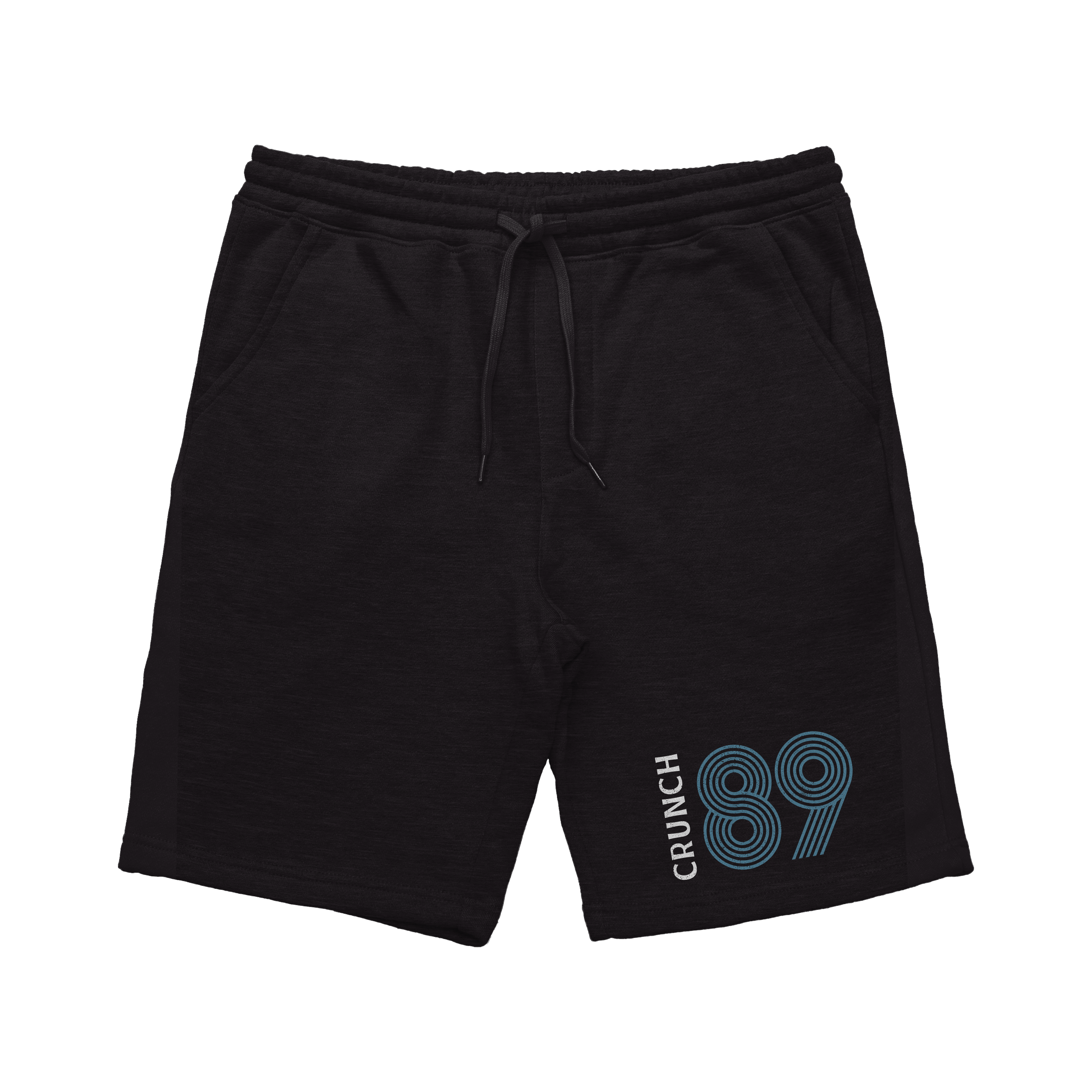
Created a commemorative retail collection celebrating Crunch’s founding year, drawing on vintage-inspired color palettes and distressed graphic treatments to evoke the brand’s 1989 origins. The collection balanced nostalgic storytelling with contemporary styling to create a brand-forward anniversary drop.
Unisex Tee

Unisex Hoodie
Men’s Tee
Men’s Shorts
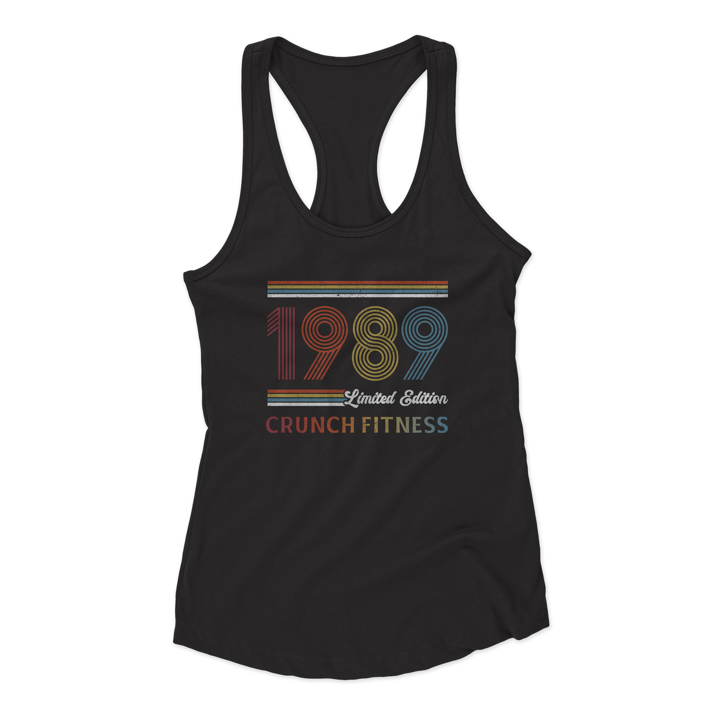
Women’s Tank
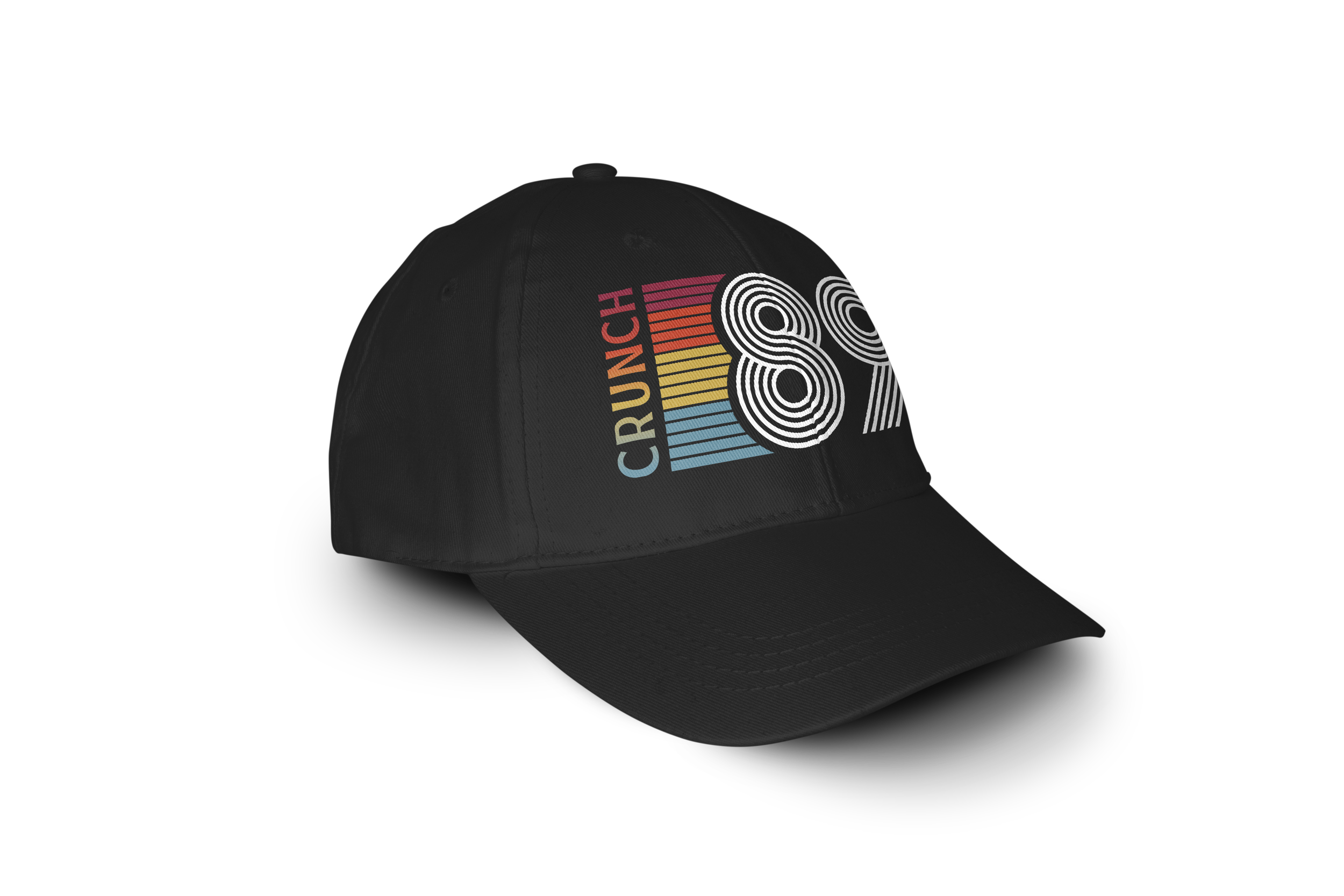
Hat
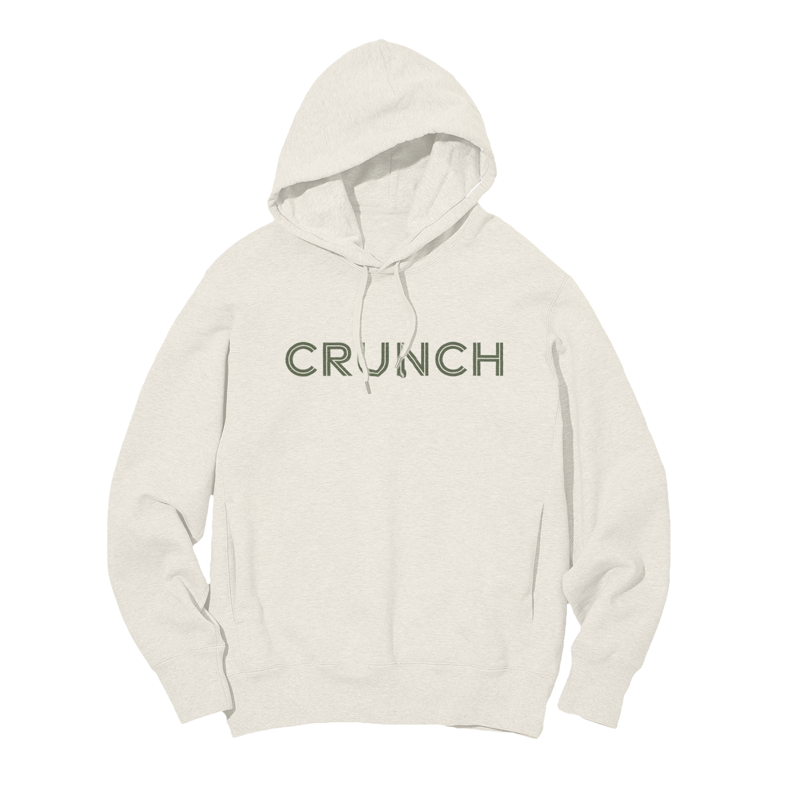
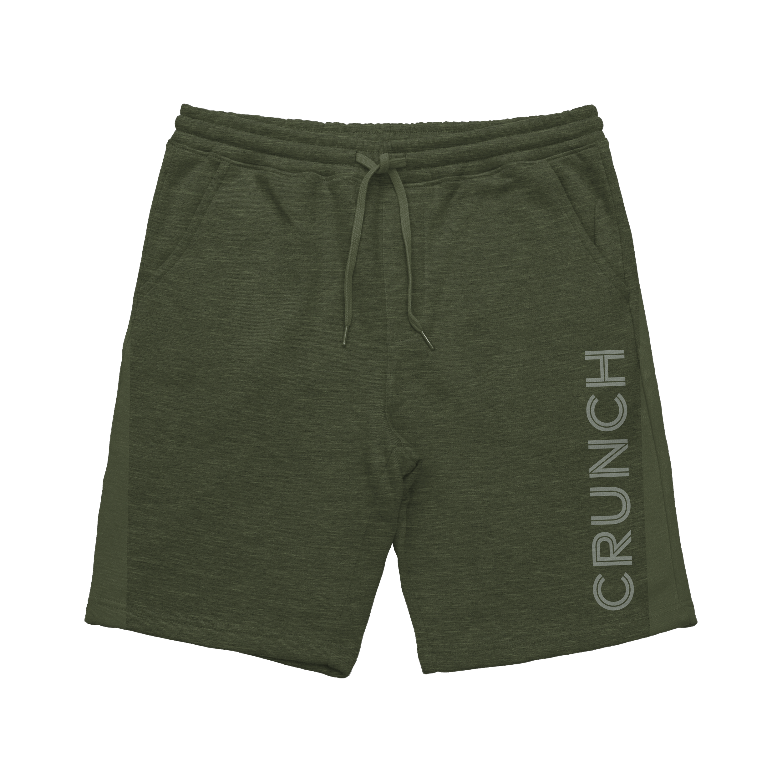
Introduced a collegiate varsity-inspired retail direction centered on “Property of Crunch Athletic Department” messaging. The collection used earthy greens, browns, and tans alongside athletic typography to create a nostalgic campus-inspired aesthetic while maintaining the brand’s energetic identity.
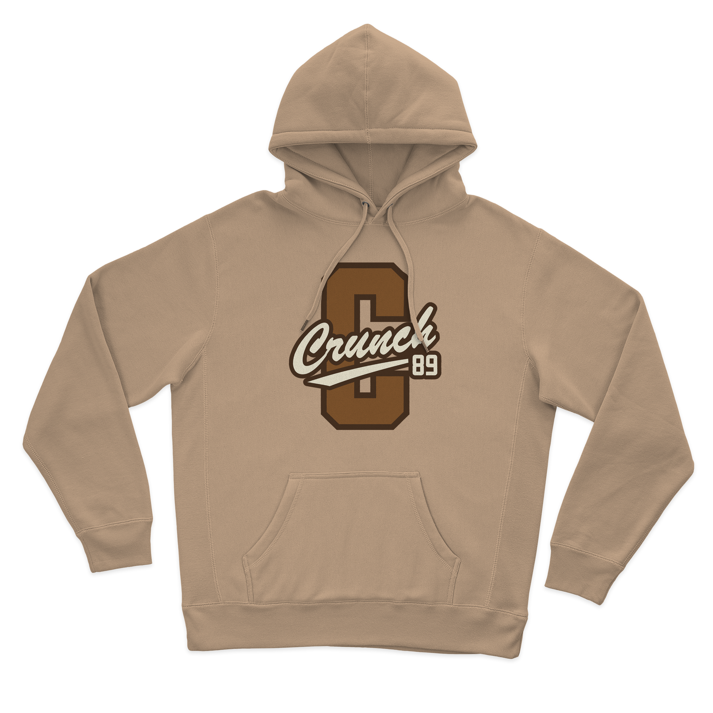
Unisex Hoodie
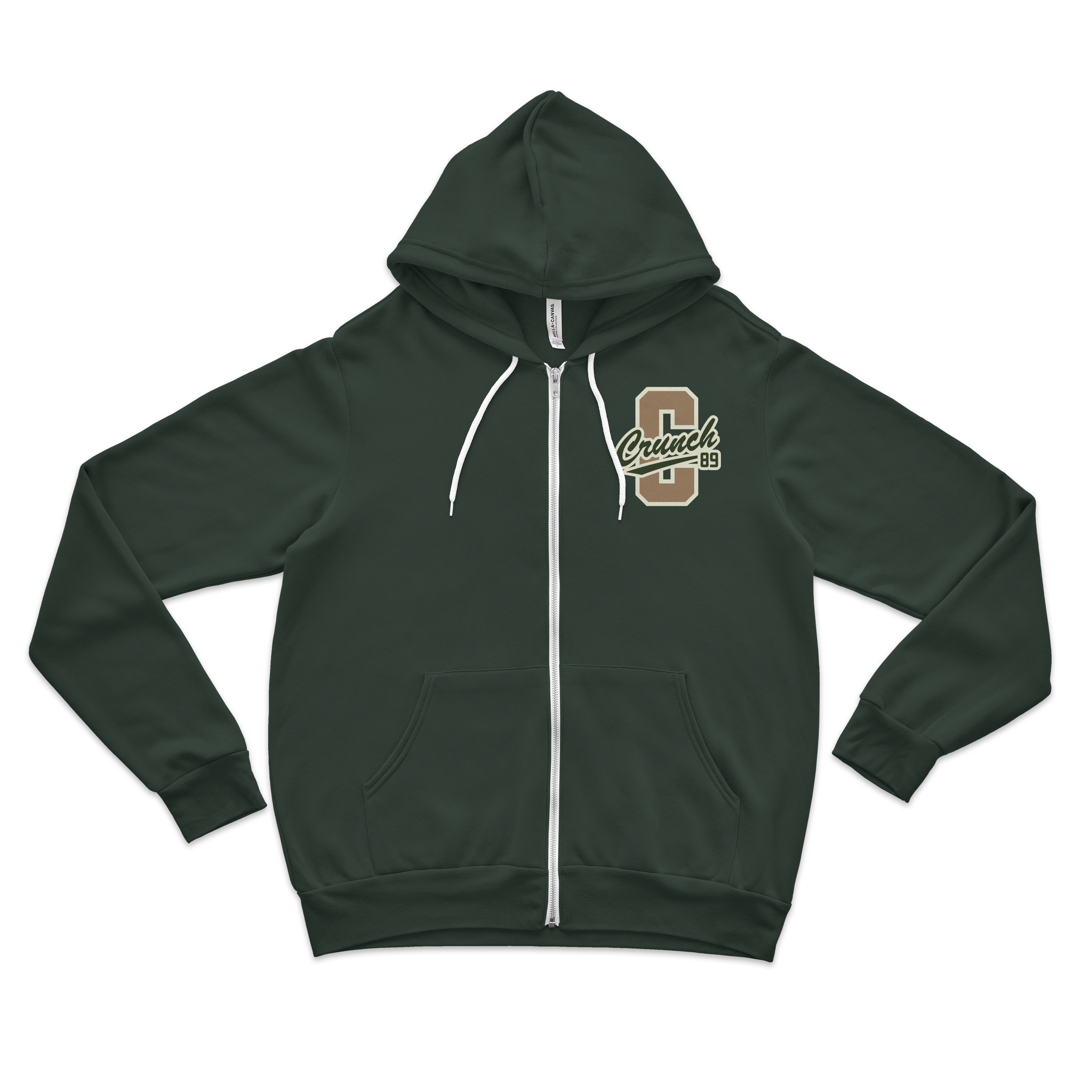
Unisex Zip Up
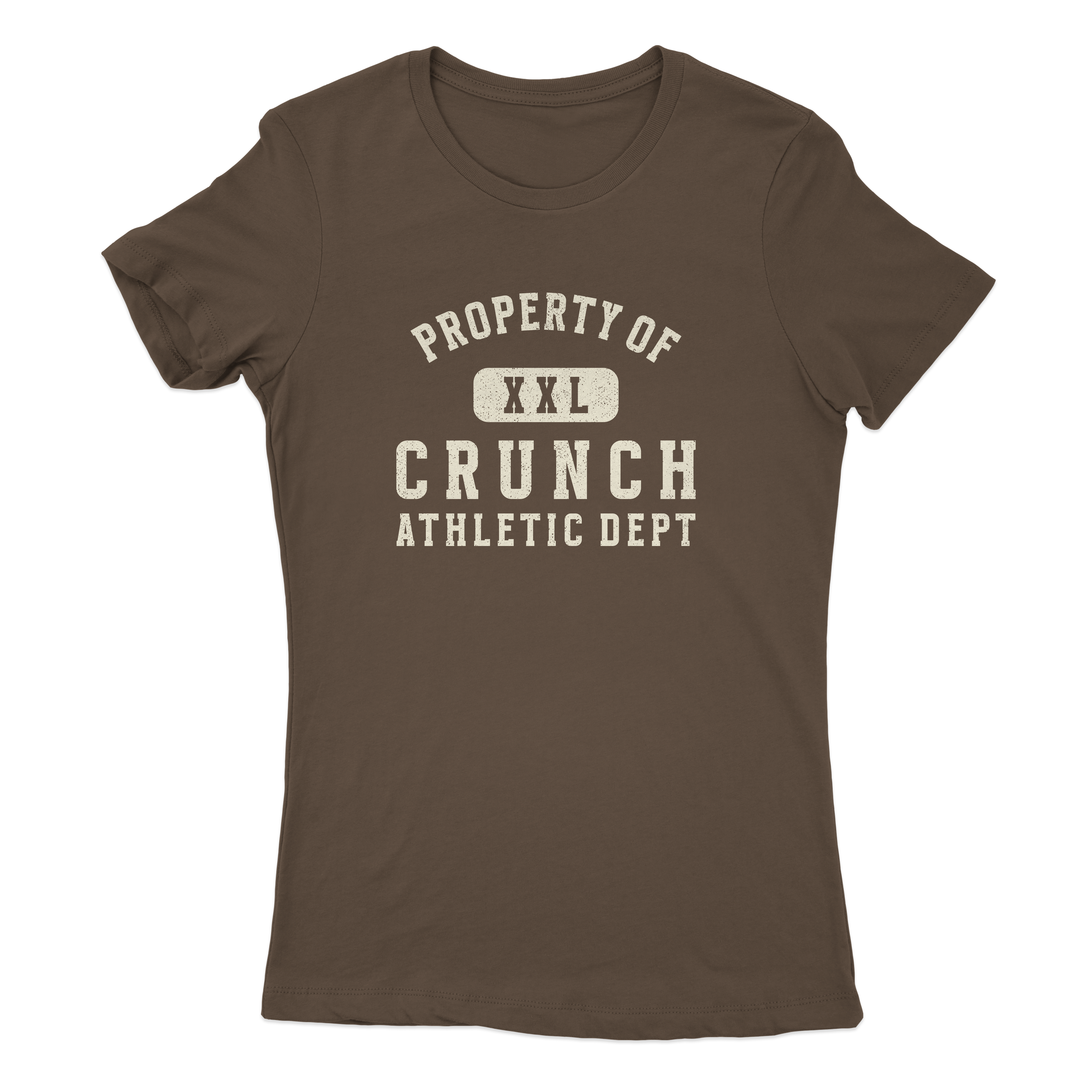
Women’s Tee
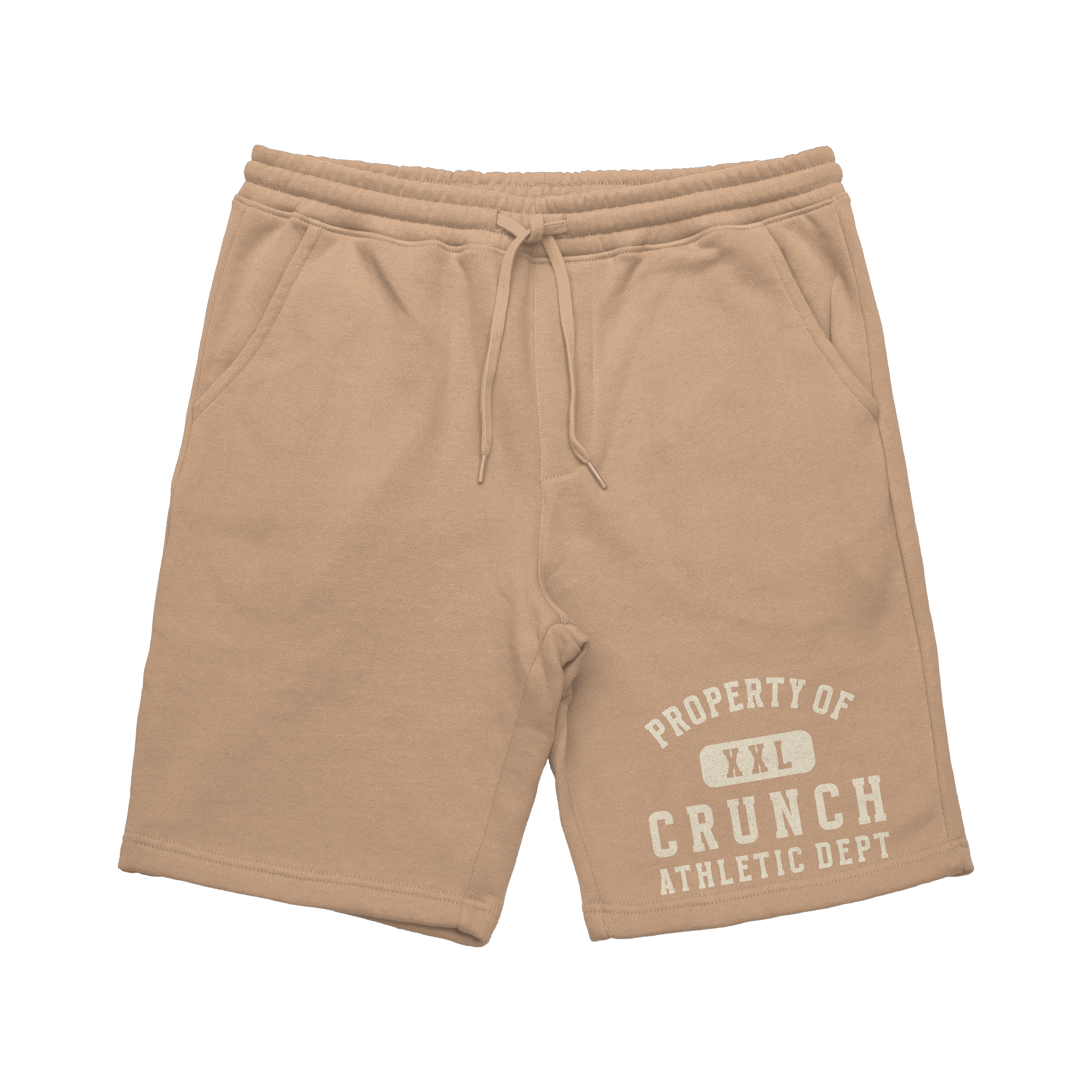
Men’s Shorts