Title
Crunch Fitness Integrated Campaign Design
Timeframe
3 campaign cycles (2022–2026)
Context
In-house design team, Crunch Fitness
Scope
Executed campaign toolkits, developed typographic systems, and owned timelines and design review.
Overview
Across 3 campaign cycles and 5 years, my role at Crunch grew from executing a design system to building and owning it myself. I started by translating an Art Director's concept into a working toolkit, moved into developing the typographic and photographic direction, and eventually took on end-to-end ownership, from conception to production.
Scale
Global rollout across 550+ clubs, 3M+ members.
Impact
2026 cycle drove a 31% lift in brand awareness, with 72% of purchase intent influenced by creative.
Title
Go Crunch Mode (2022)
Credits
Art Director: Suze Myers
Photographer: Coty Tarr
Role
Jr Graphic Designer
Overview
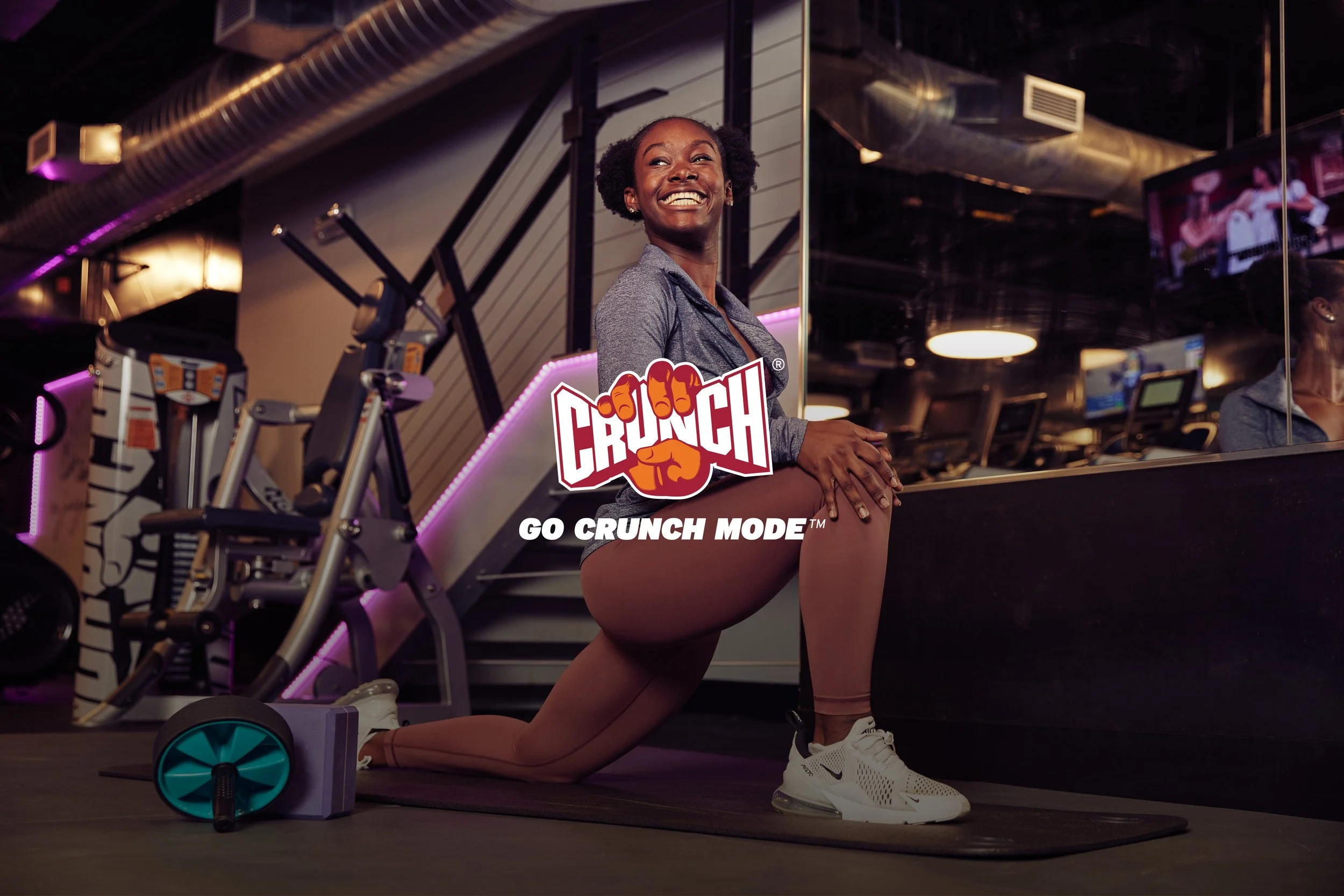
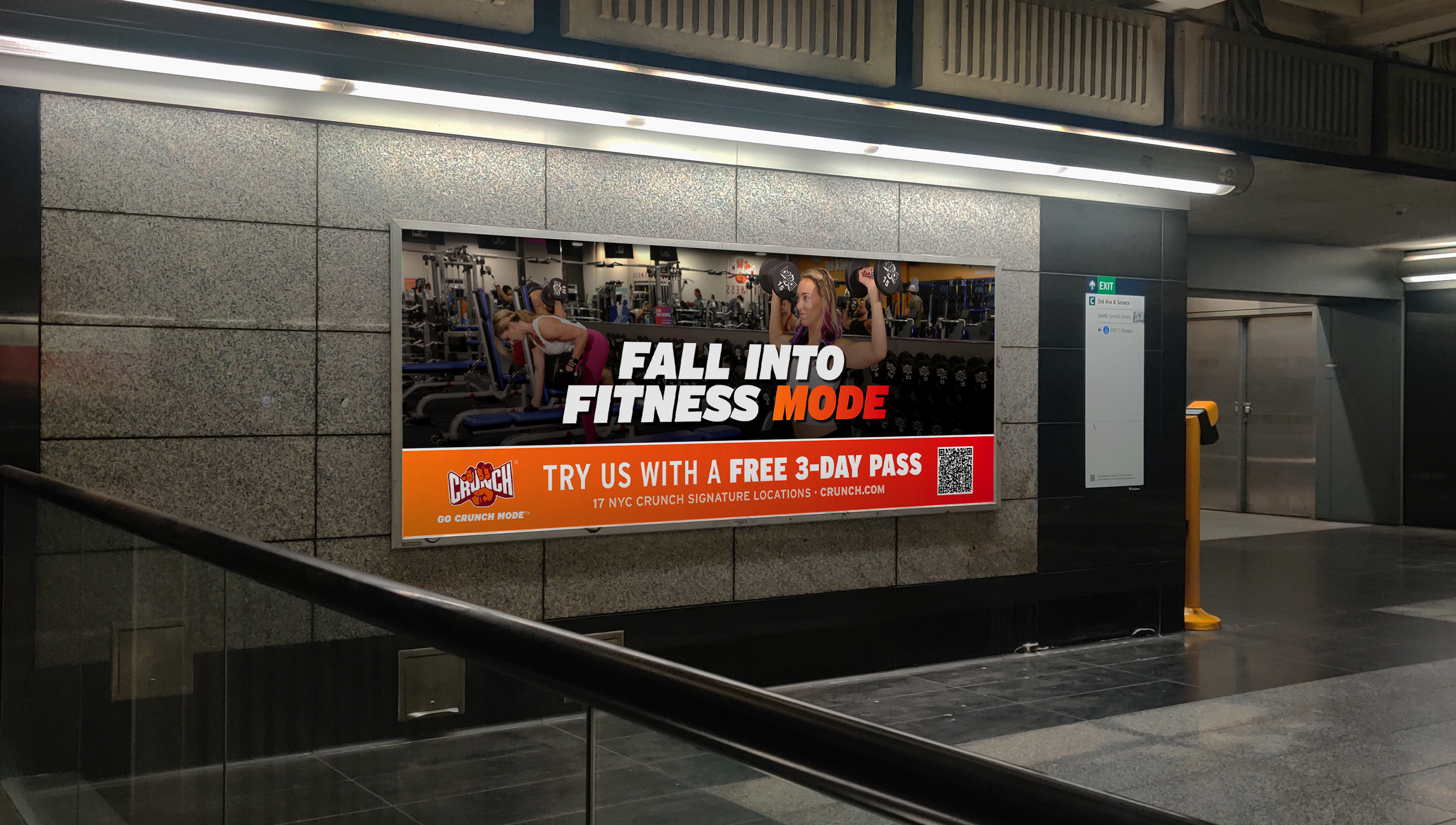
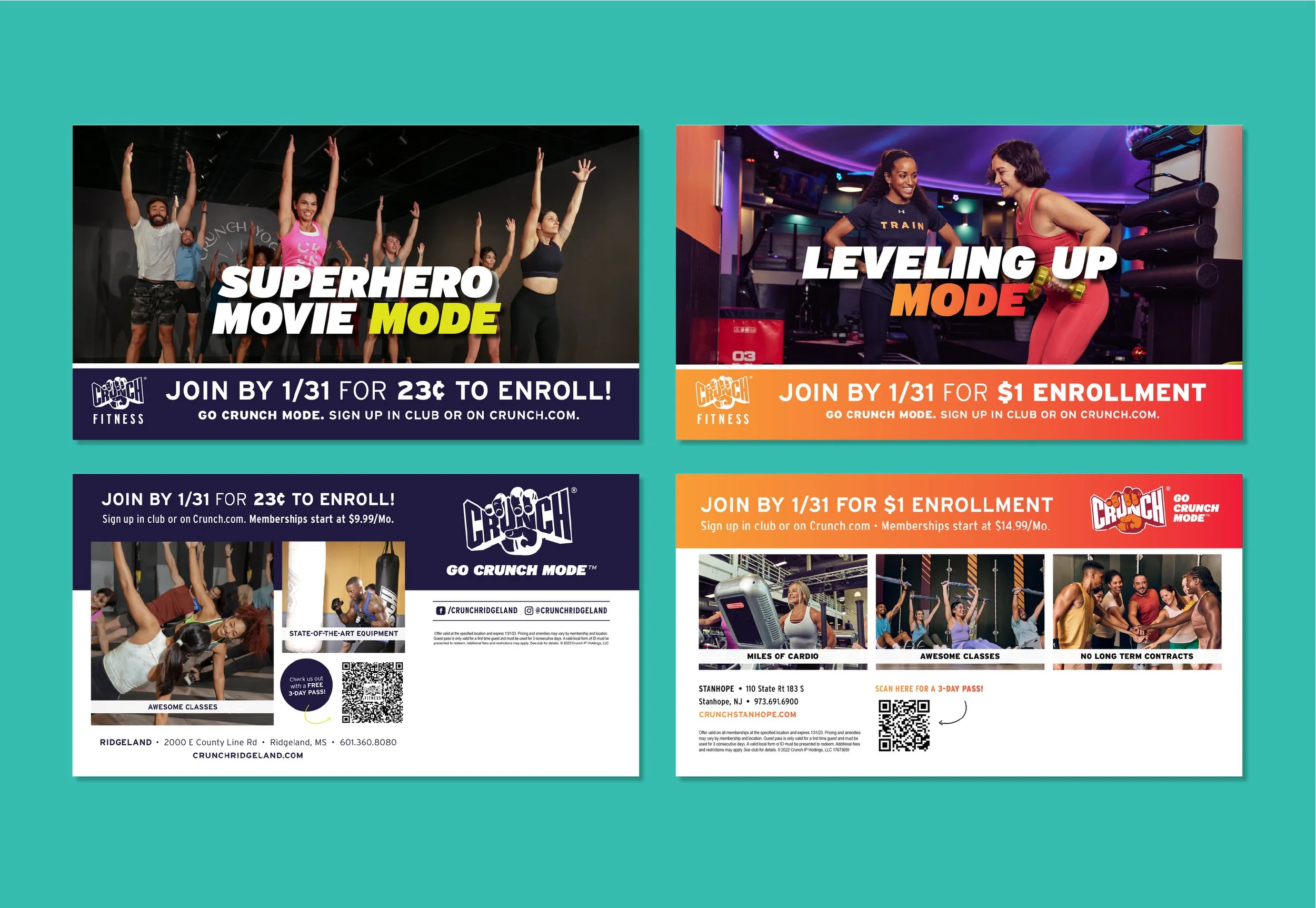
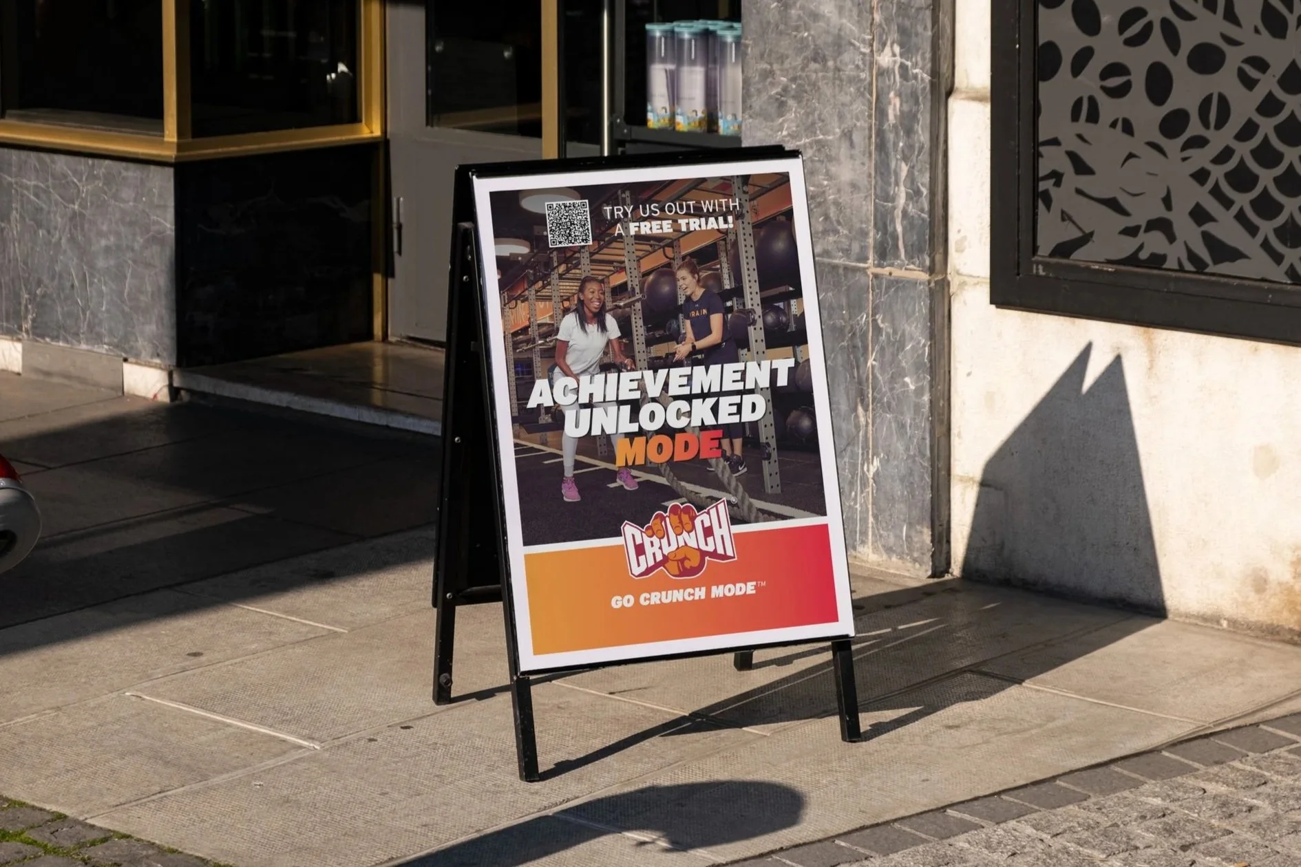
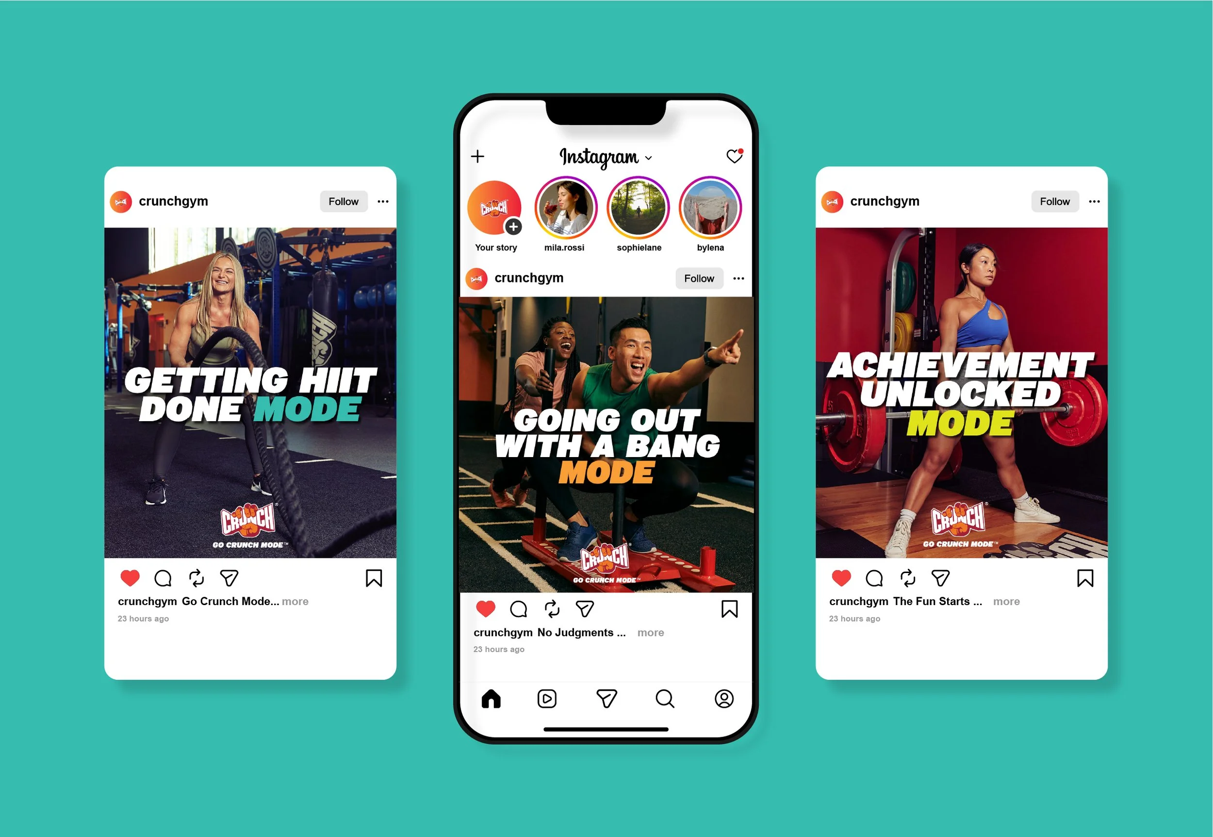
Post-Covid, The Go Crunch Mode campaign aimed to get people back into the gym. Using the notion of different “modes,” storytelling focused on the benefits of working out at a gym, such as premium equipment and amenities, access to classes and personal training, and a sense of community. Creative encouraged gym-goers to find their mode.
Working from the Art Director’s concept (oversized typography, high-energy color, and group photography), I built the toolkit across formats, from social and direct mail to subway ads and sandwich boards. The main challenge was maintaining consistency at scale: selecting photo crops and scaling the type treatment so both held up from a social post to a billboard. In retrospect, as a senior-level designer, I saw that the campaign’s wide color palette left too much open to interpretation: franchisees adapting the toolkit often applied colors incorrectly, a lesson that informed future color palettes.
Title
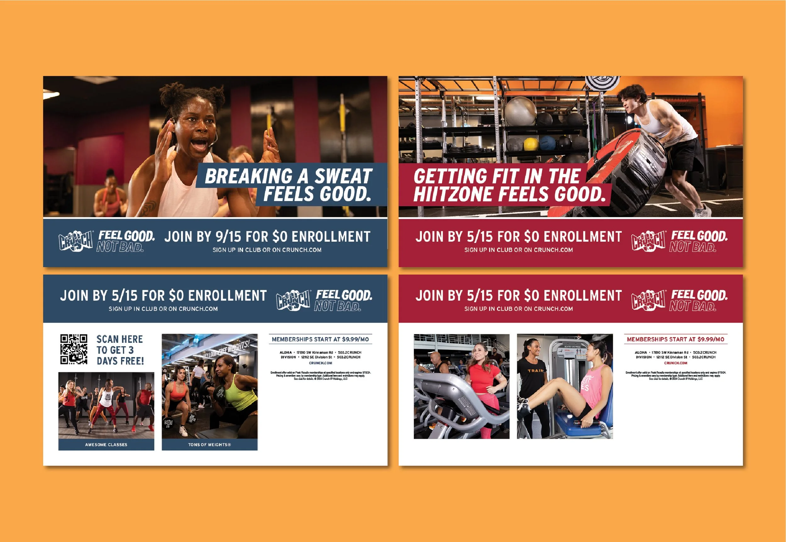
Feel Good Here (2024)
Credits
Creative Direction: Luis Vega
Photography: Murphy Made
Role
Sr Graphic Designer
Overview
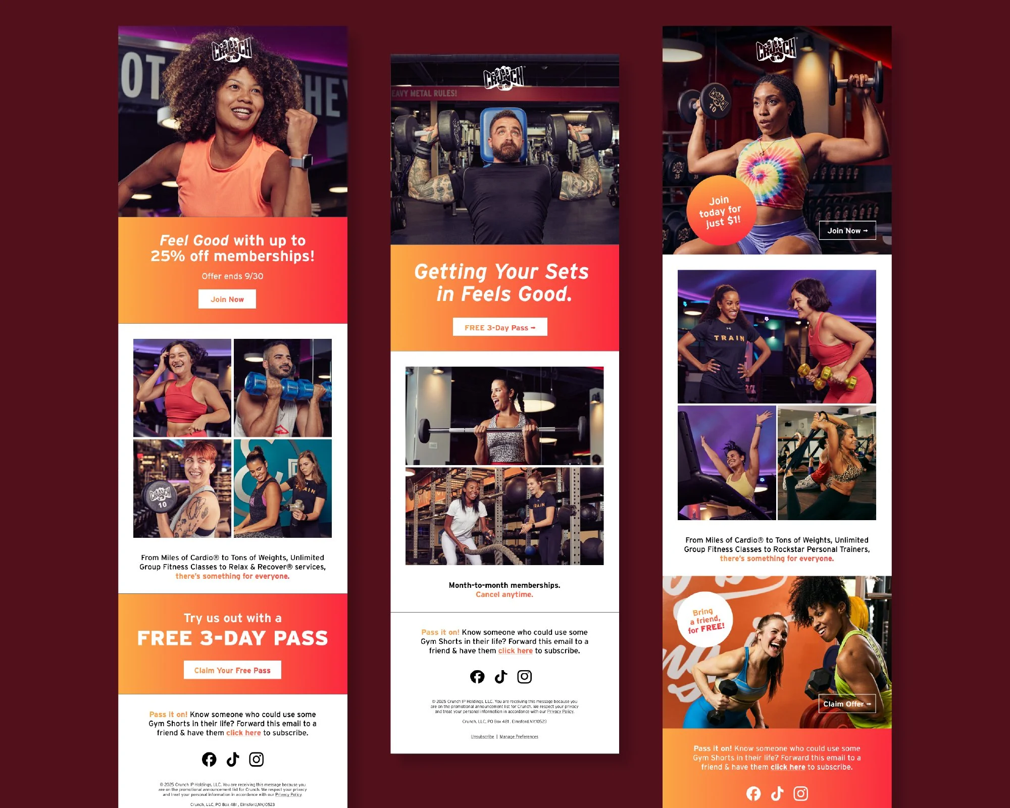
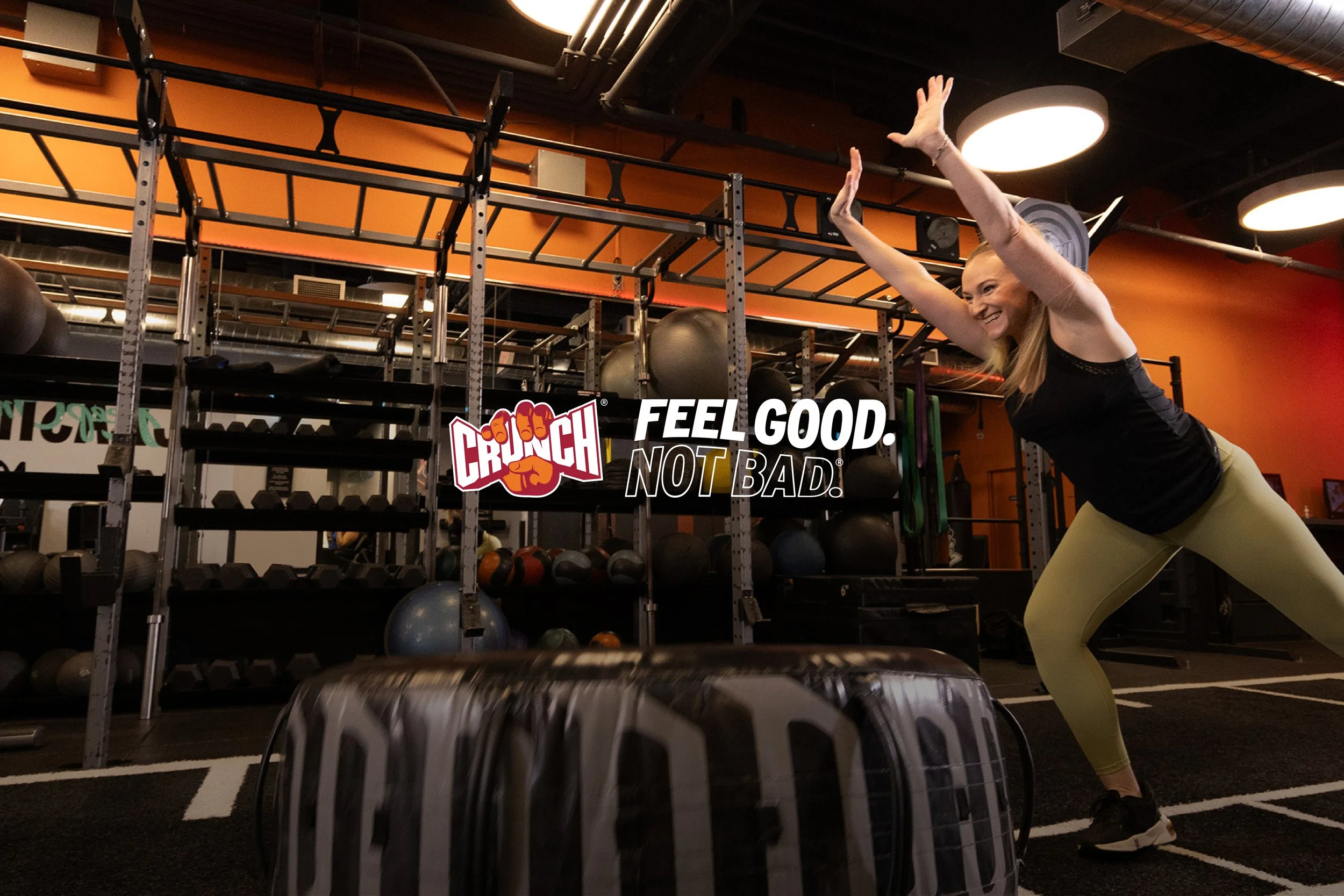
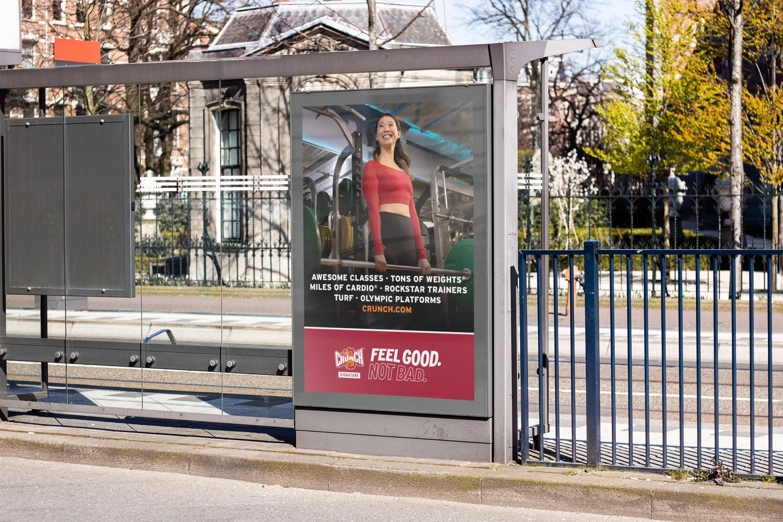
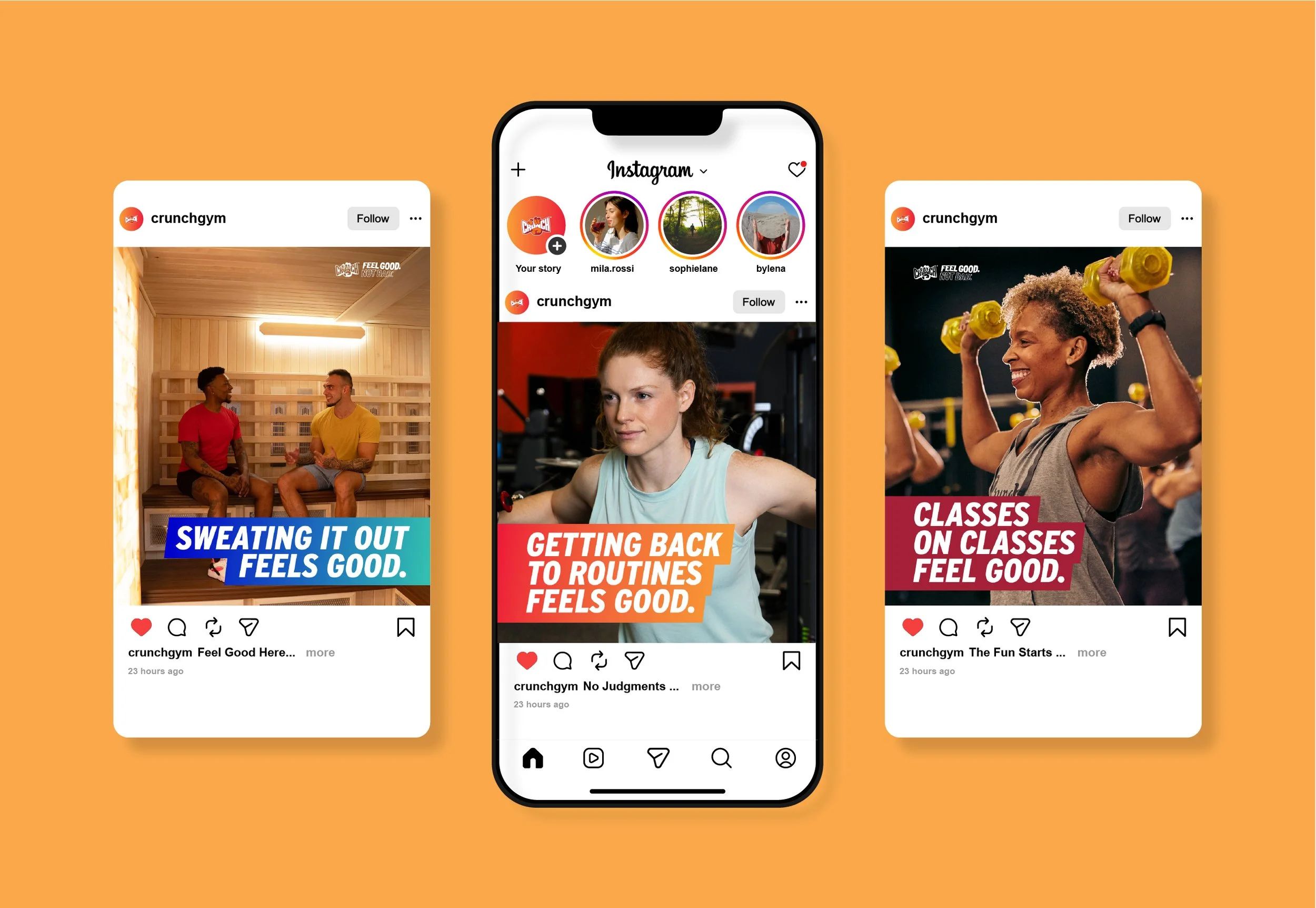
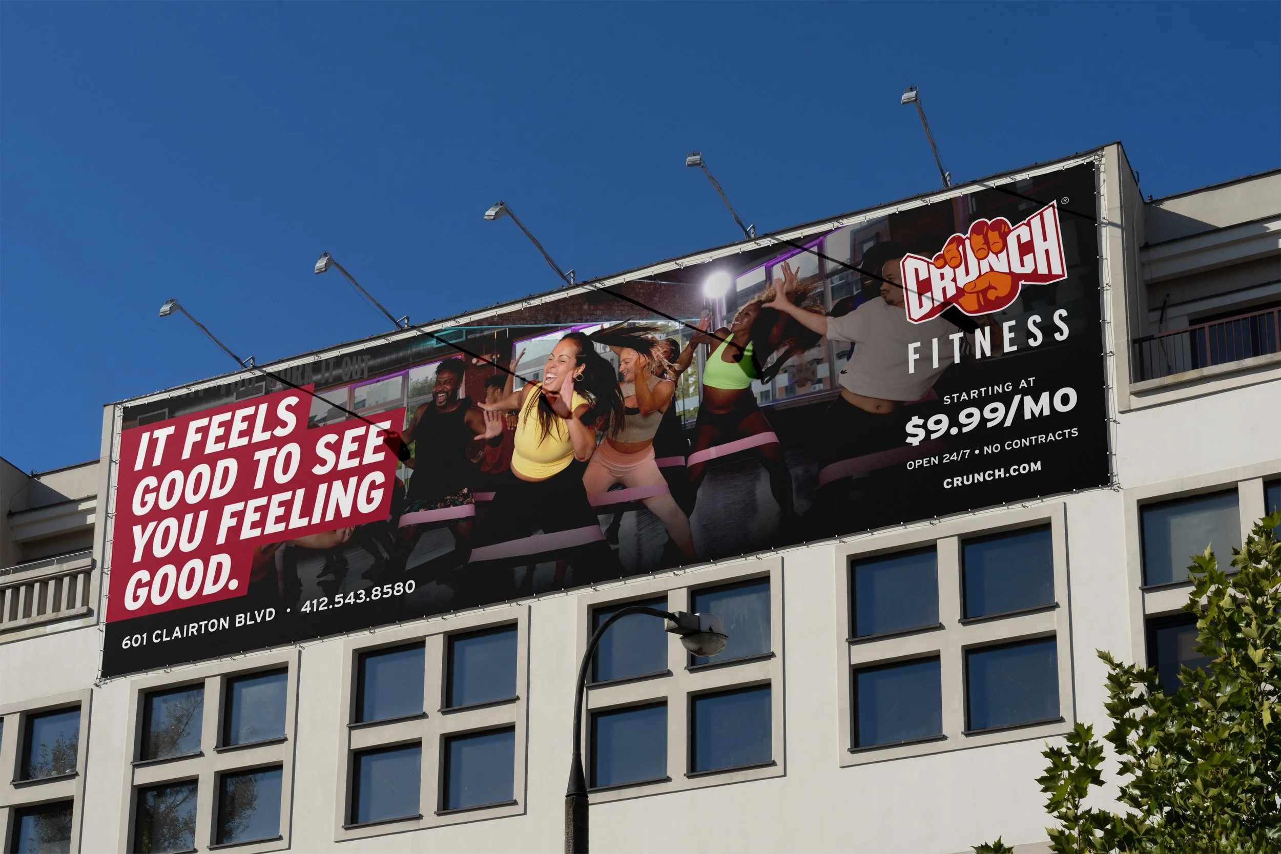
With the goal of resonating with Crunch’s key demographic of 18–35 year-olds, The Feel Good Here campaign aimed to strike the emotional chord of the average American: Post-Covid, life has been pretty tough. Research shows that levels of depression and anxiety are at all-time highs. But everyone deserves to Feel Good, and you can Feel Good at Crunch. When nothing else is going right, you have your workout.
Working under the Creative Director, I developed the typographic system and led image selection for this cycle, introducing a more assertive type treatment and a simplified palette rooted in Crunch’s core brand colors. Color-blocked headers enhanced message visibility, but after a year in use, the constraints of the system became clear: one-off assets that needed to tie back to the campaign were hard to fit into the color-block structure.
Title
Feel More Here (2026)
Credits
Creative Direction: Luis Vega
Photography: Catherine Hurt
Role
Design Manager
Overview
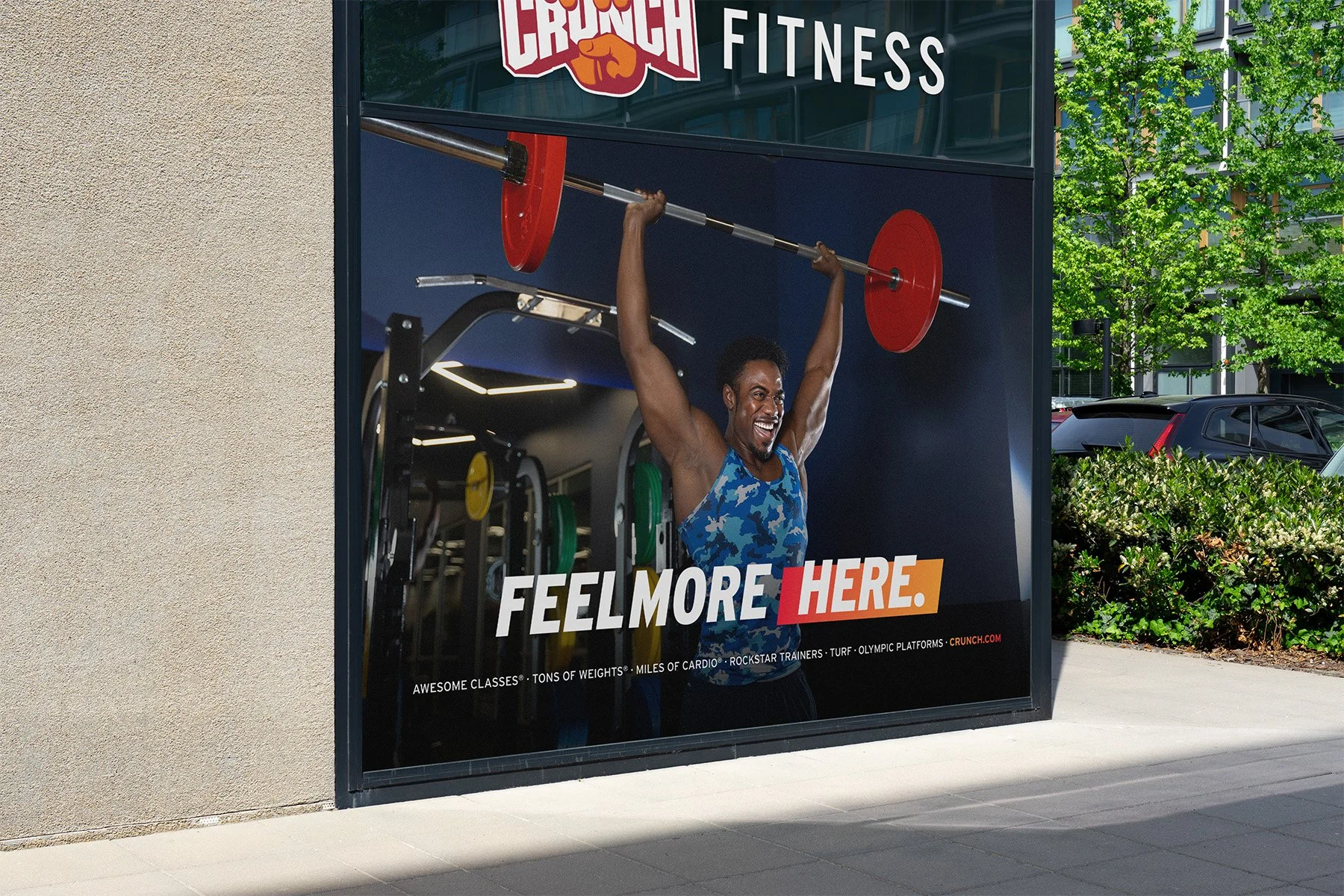
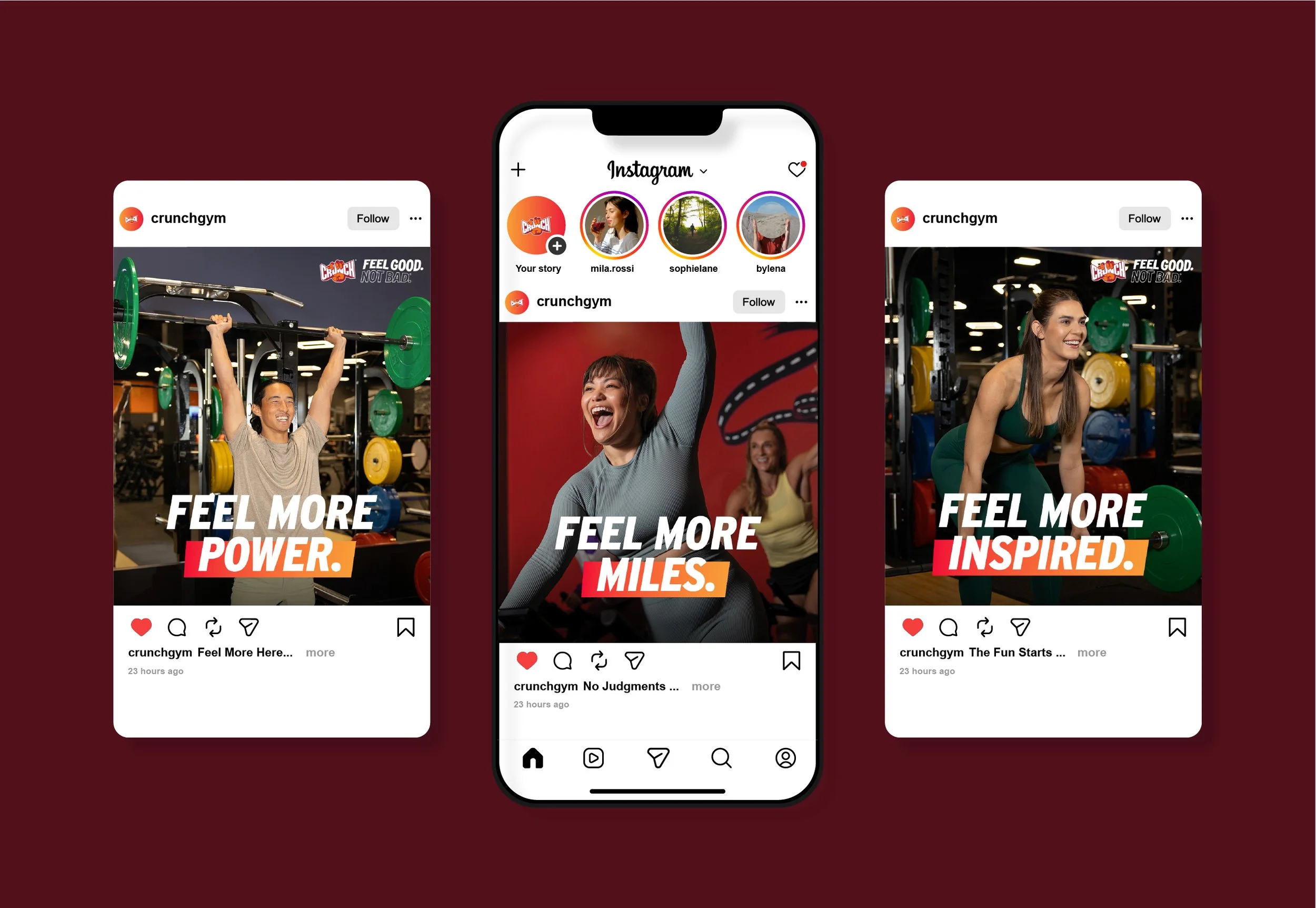
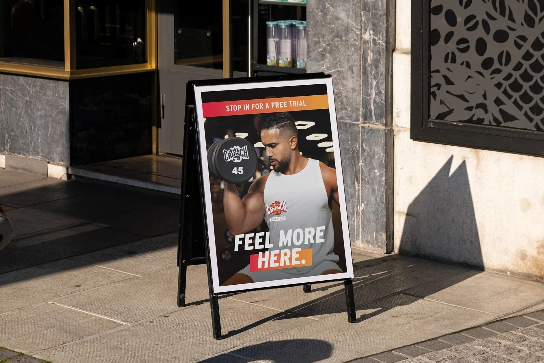
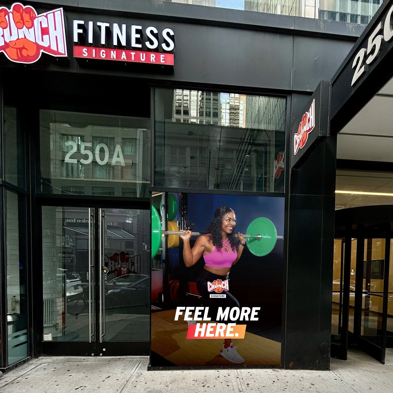
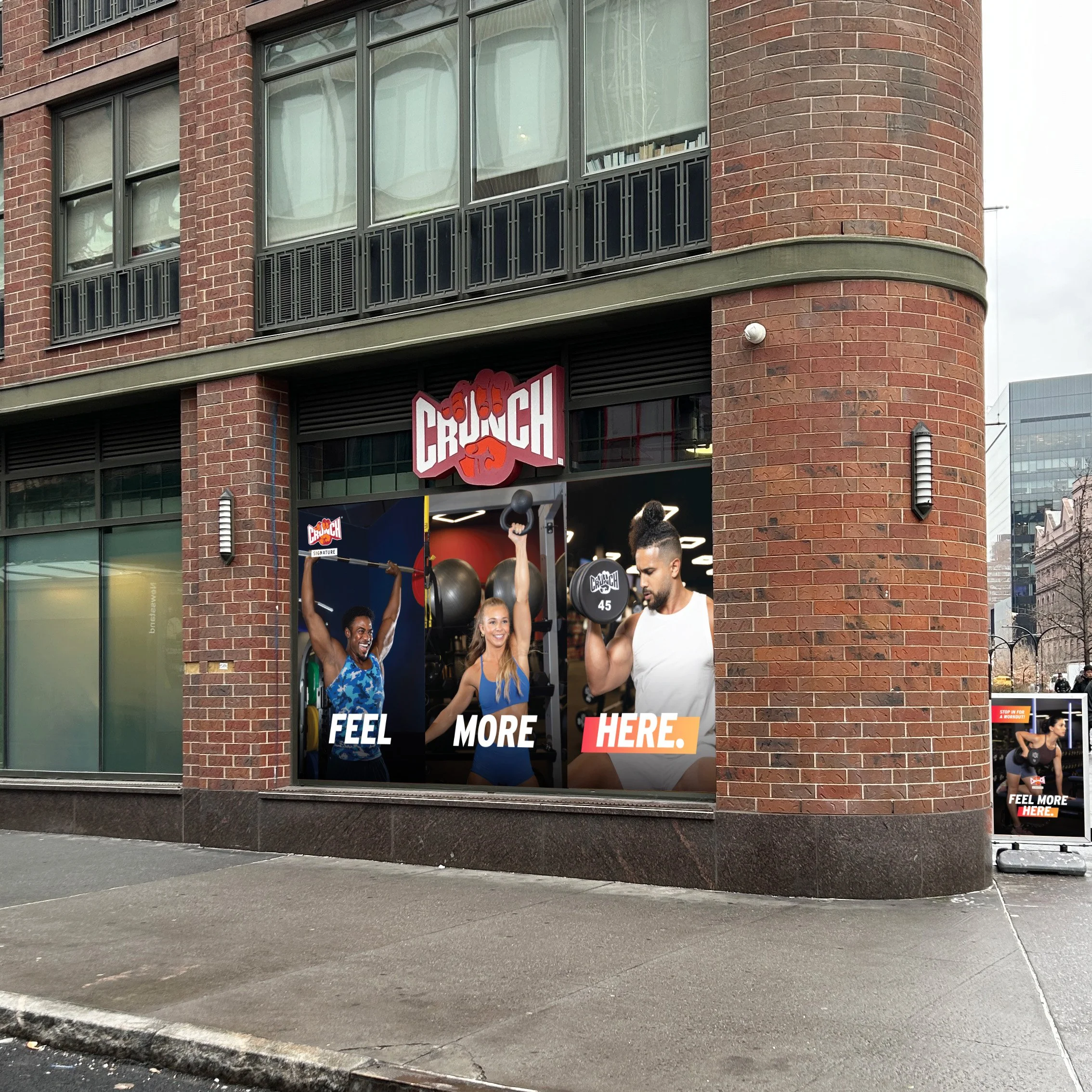
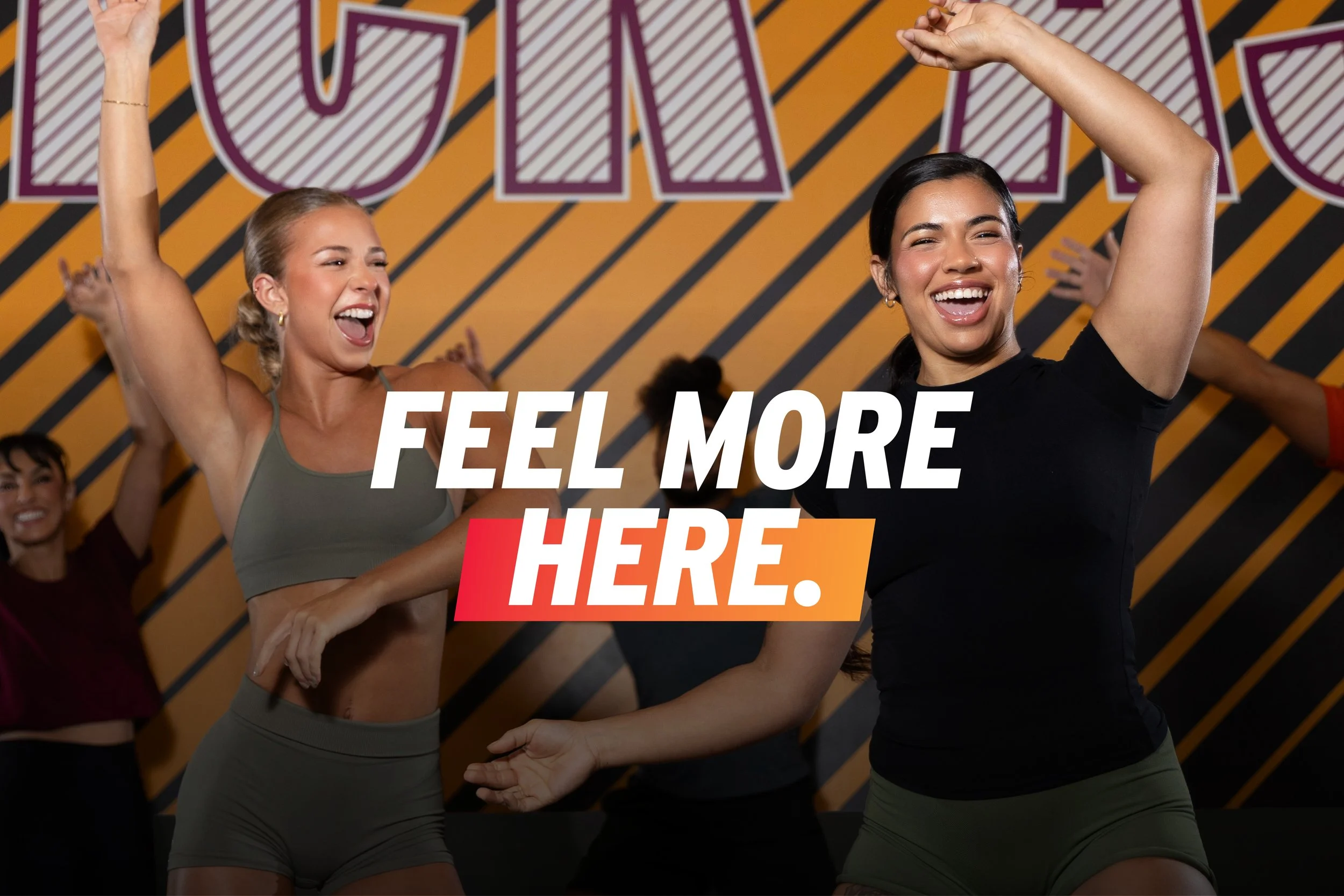
Building off the success of The Feel Good Here campaign, The Feel More campaign plays with the idea that you don’t just deserve to Feel Good — you deserve to Feel More. And where can you Feel More? At Crunch!
As Design Manager, I owned this campaign end to end, setting the production timeline, developing the typographic system and layout approach, and directing image selection, including the decision to shift toward close-up, high-energy photography. I reviewed the work of two designers against the system as it moved through production.
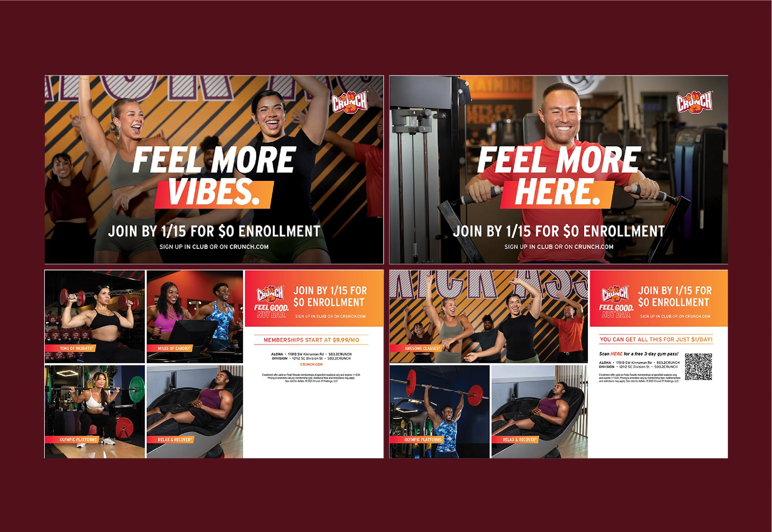
I made a core fix this cycle: simplifying the palette and tightening the layouts to resolve previous application and rigidity issues. I also led the redesign of direct mail, moving to a more contemporary layout that put photography front and center. I reduced the number of images on the back so each could run larger, for a cleaner, more modern feel. This campaign led to a 31% lift in brand awareness, with 72% of purchase intent influenced by creative.